


présentation / presentation
—
Dans le cadre de la construction d’un nouvel îlot à Bordeaux nord, l’aménageur Nhood (ex Nodi) a développé un projet avec Linkcity, le “Square St-Louis”, mêlant espaces verts et habitations, le tout dans une volonté collective de mêler les habitants à travers des activités fédératrices. Le projet s’articule autour de volontés environnementales actuelles.
Avec l’aide de l’agence deux degrés, nous avons développé une identité vivante et modulable pour représenter le projet mais aussi pour que les habitants puissent s’identifier à leur nouveau lieu de vie.
—
In the context of the building of a new block in North Bordeaux, the land developer Nhood (ex Nodi) and Linkcity have developed a project, “Square St-Louis”, mixing green spaces and residences with the collective willingness of mixing people through federative activities. The project is articulated around current willingness towards environmental issues.With the aid of deux degrés agency, we have developed a lively and flexible identity to represent the project but also to allow the inhabitants to identify themselves to their new living place.


concept & graphisme / concept & graphic design
—
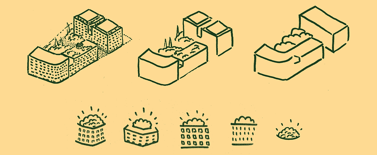
Afin de représenter cette énergie et le parc de l’îlot, nous avons travaillé une identité chaleureuse, dynamique et proche des habitants ! Le logo représente cette idée de convivialité autour d’un cœur d’îlot vert et ouvert. Il est aussi là pour rassurer sur le vivre ensemble, sur l’animation globale de cet nouvelle résidence. Petit à petit, nous avons symbolisé les principales idées et joué sur les éléments reconnaissables du bâtiment comme cette angle arrondi et ces arbres dépassants des bâtiments.
—
Afin de représenter cette énergie et le parc de l’îlot, nous avons travaillé une identité chaleureuse, dynamique et proche des habitants ! Le logo représente cette idée de convivialité autour d’un cœur d’îlot vert et ouvert. Il est aussi là pour rassurer sur le vivre ensemble, sur l’animation globale de cet nouvelle résidence. Petit à petit, nous avons symbolisé les principales idées et joué sur les éléments reconnaissables du bâtiment comme cette angle arrondi et ces arbres dépassants des bâtiments.
Une fois cette base graphique posée, j’ai pu jouer pour différentes déclinaisons comme les palissades de chantier ou une suite de pictogrammes servants pour la signalétique future.
—
—
To represent this energy and the block’s park, we worked on a warm and dynamic identity, close to inhabitants! The logo represents this idea of conviviality around a green and open block heart. It also reassures about the possibility to live together and about the global animation of this new residence. Little by little, we have symbolized the main ideas and played on the recognizable elements of the building like this round angle and the trees jutting out above the buildings.
Once this graphical foundation established, I played with several declinations like hoardings/fences or a series of pictograms useful for future signs.
Once this graphical foundation established, I played with several declinations like hoardings/fences or a series of pictograms useful for future signs.


illustrations / illustrations
—
Pour mieux représenter cette convivialité et cette espace de vie, j’ai préféré passer par un dessin symbolique du lieu au pastel gras. Ce traité graphique permet une déclinaison compréhensible et vive.
—
—
Pour mieux représenter cette convivialité et cette espace de vie, j’ai préféré passer par un dessin symbolique du lieu au pastel gras. Ce traité graphique permet une déclinaison compréhensible et vive.
—
To better depict this conviviality and this living space, I preferred to use an oil pastel drawing symbolic of the place. This graphic treaty allows an understandable and lively declination.

palissades / hoarding/fences
—
—


typographies / typefaces
—
J'ai utilisé trois typographies pour l’identité visuelle :
I used three typefaces for this identity:
—
J'ai utilisé trois typographies pour l’identité visuelle :
I used three typefaces for this identity:

J’ai opté pour la typographie « Garage Gothic » (1992), dessinée par Tobias Frere-Jones (USA), pour sa franchise et son côté imposant. Typographie tirée du vernaculaire urbain, elle permet d’amener une touche moins rectiligne aux bâtiments et se lie avec les dessins.
I opted for the “Garage Gothic” typeface (1992) from the great typographic foundry Tobias Frere-Jones, both for it’s frankness and impressive side. This typeface has been taken from the urban vernacular font family. It diminishes the straightness of the buildings and bounds well with the drawings.
—
Pour contrebalancer et amener cette touche proche des habitants, j’ai opté pour une typographie manuscrite, la « Romy » (2007). Fruit d’une belle collaboration entre le grand calligraphe-typographe argentine Angel Koziupa et le typographe Alejandro Paul de la fonderie Sudtipos, cette typographie répond à la demande avec beaucoup de vivacité et d’efficacité !
To counterbalance and bring this touch of proximity to inhabitants, I opted for the handwritten typeface “Romy”. It ensues from the beautiful collaboration between the great Argentinian calligrapher-typographer Angel Koziupa and the typographer Alejandro Paul from Sudtipos typographic foundry. It meets the expectations with a lot of vivacity and efficiency!
—
Le reste du texte, plus informatif mais aussi inspiré d’un quartier urbain, est écrit en « Montserrat » (2011) de la typographe Julieta Ulanovsky (Argentine) du studio ZkySky. Elle permet une bonne adéquation pour la suite des déclinaisons et pour le web.
The rest of the text, more informative but also inspired from an urban block, is written in “Montserrat” from typographer Julieta Ulanovsky from ZkySky studio. It allows a great adequacy for the next declinations and for the web.
autre crédits / others credits & Merci à / Thanks to
architecture : maîtrise d’œuvre > Nadau architecture, Faye architectes ; paysagistes/landscapers: LS2 paysages avec Jonathan Rouget ; images 3D : Motiv studio ; impression et pose palissade / hoarding/fences print: ACSD Bordeaux avec Jean-François Fages — Amandine Deslandes pour sa confiance et son accompagnement, à Ségolène Grange pour son accompagnement et sa confiance, à Mathieu de deux degrés et à Slip pour ses traductions ; )
architecture : maîtrise d’œuvre > Nadau architecture, Faye architectes ; paysagistes/landscapers: LS2 paysages avec Jonathan Rouget ; images 3D : Motiv studio ; impression et pose palissade / hoarding/fences print: ACSD Bordeaux avec Jean-François Fages — Amandine Deslandes pour sa confiance et son accompagnement, à Ségolène Grange pour son accompagnement et sa confiance, à Mathieu de deux degrés et à Slip pour ses traductions ; )


