Type Directors Club
Fostering A Dynamic Design Community
The Project
Designing a Better Chicago is an annual celebration, for residents and visitors alike, that shines a light on the extraordinary impact of design on civic life. The program also supports local individuals and organizations using the power of design to advance social good through its Design Impact Grant.
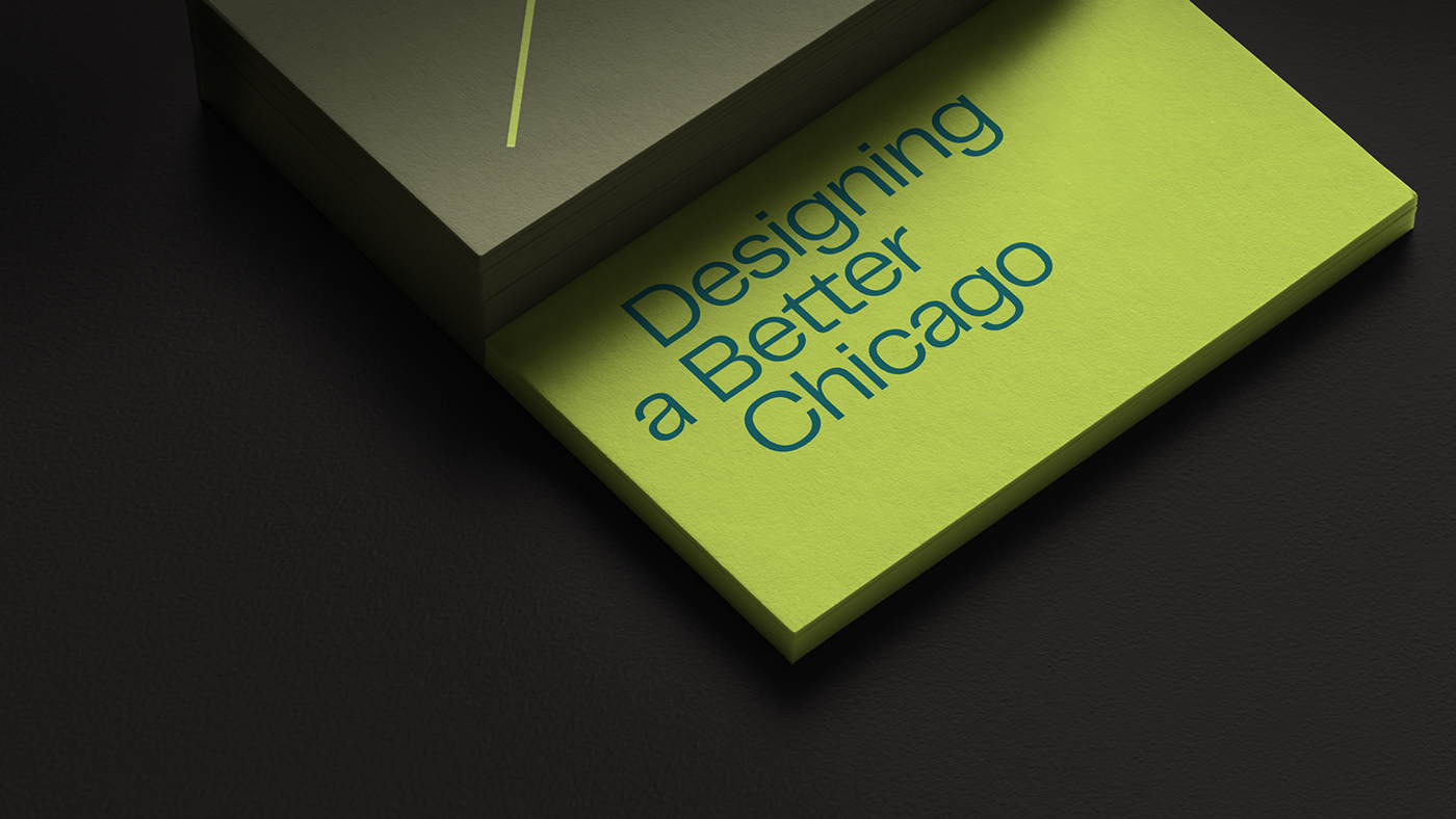
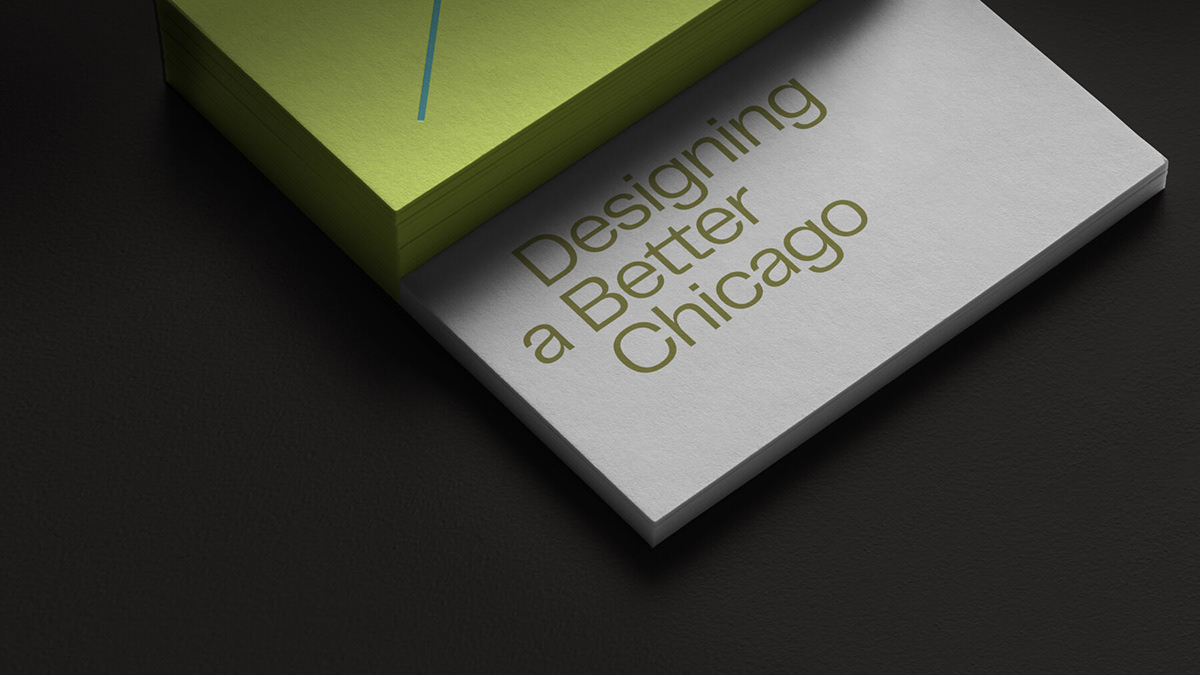
The effort is a collaboration between theMART, NeoCon, DCASE and the Design Museum of Chicago. The team reached out to us looking for a thoughtful visual identity to build awareness and enthusiasm. Together, we developed a thoroughly contemporary system that is deeply rooted in Chicago’s history of design excellence.


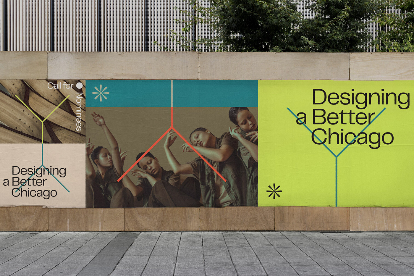
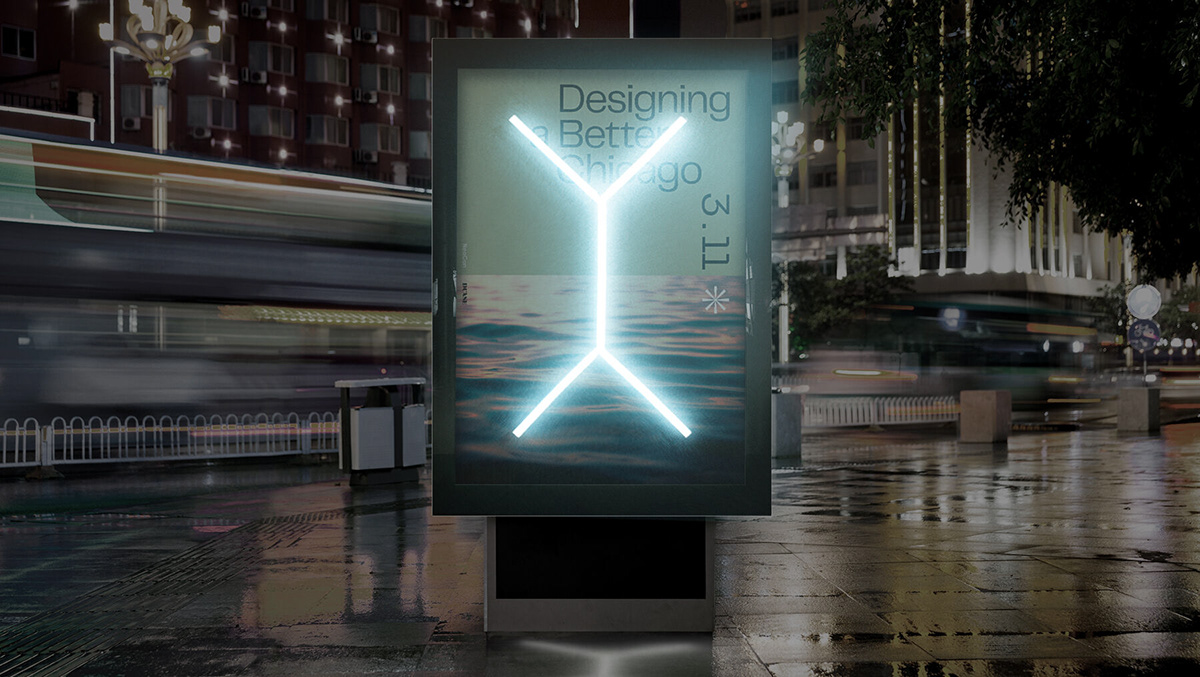
Printed and Environmental Applications
Representing the full expression of the visual identity, the website provides an interactive platform to learn more about DBC and highlights the Design Impact Grant program. Dramatic floods of color shift as users scroll through content. With a prominent link out to NeoCon, it also displays how the DBC identity plays well with the marquee event’s branding.


Photography ranges from environmental and ambient to active and people focused. The textural images inspire folks to look differently at the world around them. Human subjects provide a glimpse into what is happening throughout the city at any given moment.


Wayfinding Signage
Extensions of the core logo symbol, design-inspired geometric shapes work together to guide people through future exhibitions and installations across the city.


The Logo
To develop the logo, we discovered inspiration in the overlooked—Chicago’s municipal device. An iconic symbol that hides in plain sight throughout the city, it references the 19th-century engineering feat of reversing the flow of the Chicago River. The linear forms provide a pared down yet meaningful foundation for the entire visual system.


Composed of a reflected symbol and wordmark, the logo becomes flexible and dynamic as arrangements are formed. The offset alignment emphasizes the DBC initialism and sits comfortably alongside the symbol. Set in the typeface Telegraf, the wordmark connects to the symbol through geometry and subtle angles.


