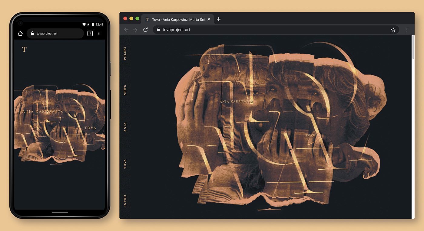

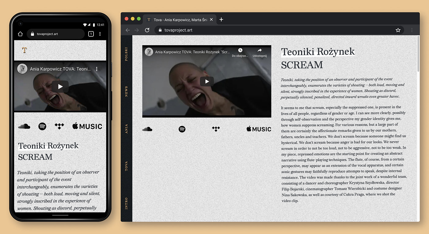
Design and implementation of a custom Wordpress theme for Ania Karpowicz's TOVA.
Read the main case study here: TOVA (Case Study)

It was an interesting exercise to extend the aesthetics of the cover art – a self-contained, static piece – into the inherently fluid and open-ended realm of the web.
Thematically, TOVA is indirectly rooted in the historical context of post-transformational Poland – that is, the experience of living in the young democracy, still carrying the not-so-subtle remnants of the Soviet era.
Combined with the experimental and explorational nature of TOVA's music, it made sense to borrow from the aesthetics of the early Internet, with its "homemade" and somewhat raw feel. The website is therefore intentionally rugged and slightly unpolished, as if it was designed by the fragmented collage of xeroxed portraits from the cover art.

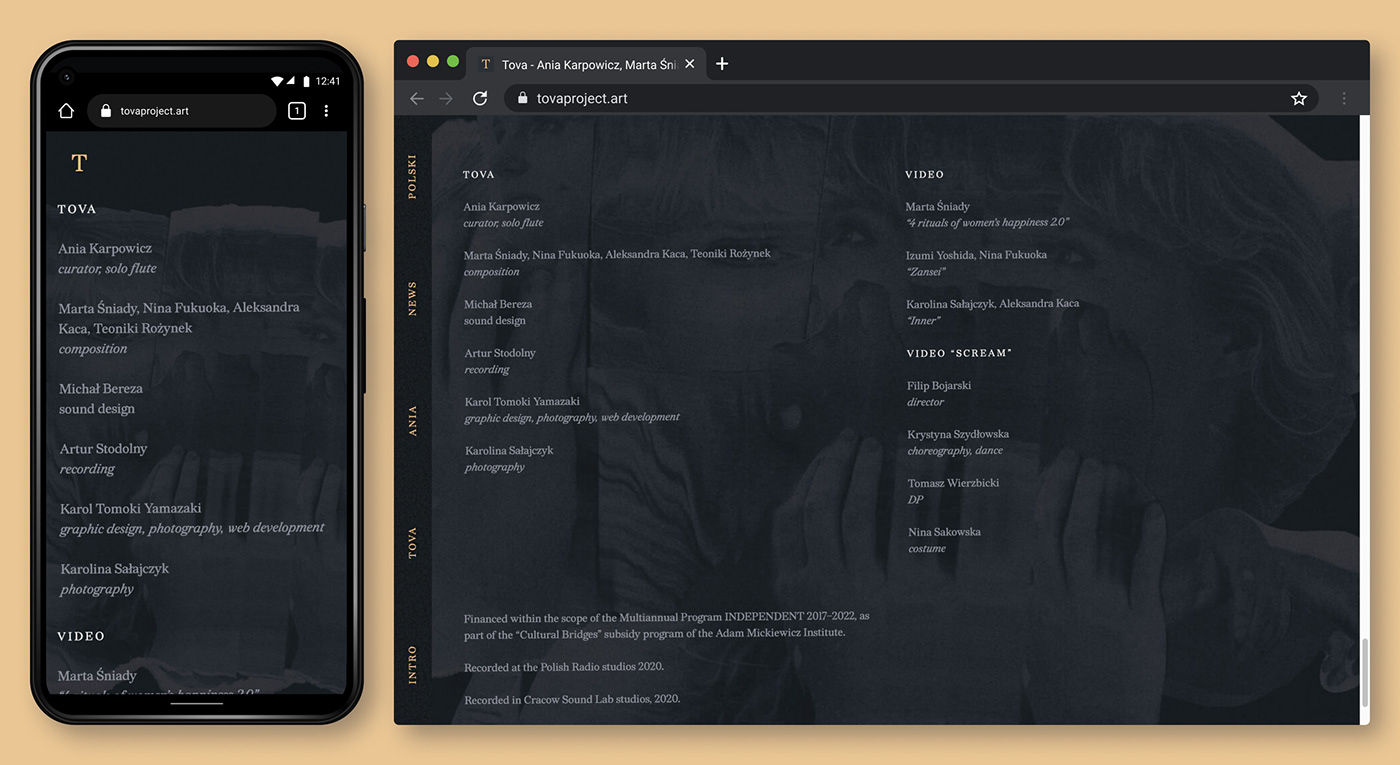

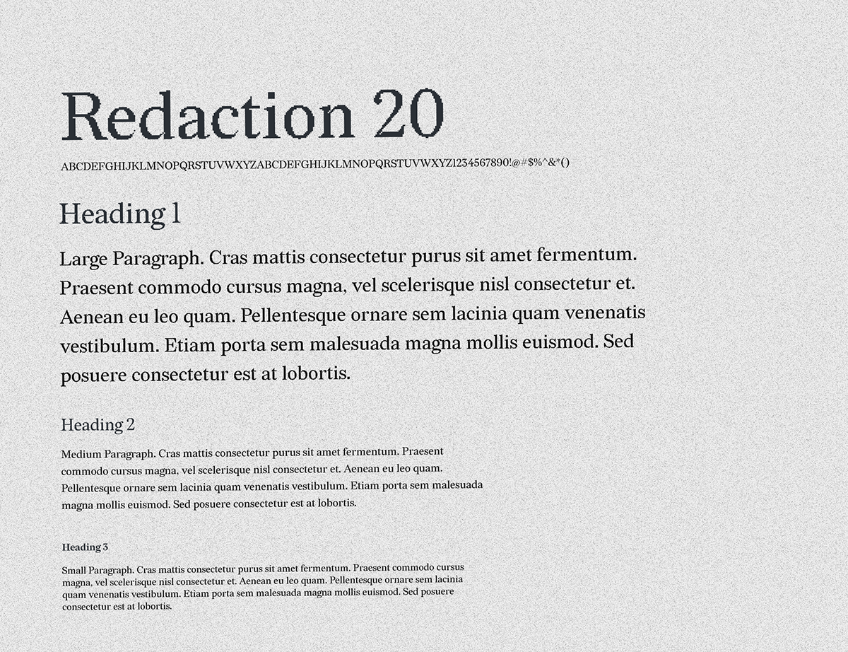
For the typeface, I chose Redaction 20 by Forest Young and Jeremy Mickel. Designed as part of an exhibition on unconstituional cash bail system in the US, it seems like an odd choice. However, it immediately resonated with me for two reasons: first, the typeface's letterforms are based on 2 fonts most often found on US legal documents: Times New Roman and Century Schoolbook, both also strongly reminiscent of the '90s and the aesthetics of early mainstream computing. Furthermore, TOVA talks about personal identity, especially that which is under different forms of oppression; Redaction's thematic origins of social justice and abuse are therefore not very far away from the stories told by TOVA's music.