


Branding high-end businesses is tricky but damned exciting. Our client commissioned us to develop a brand for an electric boat retailer based in Russia. The product he works with is a new one not only for Russia but for the world market too.
We started with defining a target audience. The main advantage of electric boats over their petrol-powered competitors is being eco-friendly and quiet. These product qualities helped us to identify the customer: a visionary who seeks new experiences. He wonders about progress, and he cares about the future and his impact to it as well.


Electric boat is an expensive possessing. Every tiny detail matters. You need the client to be sure the boat fits him perfectly well. That’s why the demonstration becomes a journey. Edisson is here to organize a tour to the shipyard, test-drive and give you a entertainment programme.
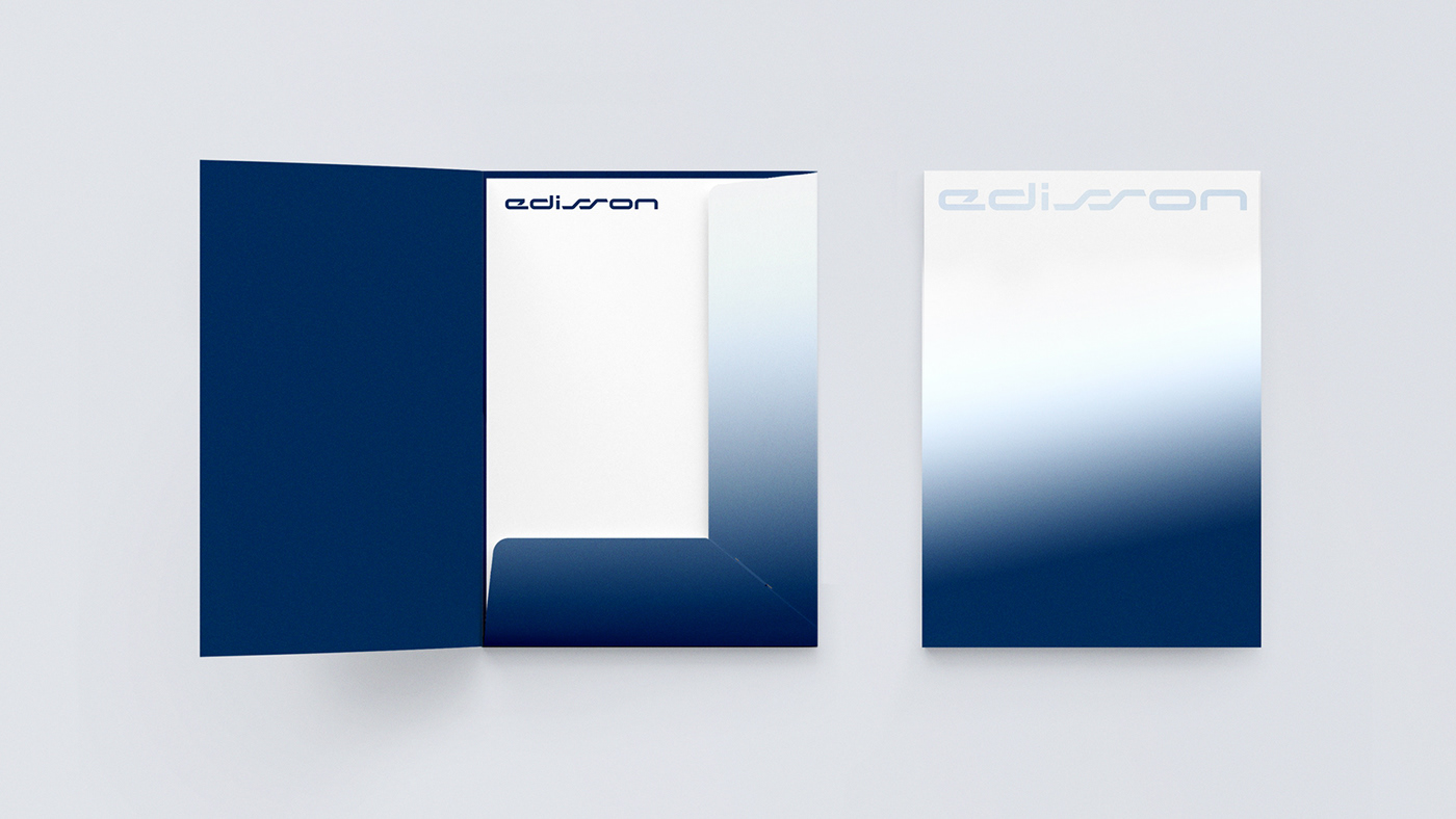
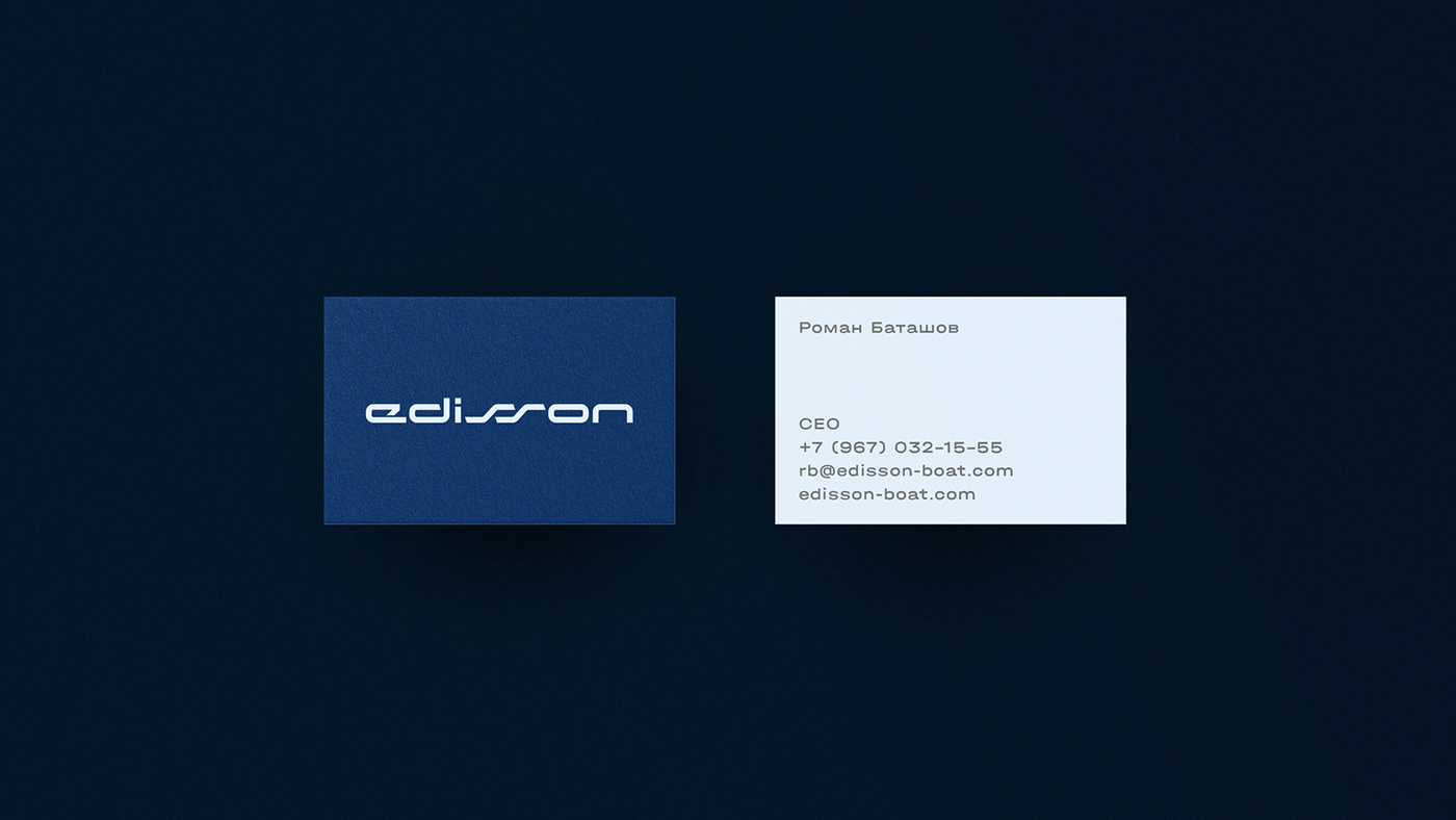
The brand name is inspired by the name of the famous inventor Thomas Alva Edison. We used double S as it adds to the character and personality of the brand.
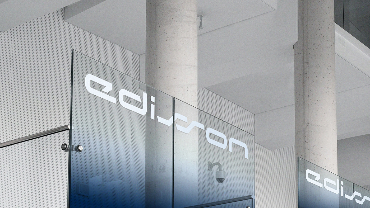
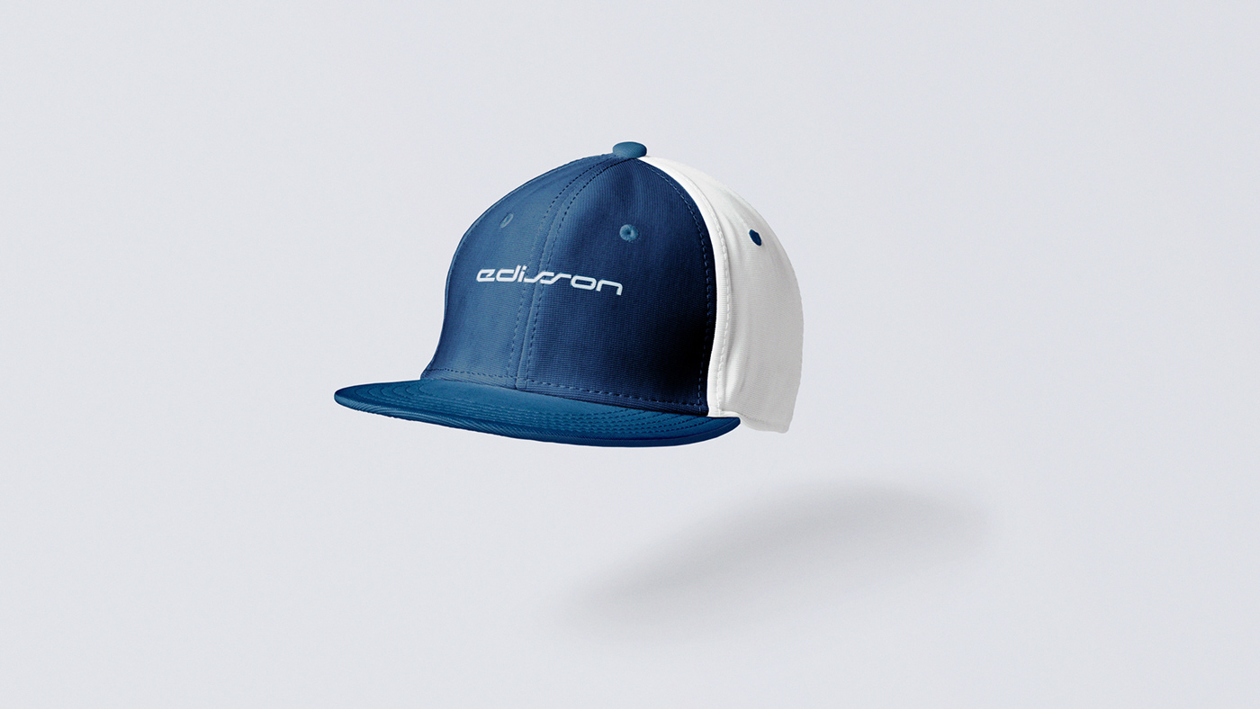
Edisson’s logo is an all-caps wordmark forming a dynamic stripe. Letterforms give you associations with hi-tech and innovations from the first sight. The color palette is based on deep blue and a refined gradient. It reminds one of the sky above the sea which is all about the shades much like the product is about the details. It emphasizes brand’s being innovative and exclusive.


Visit Site:
Credits:
Art Director — Olga Kutovaya
Design Concept — Anastasia Kuprina
Identity System — Alexander Kopinov
Art Director — Olga Kutovaya
Design Concept — Anastasia Kuprina
Identity System — Alexander Kopinov


