


Role: University of Maryland MicroMasters in Instructional Design student.
Official Project Purpose: This is the first of the four courses, so the portfolio requirement was more to get up and started so that by the final class students would have a portfolio ready to go for job hunting with students work in place.
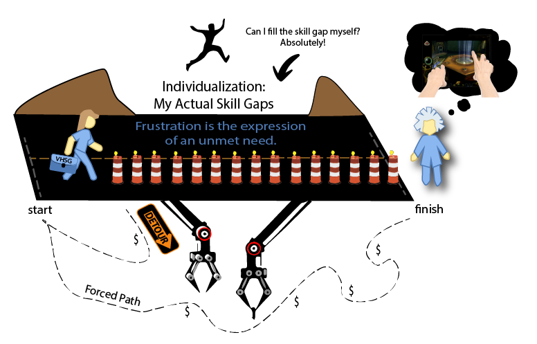
My Purpose: I took the course as a 15 year veteran of instructional design that is now finding that experience must now also come with a piece of paper, a Master's degree. Being a veteran in a course for newbies has its own challenges. Most of the objectives are frustrating because time is spent on things the veteran has long ago mastered while skills that veteran feels they really need to be spending time on have to be set on a back burner. I created an illustration borne out of this frustration:
My Purpose: I took the course as a 15 year veteran of instructional design that is now finding that experience must now also come with a piece of paper, a Master's degree. Being a veteran in a course for newbies has its own challenges. Most of the objectives are frustrating because time is spent on things the veteran has long ago mastered while skills that veteran feels they really need to be spending time on have to be set on a back burner. I created an illustration borne out of this frustration:
So, I set a different goal for my student portfolio. Sure, I had things in my portfolio that the course required such as weekly summaries that demonstrated reflection on the course content. A problem/project or two that would become a thread to continue in the later courses that would follow this one. My goal was to consider how I would design an instruction design degree program that would do the job far better than the traditional model.
ICONS
While my portfolio website contains the full content, by project here in my Behance page is more on the design elements of the class portfolio. One of the aspects of which involved selecting and designing icons for the sub-specialities in instructional design. One of my goals with the icons was to keep them limited to one to three colors. I designed them in black, gray, and white as a base which could be adapted to the color scheme of the section they would be placed into.

My Course Design
My own course design is an immersive experience in an advanced project that runs as a Bachelors program focused entirely on using actual research tools such as eye-tracking, mobile EEG, and Glass Brain (Unity 3D plus MRI-DTI) technology. It enhances theory by giving hard data to analysis of learning. Here in my portfolio, I am merely prototyping so I used data from a research study at https://affect.media.mit.edu/pdfs/10.Poh-etal-TBME-EDA-tests.pdf using merely an electrodermal sensor, but the style of data is useful for my prototype which later will be replaced by actual EEG readings. There are commercial sensors now that work with Smartphones, so I can see my prototype technologically becoming a reality when I move forward in two years with my plan to actually run this as a course.

The brain is visibly at its lowest activity level during lectures. It is even less active than during REM sleep. When the students are an active participant, however, the brain is very active. My personal learning approach is 'active learning is real learning'.
The following images are a small snippet of my initial brainstorming storyboard for the immersive experience.

The dashboard in the storyboard is fleshed out in the mock-up below.

The mockup: In my idealized degree program, instructional design and the allied degrees would be building courses from their freshman year instead of taking traditional courses. Their professors would instead be SMEs. They would have modern technology that monitored brain activity of learners while on task. Glass Brain is a new technology that does this and is part of research I am actively following to catch any nuggets of learning gold that gives new insight or proves/disproves long held learning theories. Another technology highlighted in this simulation is eye-tracking that is used in conjunction with the Glass Brain monitoring. Instead of being told graphic design tips, they learn it through data from A B testing. Participants in the ID program are holding a variety of roles. They are monitoring learning at the brain activity level to learn how to best build e-learning. They are building courses based on the proof of concepts coming out of the monitoring project. They are students that are participants in the evaluation of the learning that is being built.
Case Studies
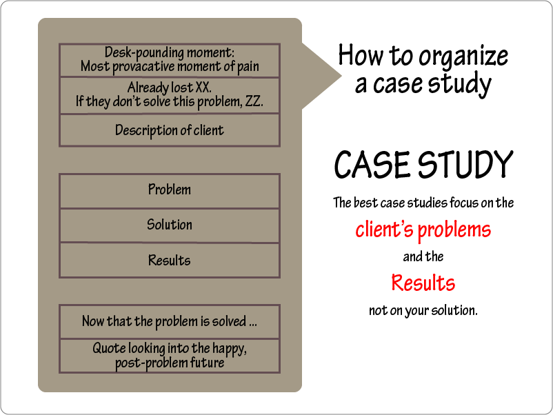
Case studies play a big role in the courses and in the portfolio. This illustration was created to introduce the case study format encouraged in the course. I was surprised that the recommendation was to not focus on our solution. I need to create some A B testing and try that with real people and see if that really is better.
Design Problems
We were to select design problems that we were actually experiencing that related to learning. I teach middle school and high school level online courses. I saw a need to add some gamification that catches students being good in this environment and some motivation for students that slipped into negative behaviors easily. I began with a survey in our Facebook Group for our project. These surveys allow parents and teachers to type in their own entries which is an effective way to identify needs in our project.

The survey showed that parents and teachers felt that chat distractions were an issue that would be good to tackle. We did not want to squelch chat because that also is how teachers engage students. What we needed was a gamification to raise the bar of the content of the chat. The goal was to catch them being good and reward it and create some incentive for the ones that tended to post distraction in chat to redirect. I worked on a design where it was easy for teachers to give points during a live class and where the students scores would display in a leaderboard in the course and their results were in their parent account's sidebar. This is set up for team play. In the image below you see a blue team member and two red team members.

This illustration explores the connections across problem, theory, tools, and team members for the Live Chat Gamification project.

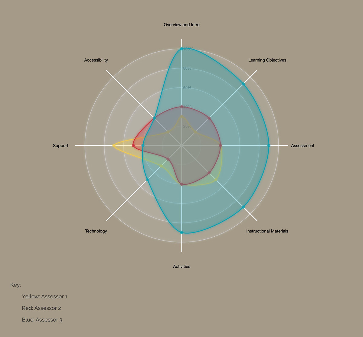
Radar charts pop up in several places in my course portfolio. It is in the scoring for the gamification, in the Peer-Review Score, and a few other places. Recall that was also learning a javascript library called D3.js. This gave me an opportunity to put one of the chart types to use. A few of these are interactive. In the one below, there are three review cycles which are color coded. When you roll over the title or a scoring patterns, the one you are selecting will move to the top of the stack and increase in opacity a little. This screenshot is from my test run of the code to be sure the data was coming in correctly from the JSON file.

Below is the D3.js radar chart I use for Quality Matters scoring.
INTERACTIVE ELEMENTS
A great deal of the theory content begged for the build of interactive activities. The following two images are Adobe Captivate drag and drop activities I created for practice related to the David Kolb model.


BLOOMS TAXONOMY
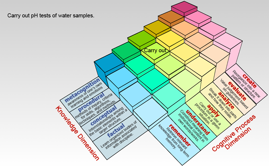
One of my favorite educational theorists is Bloom. I love his taxonomy. It has been modified a time or two by others, for the better. The best shift was to move Create as a higher level than Evaluate. this shift happened about a decade ago. About that time, I came across this interactive for Bloom. It was built in Flash and has since been replaced by just a static graphic. I coded this one up in Captivate so I could still enjoy the interactive version. I put my own spin on it to add to its value to me. When you hover over a colored block, the activities show for that particular Bloom level. If there are more activities than can be listed in that space in the top left, then a click instead of hover will link you to another page with the information. This little tool will be great to track data when I need to communicate to stakeholders what Bloom level a unit includes.
SPACED PRACTICE
Another learning method I place a lot of value in is spaced practice. It is one of the few learning techniques that has held up well through the years when methods come under close analysis in research studies. I use a tool called Cerego for my own spaced practice. As a coding challenge mixed with my entry into my ID portfolio, I made it a goal to code up my own Cerego. This is a screenshot from the gamified dashboard that tracks progress of active decks. Each dot is a deck of related content that must be mastered longterm. I first used Cerego when I was taking an EdX Harvard course on human anatomy. An example deck from that course was all of the core anatomy terms, about 100 of them, that we were to master for the final exam. I wanted a recall that would be years of easy recall because periodically I taught Advanced Biology.

About the dashboard design:
The data that is represented by the vertical position of the dots (decks) is related to the spacing in time. The closer the dot is to the top, the more recent the deck was reviewed. Dots migrate downward with time automatically with the dots that are further left dropping fast. The very first column literally drops to the bottom in an hour. The column furthest right takes a year or more to drop to the bottom. When the dot has reached the bottom, you are due or past due on doing your review pass for that deck. The position left and right indicates mastery of the deck. The newest decks will be toward the left. The deck that have been practiced for long stretches of time will be further right.
The data that is represented by the vertical position of the dots (decks) is related to the spacing in time. The closer the dot is to the top, the more recent the deck was reviewed. Dots migrate downward with time automatically with the dots that are further left dropping fast. The very first column literally drops to the bottom in an hour. The column furthest right takes a year or more to drop to the bottom. When the dot has reached the bottom, you are due or past due on doing your review pass for that deck. The position left and right indicates mastery of the deck. The newest decks will be toward the left. The deck that have been practiced for long stretches of time will be further right.
THE COLLABORATORY
I started a collaborative project with other students of the course. We decided to call it the Collaboratory. We met up weekly during the course duration to talk about research about how we learn that went beyond what the course was covering. We also did a lot of peer mentoring. The illustration is one of those sub-projects I never quite finished. I had too many balls up in the air with all the fin things I was building. This one made sense to be the one to let go of. When I finally do get around to finishing it, the plan is for it to be animated. The SME brain will start out with all the connections and 'lights'. The animation will then show them shining brighter, then a spark of movement will speed out from it down the neuronal path through the Instructional designer/developer bar to then create a path and light in the learner brain.

As you can see in the original brain image below, I simplified it down to far fewer paths to make the animation time out to something more reasonable in length. Eventually, I likely will use some spin off of this for a personal business logo.

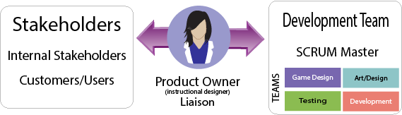
The Collaboratory had an emphasis on Agile product development. None of the others knew much about it and wanted to mentor them into how to use it, so I became the SCRUM master. These graphics were used for training.


Story points are handy tools in sprint planning meetings. These meetings are set to occur at regular intervals based on the length of time that the sprints run. Sometimes, sprints are as short as two weeks. Five weeks is the most typical time span. The member that will have the task is usually the one that selects the story card that they feel is a good estimate of the points/time needed. These then were loaded into Trello which is what we used for project management. I have since had the good fortune to be introduced to JIRA in one of my longterm contracts. The same company makes both, but JIRA is the far more sophisticated older brother. It is less visual though. I do love how I can work the graphics in with the use of Trello.


