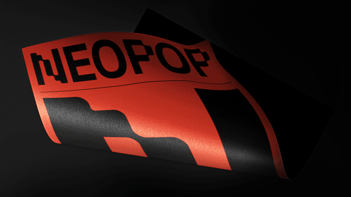
Identity for Neopop Music Festival — Viana do Castelo
Identity — Web — Video — Typography
NEOPOP is the largest electronic music festival in the country. With 15 years of existence, the urgency of developing a cohesive and consistent visual identity with the international positioning already established by the Festival allowed us to create and develop the new NEOPOP brand identity.


The maturity of the festival and the various developments of the brand constituted a challenge for the studio in the elaboration of a strategy that did not configure figurative elements or the brand as the only highlight of the festival, but that built in a thoughtful way all the existing needs.

The objective was to create a cohesive identity adapted to the needs of the festival and eliminate figurative dependence on the brand by the festival. We present an identity based on a typographic base, redesigned in the letters N and P, initials of the festival's name.
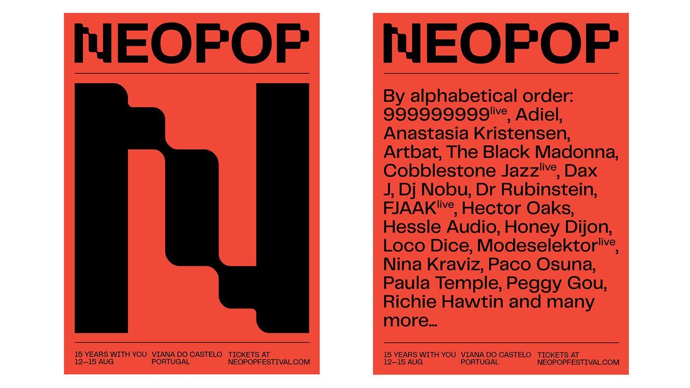
The change was indeed notorious and of great relevance, so in this first edition the objectives would be to cut through the pre-existing communication problems and highlight a new positioning for the Festival that would raise the brand and the position it occupies globally.
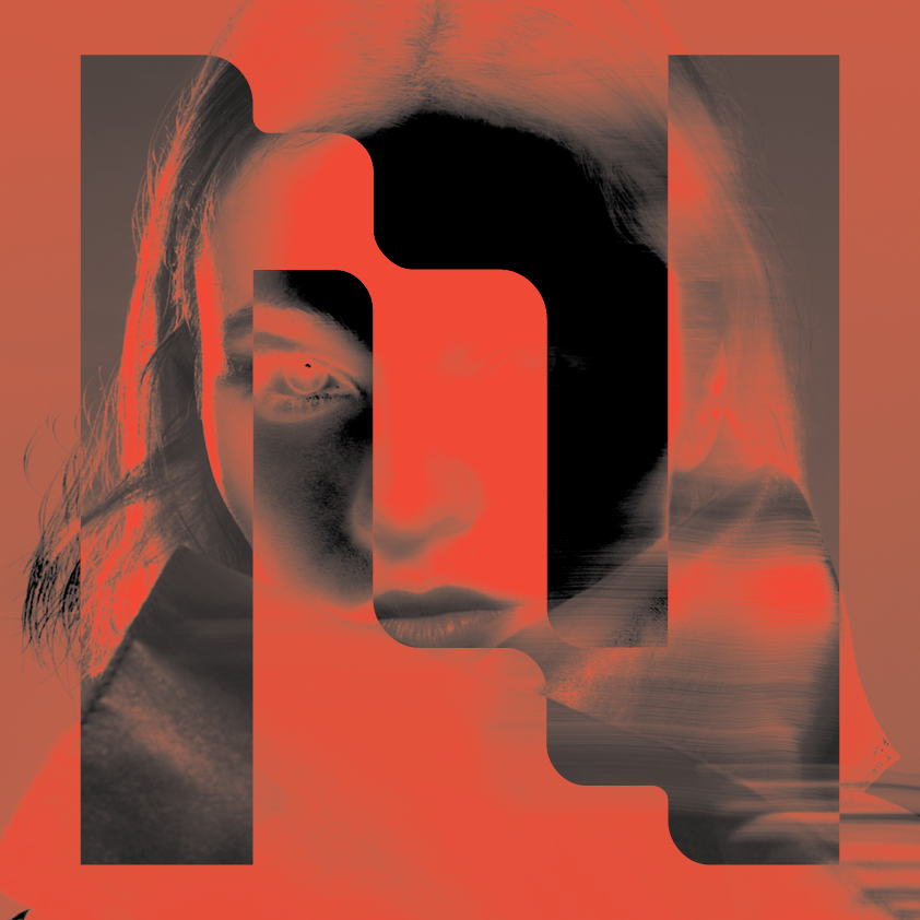
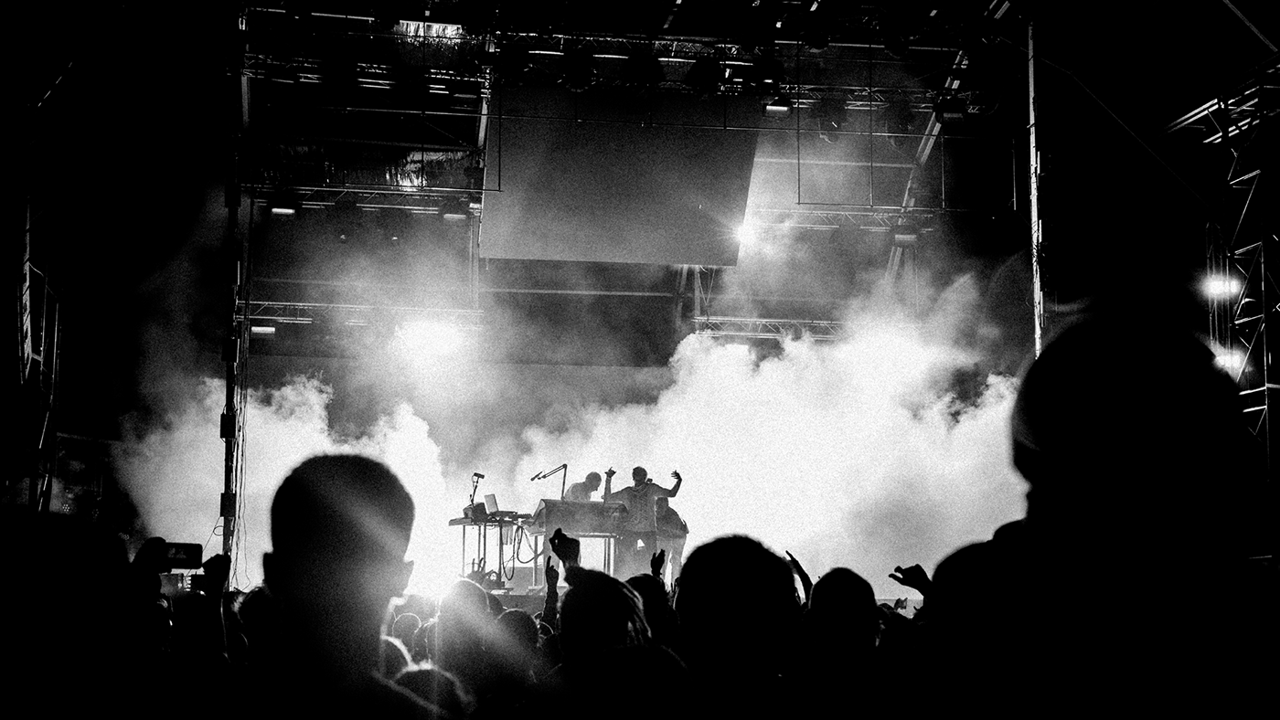
Due to 2020 Covid-19 pandemic, we couldn't materialize the identity. Let's hope next year will be filled with new opportunities and challenges and let us celebrate life with 2021 Neopop Edition.


