


Starting in 2020, before the pandemic era, I attended a course in web marketing & graphic design. The main goal was to develop a concept to encourage tourism and travel (nice joke, universe), so I created "Homanities": a way to meet new people under the same roof, travelling around the world.
Same place, same house, different people. That's the spirit that moves Homanities. The name is a play on word about Home and Humanities, depicting a place where you can feel like home, meet new people from other countries and, most importantly, a different culture.
The project takes a route into three different sections:
– graphic design
I hope you will enjoy all the efforts puts into it.
Thank you already ❤️

/ Shape
The most important part of a brand is its logo (I'm joking; everything is vital in a brand). I started to think about keywords that can best describe Homanities concept. You can see some drawings and notes about it. The main core of Homanites is to meet different culture, that's why I decided to use a specular shape made of two fused arrows, creating a path within negative space.
/ Colours
The primary colours are sky-blue and orange. I choose them for being complementary, and for also bringing a sense of reliability in the first, with the latter giving warmth and friendliness.
/ Font
I choose three different font:
– Quicksand for the name
– Comfortaa for the slogan
– Aleo for the main text.
The first two are sans-serif, with rounded edges to give a softness sensation in the reading.
For the current text instead, I choose Aleo for better readability, still didn't want a classic elegant font like "Times New Romans".


I made the stationery to better display colour weight and logo visual in different media. The business card has the logo shape that splits in half. After testing, I found out that both colours work well with the design.


The poster is the design foundation for the rest of the work. First versions were more minimalistic using a single photo as a background. With the new design, I reworked part of the project, like the brochure and the catalogue. The motion design spot is also based on this poster.


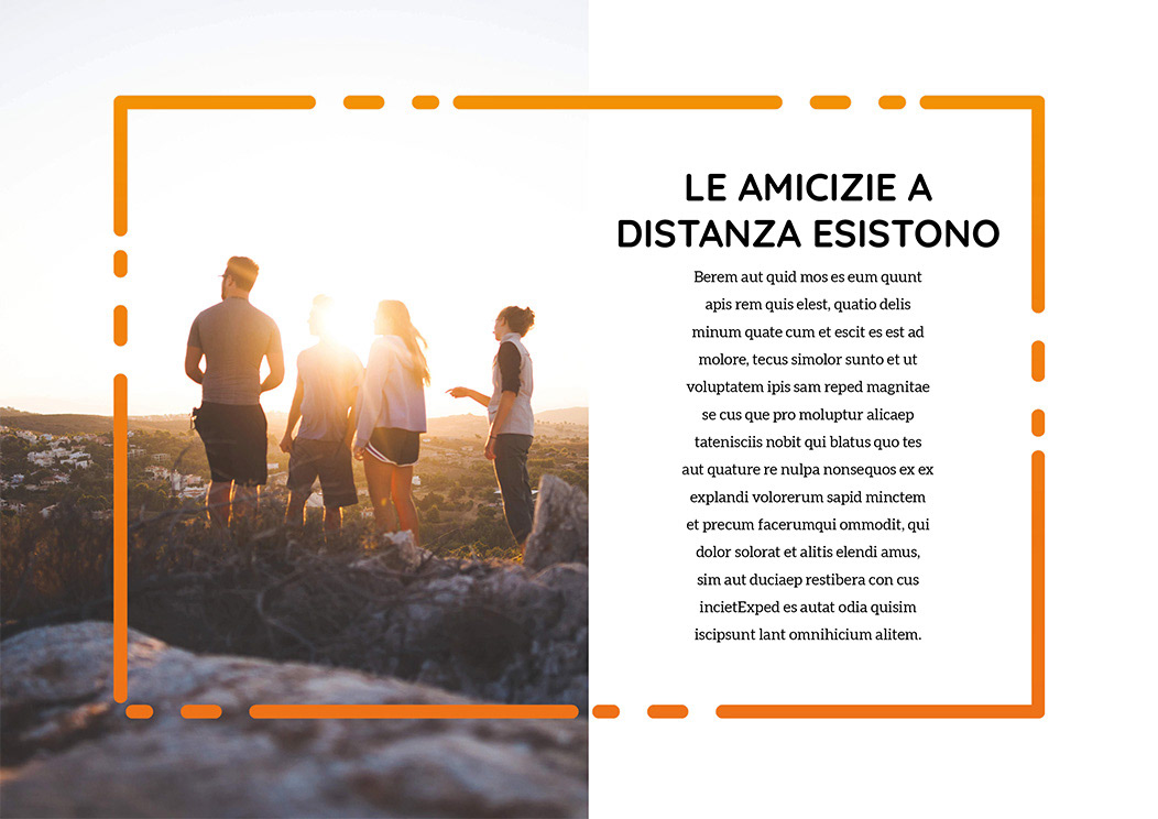
As I said, poster design was the graphic foundation, and you can see here in the brochure. The inner part wants to recall the classic treasure map where the dotted lines start from different places and arrive in the same spot. The outer part is mainly photos with groups of people, and the across split recalls the logo design. In the white part, there's a call to action for who wants to become a host for Homanities and social link.


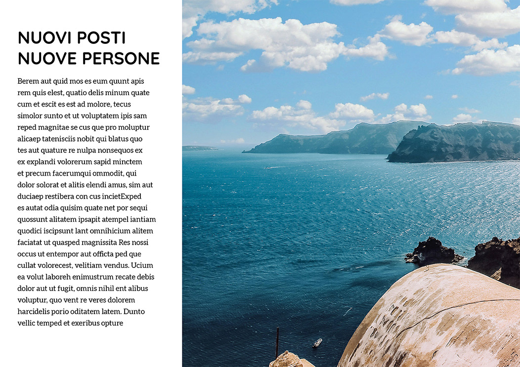
The catalogue had a smooth approach. I choose to use more photos, and less graphic to appealingly describe the brand concept and idea.


P.S.
The mockups are all made in Blender 3D by me 😀
The mockups are all made in Blender 3D by me 😀
Thanks for watching ❤️


