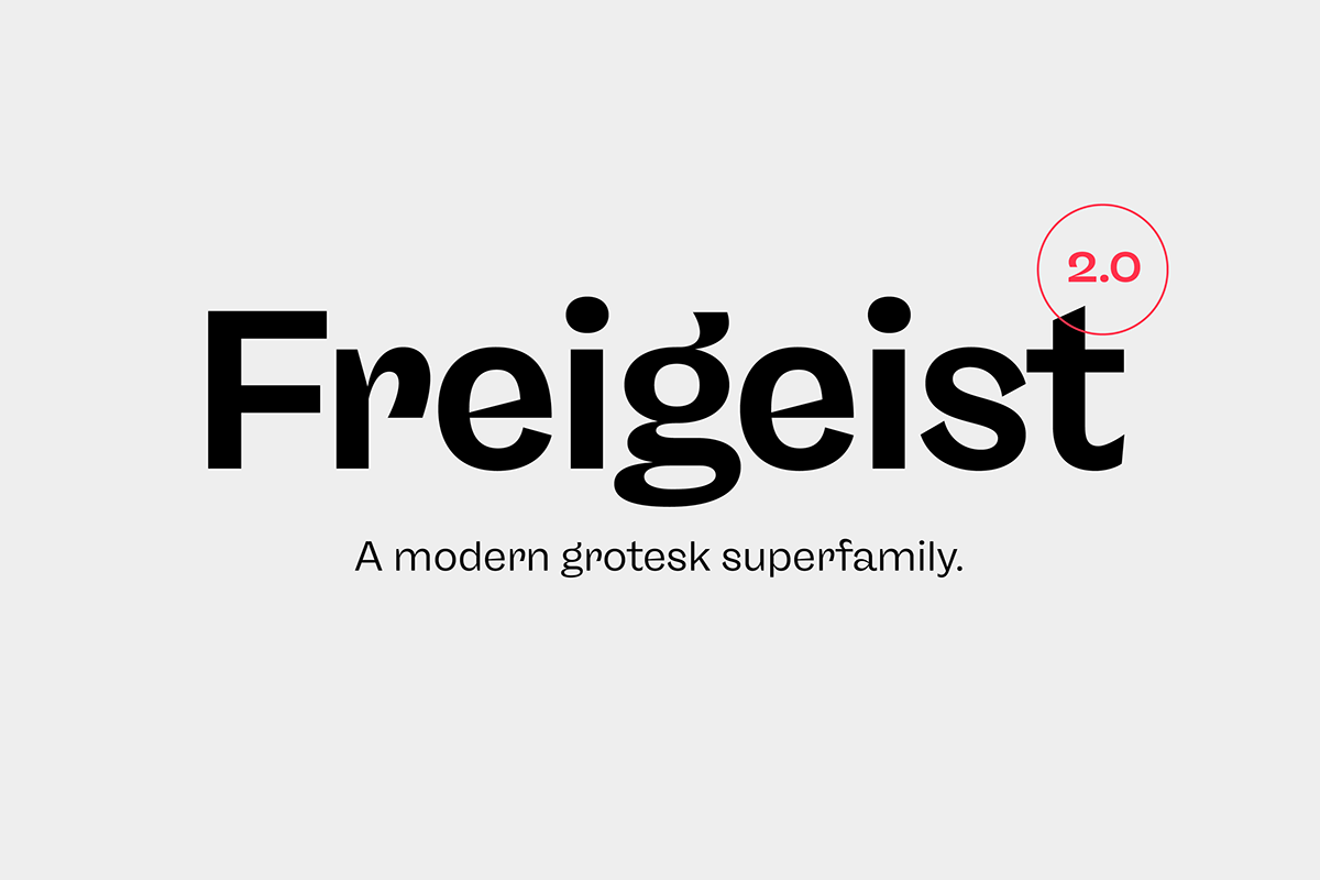
The story of Freigeist is a journey into the past, back to the early grotesk fonts and long before Helvetica and Co were standard fonts in operating systems. For what we take for granted today is the result of innovation and pioneering spirit of type foundries such as Caslon or Stephenson Blake in the 19th century, whose expressive designs are mostly forgotten today. The Freigeist family captures this untamed spirit — hence the name (German for “free spirit”) — and puts it into a contemporary context, resulting in a multi-faceted family with a wide range of applications, font styles and features for modern typesetting. Freigeist is now available in version 2.0. A complete rework.


Design Details
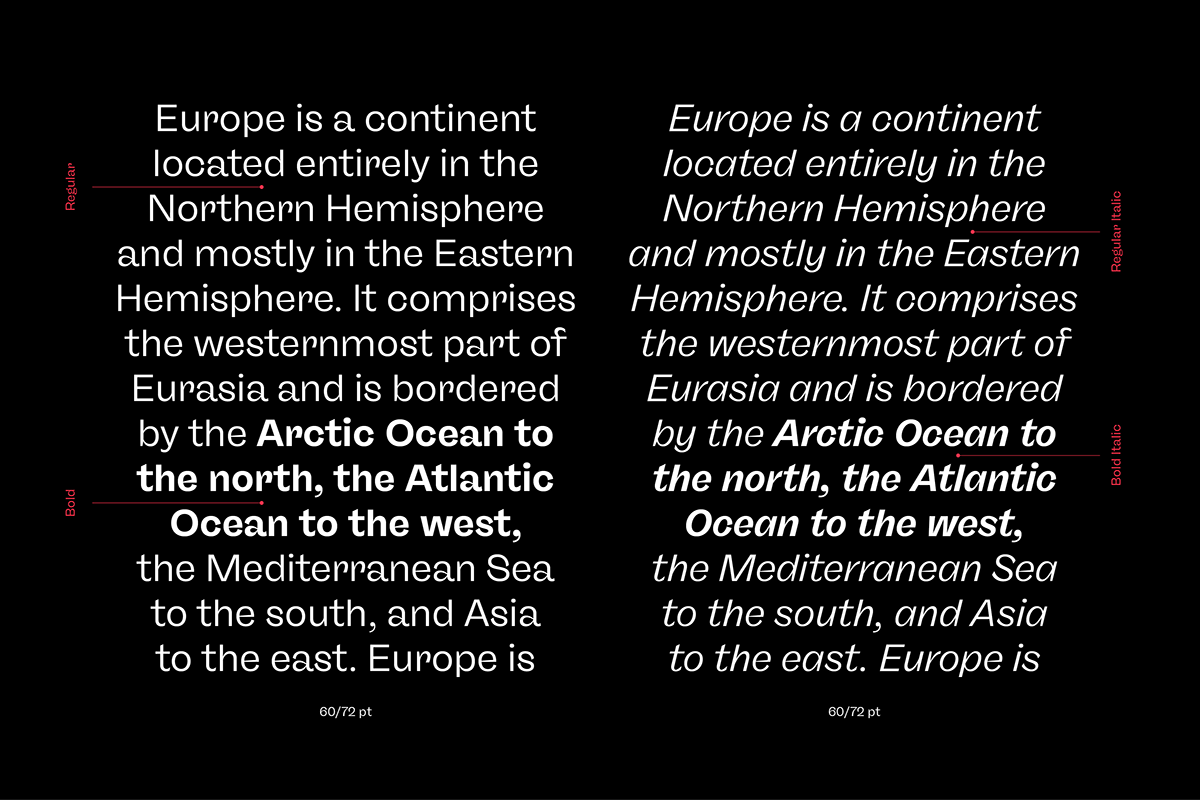
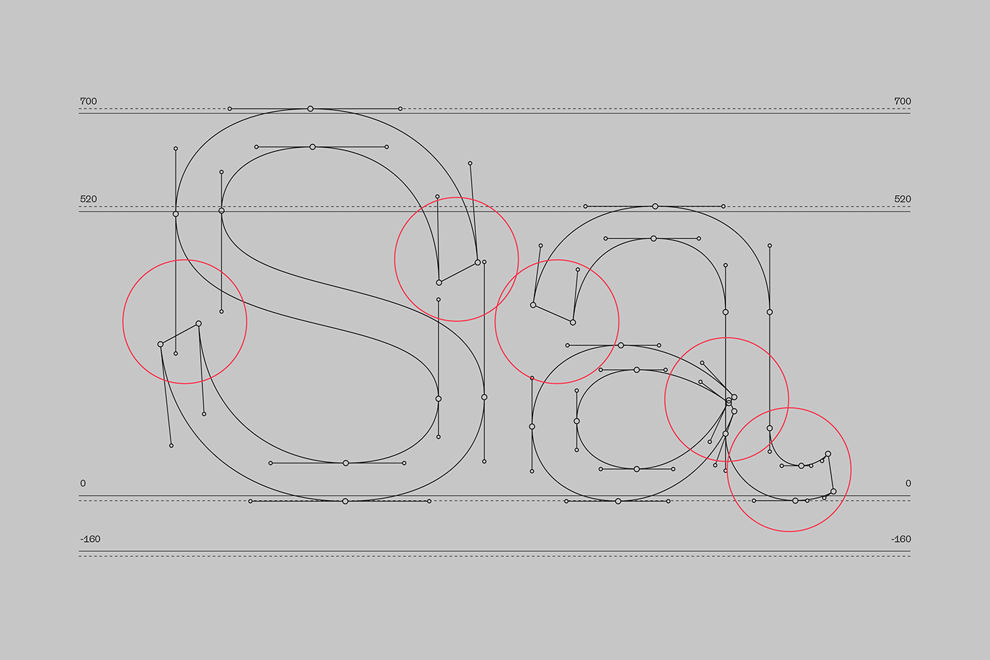
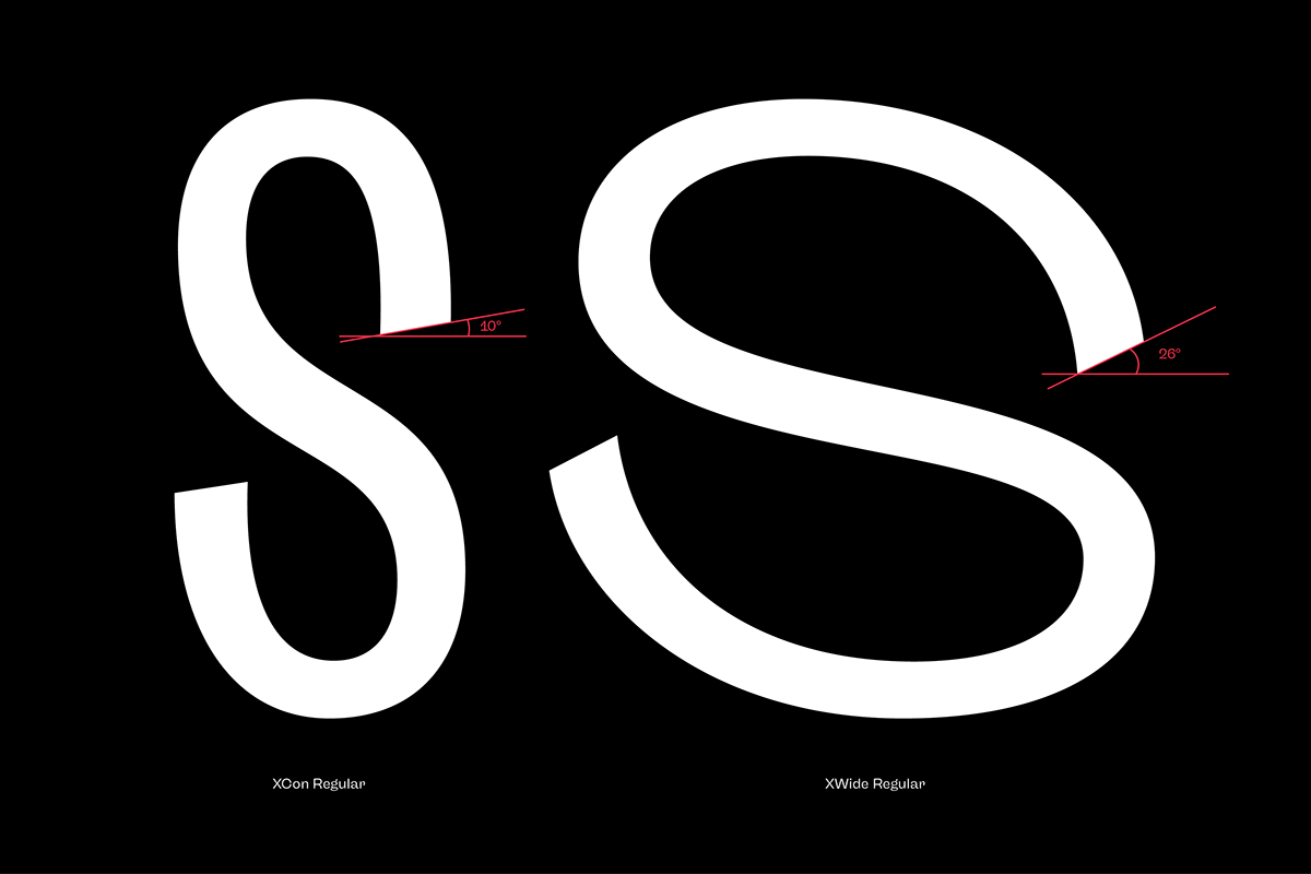
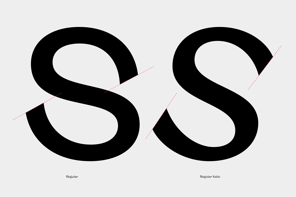
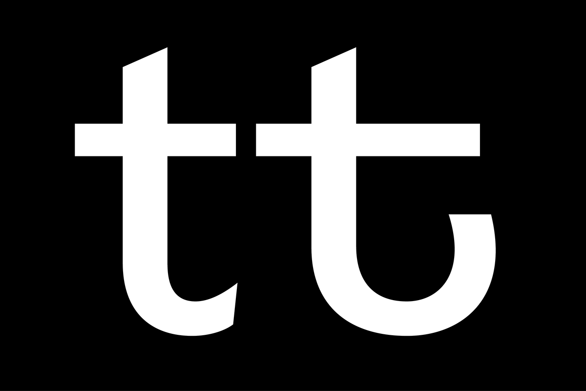
Unlike other modern grotesk typefaces like Helvetica or Univers, Freigeist is characterized by a warm and dynamic appearance. It draws inspiration from various historical models such as Caslon’s Doric or the Grotesque variants of Stephenson Blake. Particularly noticeable are the narrow terminals, the serpentine S or the dynamic g in combination with ascenders that reach to the cap-height only.


Italics
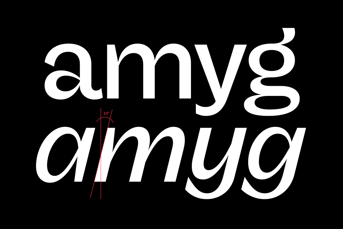
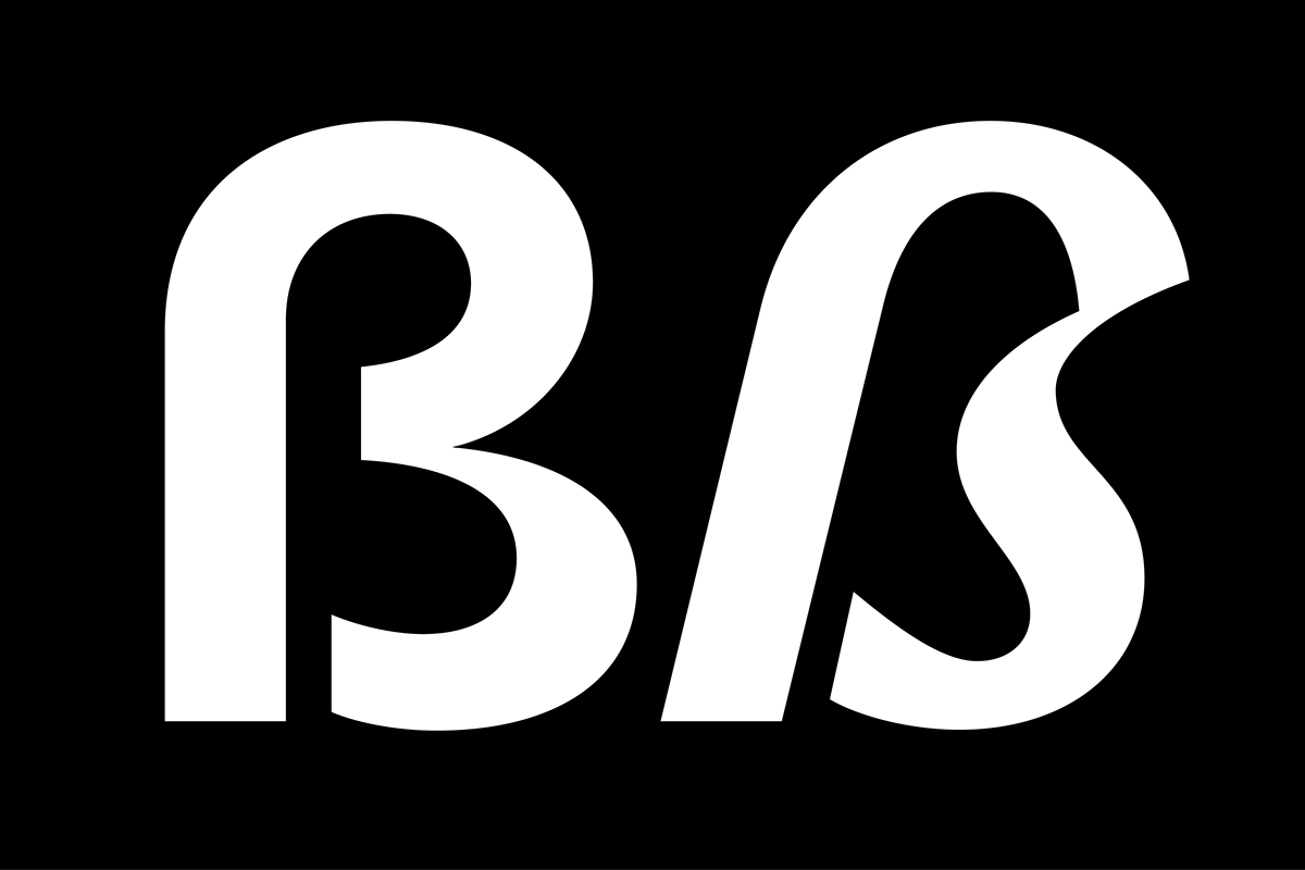
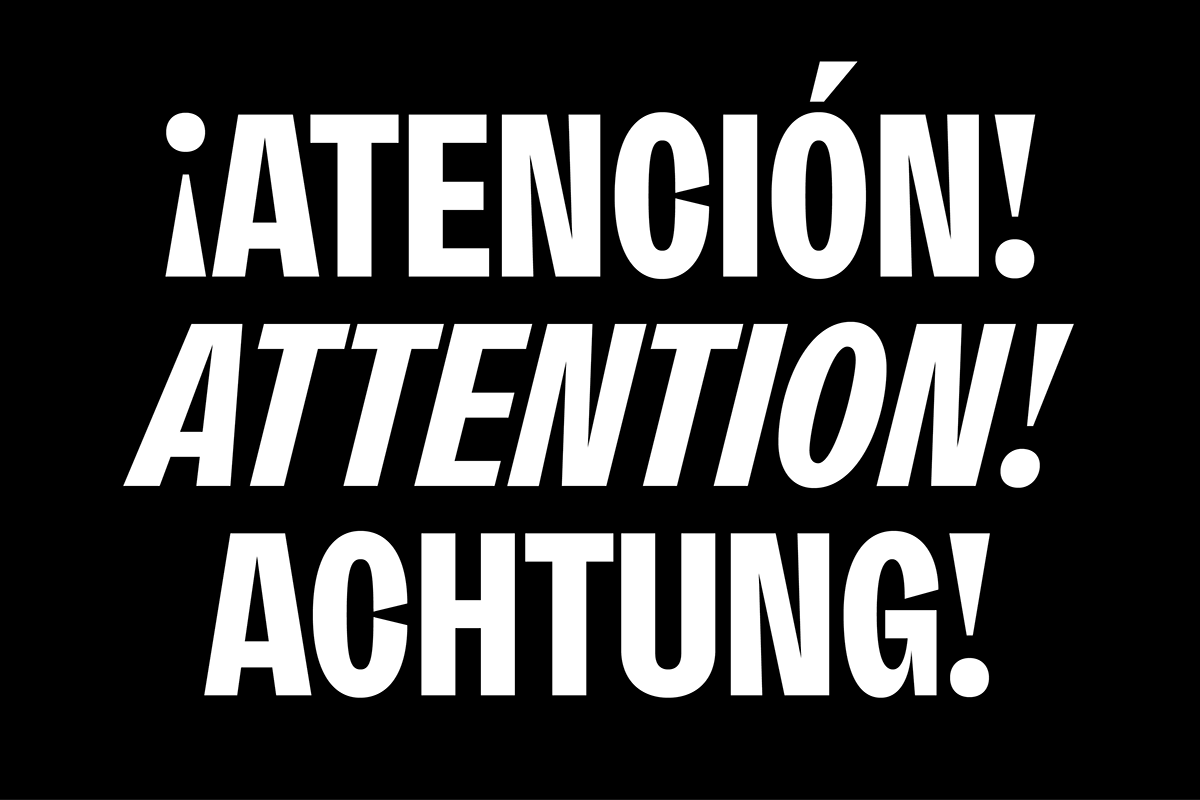
Many italic grotesk fonts are strongly oriented towards their upright counterparts. Unfortunately, this often means that they cannot do justice to their actual task, which is to highlight words or sections of a text. The italic cuts of Freigeist try to remedy this situation by using the greatest possible formal distance while reinforcing the untamed spirit. What adds to this, is a reminiscent of handwritten forms, which can be found in a, n, y or g, as well as the German sharp s or the ampersand.


Monospace
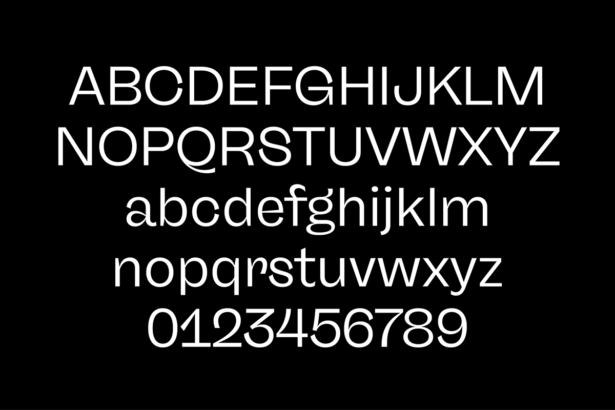
Although it is no longer necessary to use letters with identical widths today, the charm of a typewriter font is still unbroken. Maybe because it gives a text a personal touch. However, the Freigeist family has its own monospaced version that perfectly complements the proportional styles.


Alternates
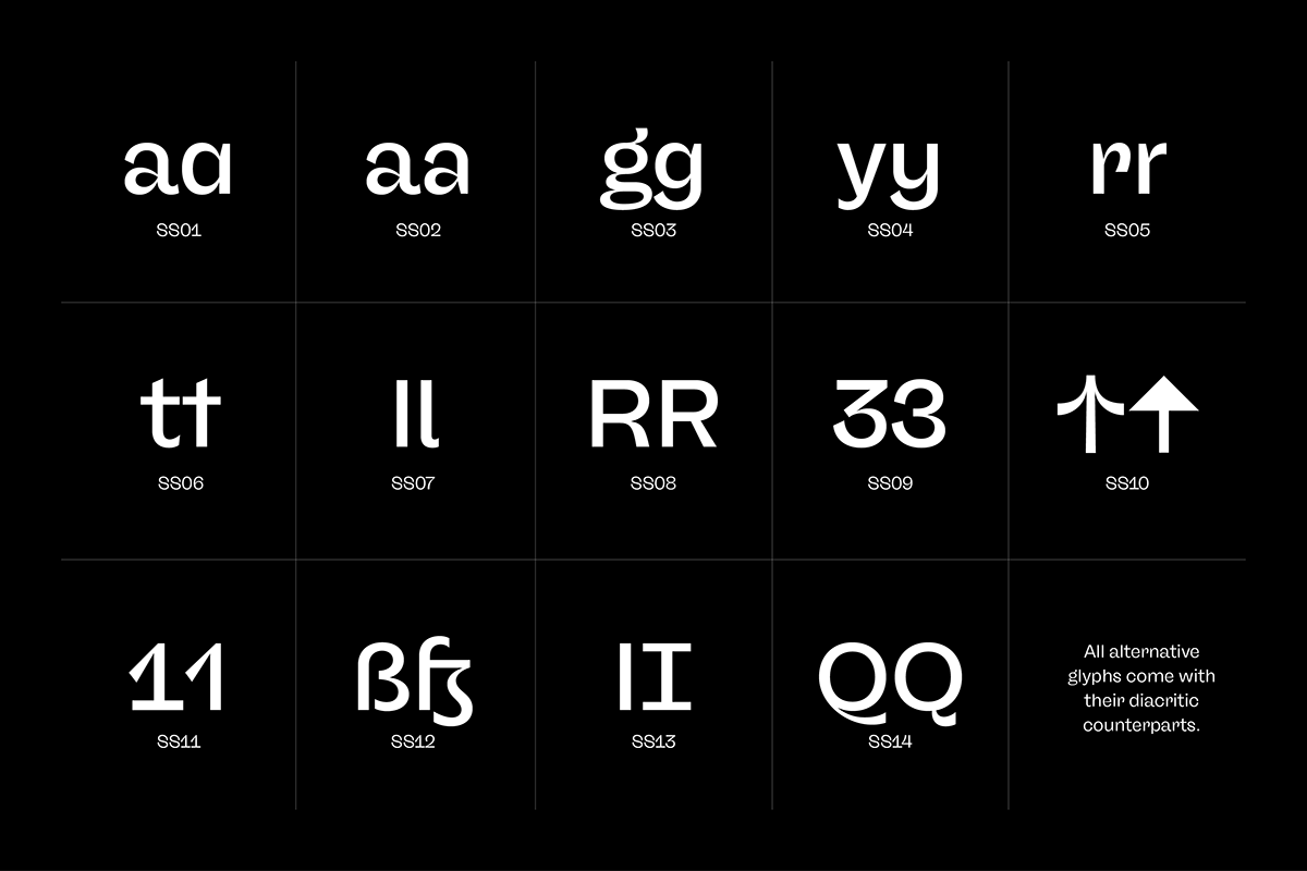
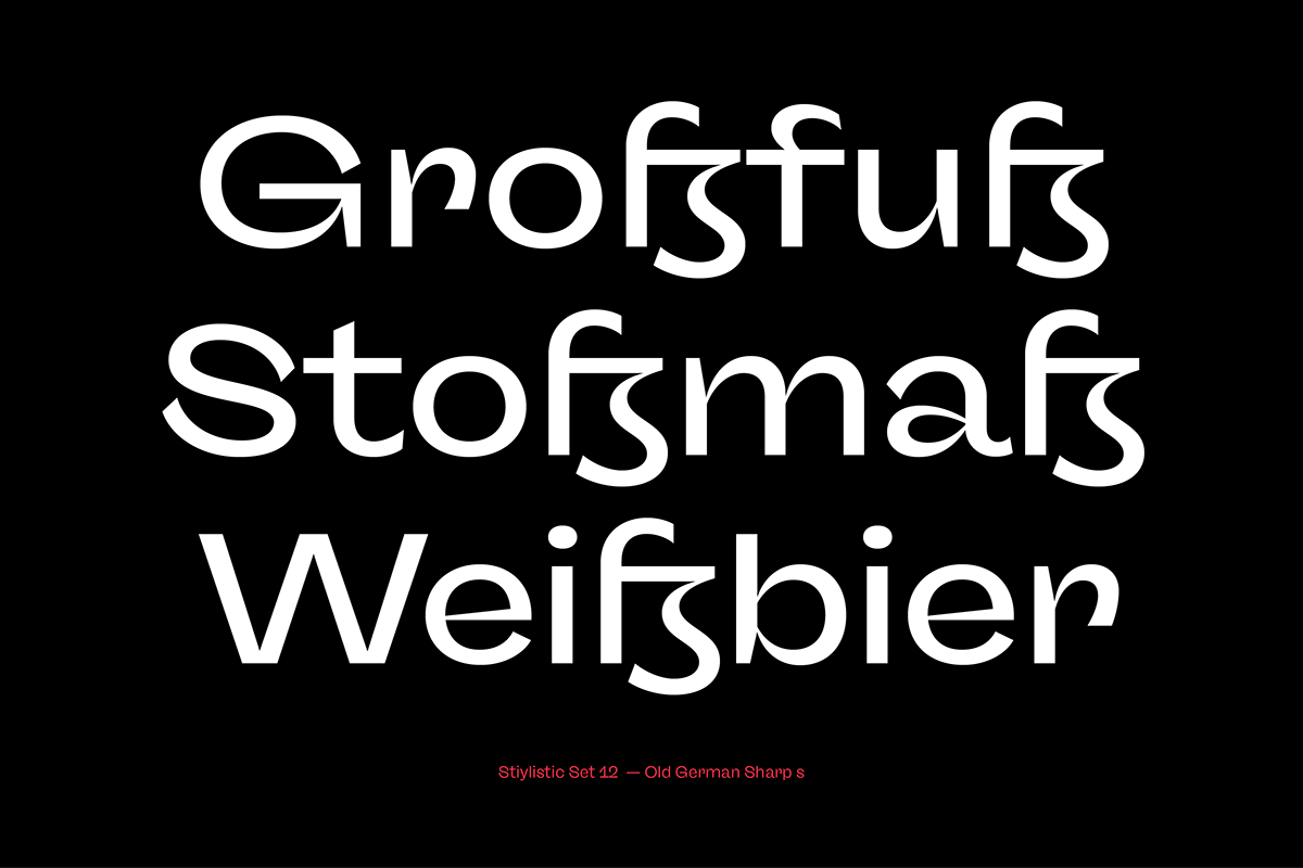
Alternative letterforms are ideal for customizing the overall appearance of a text, for usage in logos or they can even work as custom fonts for companies. Freigeist comes with ten stylistic alternatives that are easy to insert via the Opentype window, such as the single-storey a, a tail-less version of the a for compact text, when uses in condensed widths or a dialed down version of the r.


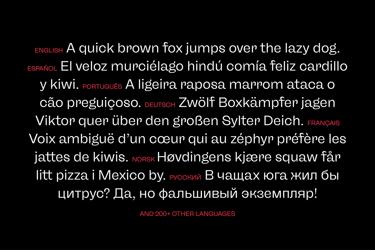
Languages
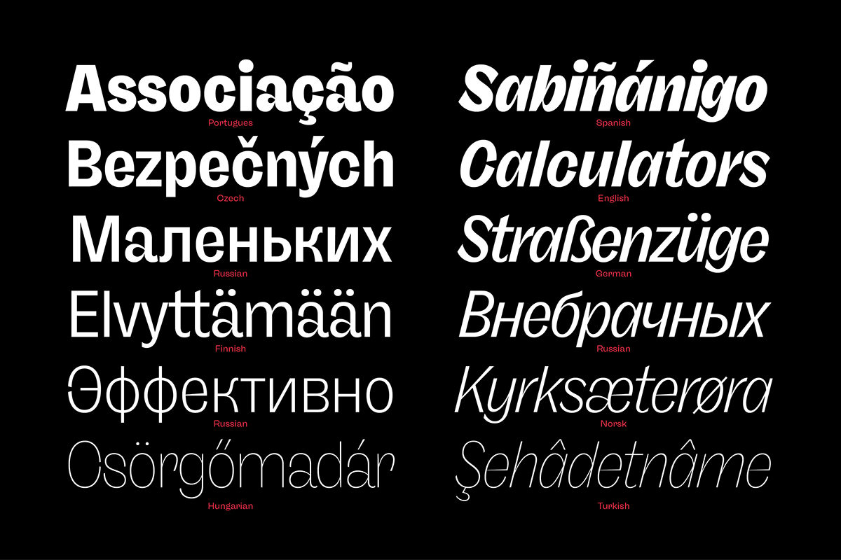
Freigeist has a built-in support for Latin and Cyrillic based scripts
and covers more than 210 languages.


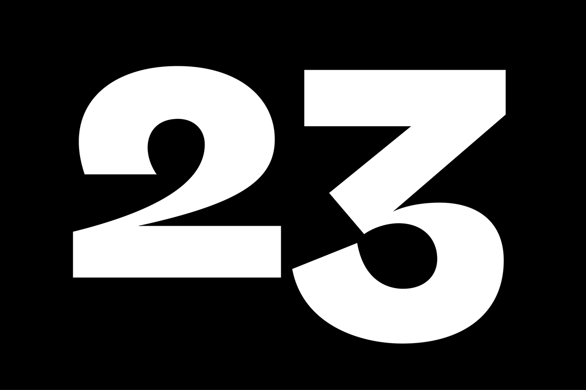
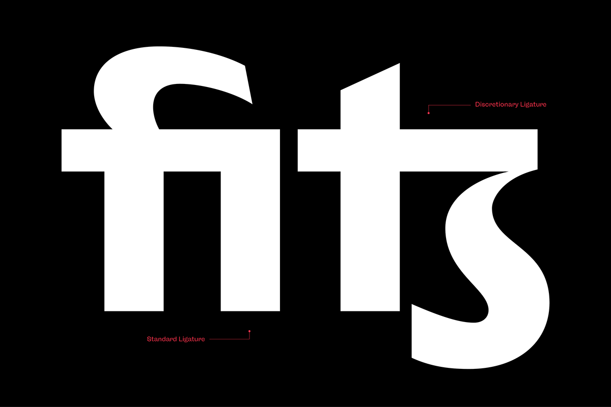
Opentype Features
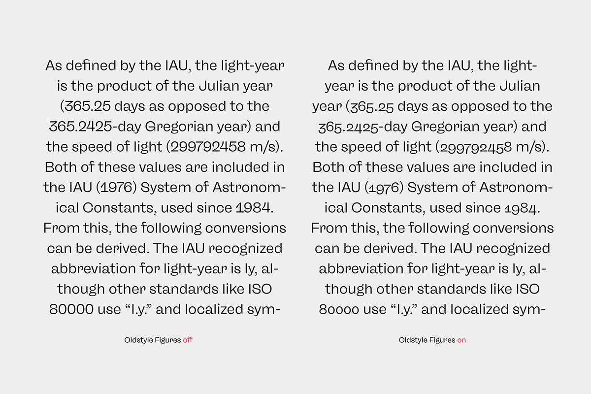
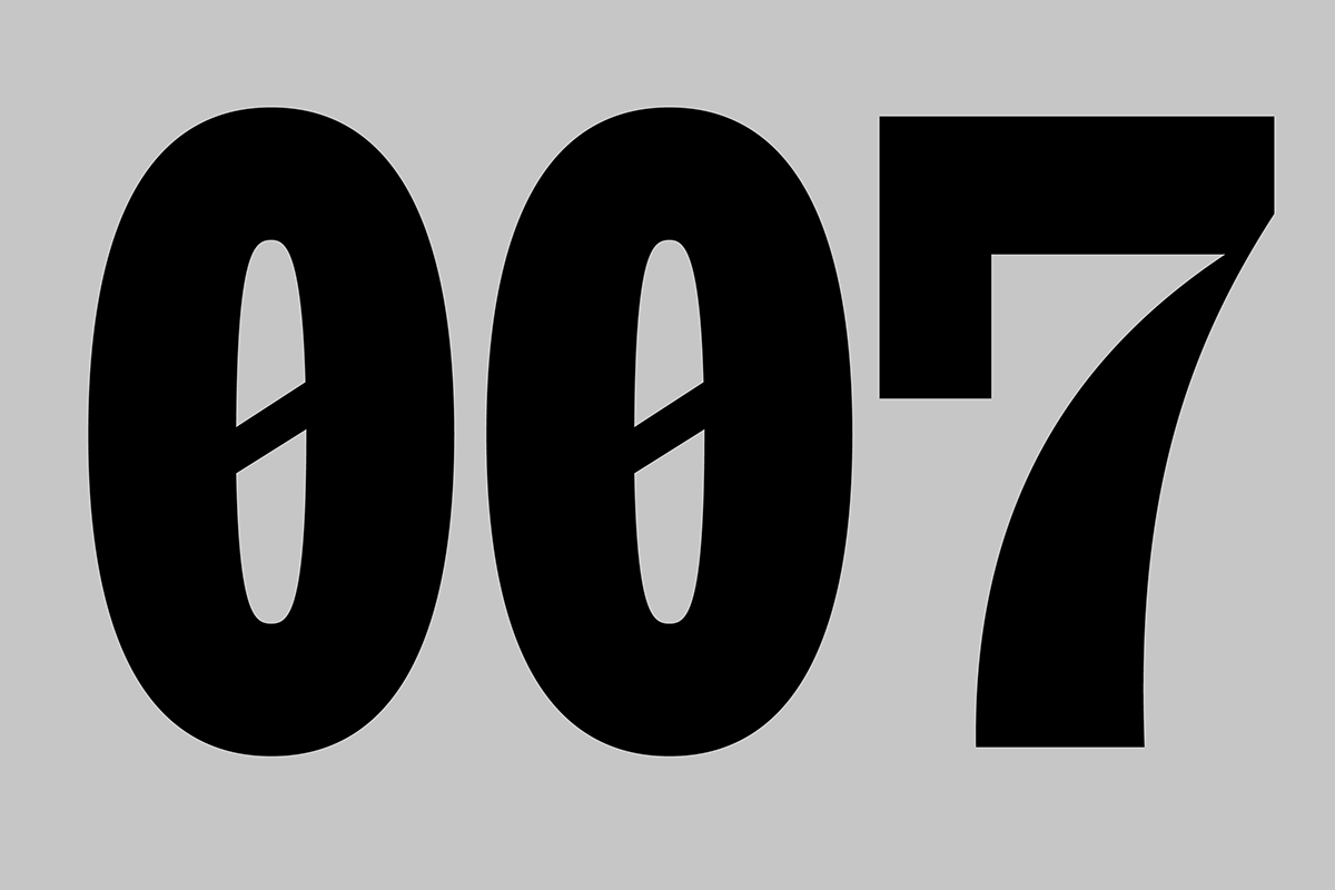
The family comes with many opentype features to support modern typesetting. This includes ligatures, different number sets or alternative shapes for texts set in all caps.


Styles
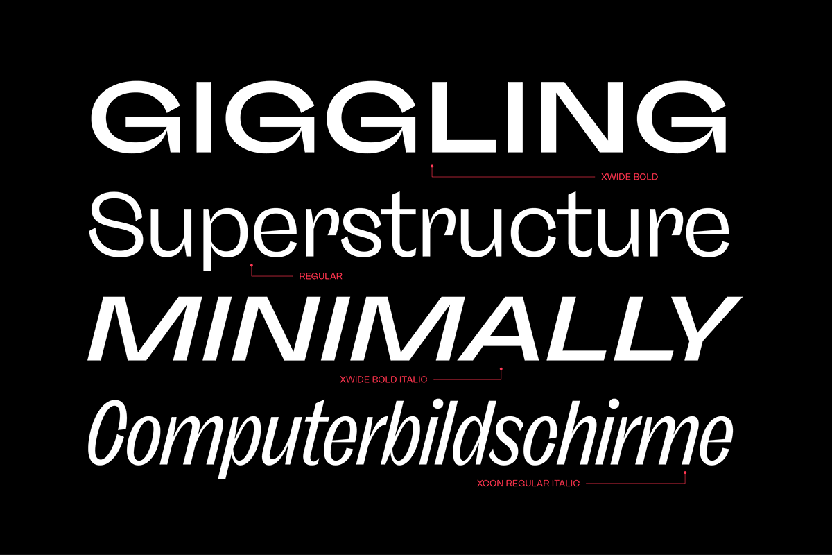
Freigeist is available in six widths (XCon, Con, Normal, Wide, XWide, Mono) and six weights (Thin, Light, Regular, Medium, Bold, Black). Including the accompanying italics, the family comes in 72 styles that are suitable for any application.