
This was my entire logo design process with THE communication from my clients. i was working with two business partners which needed a logo for a start up.
24 AUG 20
ME
"please browse this site and give me 3 logos you feel would represent your brand
this will be for the logo mark"
24 AUG 20
CLEINT
"Hi Adrian. Please see images attached from Logobook.
We were wondering if you can do a design featuring 3 butterflies.
Fits the “fly” theme and speaks to “bringing stakeholders together”?
Just an idea for a jumping off point."


26 AUG 20
ME
"A quick rationale behind my concepts.
following your direction i have an option with the 3 butterflies.
personally i feel the logo works best with just one logo mark it emphasises the focal point of the logo mark. Though i don’t think it looks that bad there will just be a few issues with scalability for example little icons for web mobile and also difficulty embroiling.
I have included different options for different usages as well.
I included a vertical arrow in the A of KHANA to emphasise the vertical idea of the brand with flight. I tried to go for an outline look to closely resemble the example logos you sent through what’s app. I’ve sent the options in black and white because it is a crucial stage in a logo development which emphasises your focus on the shapes and forms of the logo mark instead of being distracted by colours in an early stage.
also was curious what color you’d like for the logo most modern logos don’t use more that two colours. just keep that in mind.
please find attached:"


27 AUG 20
CLEINT 1
Good afternoon Adrian,
Hope you are well. Thank you very much for the email and detailed description behind your thought process. Please see my feedback below;
Our general feeling is positive. We both like the initial idea and where it is going.
In the main version of the logo, we would prefer it if its three butterflies, all the same size, oriented as if they are flying towards one another.
We would like to see versions of the design with sharper geometric lines.
We love the vertical line in the A and what it symbolises.
Are there any different outlines we can use for the butterfly? It feels like the thick lining steals the attention a bit? I am not sure if that makes sense.
Please let us know what you think of our feedback. We are by no means experts so still rely on your experience and professional guidance.
27 AUG 20
ME
okay i see what you mean i’ll send you a more geometric symbol with harder edges and thinner lines. I think i put all my chips on that lion image you sent but i have a good idea of the look you want here.
can you just clarify the butterflies flying towards one and other for me ?
I’m a bit confused by that, do you mean the butterflies at 3 points of a triangle flying towards the centre ?
I can defiantly send you a variation of the one i created with a different outline look just for your appreciation.
27 AUG 20
CLEINT 1
Thanks Adrian
On the butterflies I actually think it may look better to have them orientated as though they are flying outward from the same point (maybe above the letter “A” in the word “Khana”)


28 AUG 20
CLEINT 1
Just one immediate thought - please can you do some designs where you also add the word "CAPITAL" underneath "KHANA". We have been informed by the registrar of companies that we need to do this. But we will still use designs that only have the word "KHANA" for marketing, email banners etc.
Thanks for the quick turnaround times on this; it's not going unnoticed and we really appreciate it.
Hi Adrian
Thank again for the updated logos.
Some comments from myself:
1. A couple of people I spoke to thought that the new butterfly design somewhat resembles an abstract version of a man running. I think this could be solved by breaking up some of the continuous lines. Let me know what you think.
2. Please try the updated logo with the font from the very first batch (with the arrow in the letter "A".
please add anything else from your end.
31 AUG 20
ME
i tried a version breaking up the lines and also removing the circle gives more emphasise to that butterfly symbol.
i’m struggling to make it work having 3 butterflies have a look at how much better the version looks with one mark. what do you guys think ?


01 SEP 20
CLEINT 1
I think we are getting there but probably went too far the other way in terms of breaking up the lines. Can we try it with some of the really small segments reconnected?
01 SEP 20
CLEINT 2
Hi Adrian,
The logos shared are INCREDIBLE!!!!!!!!!!!!!!!!!!!!!!!!!!!!!!!!!!!!!!! WOW! You want us to choose one to run with? I am very excited.
The double lining on the butterfly looks fantastic. My only issue is I genuinely do not know which one I like more. Well done and thank you.
01 SEP 20
ME
thank you i’m glad that i’m on the right track.
please find attached mark as requested:


02 SEP 20
CLEINT
Hi Adrian,
I like that A. It is a lot more subtle. My favourite is the logo with the butterfly on the K. But I also REALLY like the logo you shared above. So I am happy to go with the one above or to see if we can somehow incorporate elements of both, not sure how easy that is.
The only other comment/feedback I have is... for the logo above, we just have to somehow make it obvious that it is a butterfly, although We both like the sharp geometric broken lines.
I hope this all makes sense. Again, thank you so much for the work Avo, it is looking great and I am excited.
03 SEP 20
ME
Hey guys,
I’ve tried my best to do some combination ideas here:
the option with the patterns in the word mark are extracted from the logo mark if that makes sense. so they are not just random abstract shapes.


03 SEP 20
CLEINT
Hi Adrian
Thank a lot, I really like where we are. Per my previous email, please add the word "CAPITAL" to the design because the operating name is going to be "Khana Capital".
We will still utilize the designs that don't feature the word "CAPITAL" but we do need both.
Lastly, I think we can start thinking about colors. Per your previous mail, you advised that most modern logos don't use more than 2 colors. I would love for you to propose some designs featuring some color so that we can compare them with the black and white colorway (which I do like).
Hope this all makes sense.
03 SEP 20
ME
I realised i forgot something.. apologies.
I couldn’t find it in the mail where you asked to add the word capital anyway
was thinking of doing a circular version with KHANA at the top and capital at the bottom
with some big spacing. this would be perfect for social media profile pics.
anyway i’ll send you options for that.
before i continue with the options with the “capital” included.
can you please send me the option i should use for that.
03 SEP 20
CLEINT
Thank you AVO. They look great. I have a strange question. You have a lot of experience in this. Which one is your favourite and which one do you feel will look best on different mediums ie Digital, Print, possibly even animation? What which one do you feel represents the brand best? We ideally want something that symbolizes prosperities and is very welcoming and fun but is also serious (especially when one considers the industry we intend to operate in).


03 SEP 20
ME
please find attached color options:


15 SEP 20
CLEINT
We would prefer if the actual logo did not depend on a background. That is to say, we just want the logo to focus on the butterfly design and words below – no need to be on a field of any particular colour in the back. We can then impose the logo on a background of any colour depending on the need. I hope that’s clear.
Please present the final designs in each of the colourways below as well as in the original black and white. I still think we may go for a black and white look if it’s the most striking.
On that note, please advise if you think it would be a good idea to have the default logo in black and white, and have 3 variations in the other colourways? Might be a way to also come across as not a “rigid” company? Just an idea.
Below we have kind of summarized our combined impression so far and laid out what we think the next steps ought to be so that we reach the end of the process in a reasonable amount of time for both parties. The idea is that with this feedback, you will have enough info to go and work on the final (or at most penultimate) submission.
Absolutely love it. We want this to be our official/primary logo. Only concern is how easy it is for someone to tell that the emblem is a butterfly.
We don’t want you to change it too drastically, please just see hoe you can tweak it to make it more obvious that the design is a butterfly.
15 SEP 20
ME
Hi Guys,
with regards to editing the logo to make it look more like a butterfly.
I’m going to need a little more clarification. I need specifics like the previous rounds of revisions like when you asked for geometric lines and breaking up the lines etc.
without direction it will be too much of a gamble that i tweak the logo in the right direction which will cause more revisions. What i think looks more like a butterfly would have been the first option. When going the abstract and geometric rout it becomes more challenging to make something resemble another thing.
It’s okay to go with a black and white logo but i don’t recommend it.
i can give you a logo color option on top of black and white to give you that effect of a logo that doesn’t require a specific background color.
not sure if you had seen the color variations i had sent without backgrounds.
normally companies do the logo colours in the other way for example DHL is yellow and red. but they will have variations of that logo in black on white and white on black and maybe have the logo full color with in a yellow box on top of a black or white background.
I do think it’s important to have colours but it’s not an absolute must it just makes your brand have another identifier. like imagine coca cola with out the red. you’d recognise the logo but not as easily from a distance.
18 SEP 20
CLEINT 1
Hi Avo
Thanks for the feedback. I must admit that we have gone back and forth on the butterfly. Perhaps what I mean is to land somewhere between the 1st option and the current option. For example, if maybe we used the 1st option as a template but using sharper lines for the wings rather than the rounded edges? That’s kind of what I’ve got in mind.
Also appreciate the feedback on colours. We will definitely go with a colour option.
If the above still has not clarified enough, please reach out. We are almost at the end of the road so we will make sure we stay engaged and not take up more time than necessary.


23 SEP 20
CLEINT 2
The logo is PERFECT. I cannot personally think of any changes to the actually design. It is easy to see that it is a butterfly now. Woow what an incredible design Avo. Thank you so so much. Unless Client 1 has any objections I think we can now focus/finalise the colour selection. Again Avo, not to put you on the spot but what are your views regarding colour? Do you like our colour selection? Do you think it works best or do you have any ideas?
23 SEP 20
ME
Thank you i'm very happy you like this version
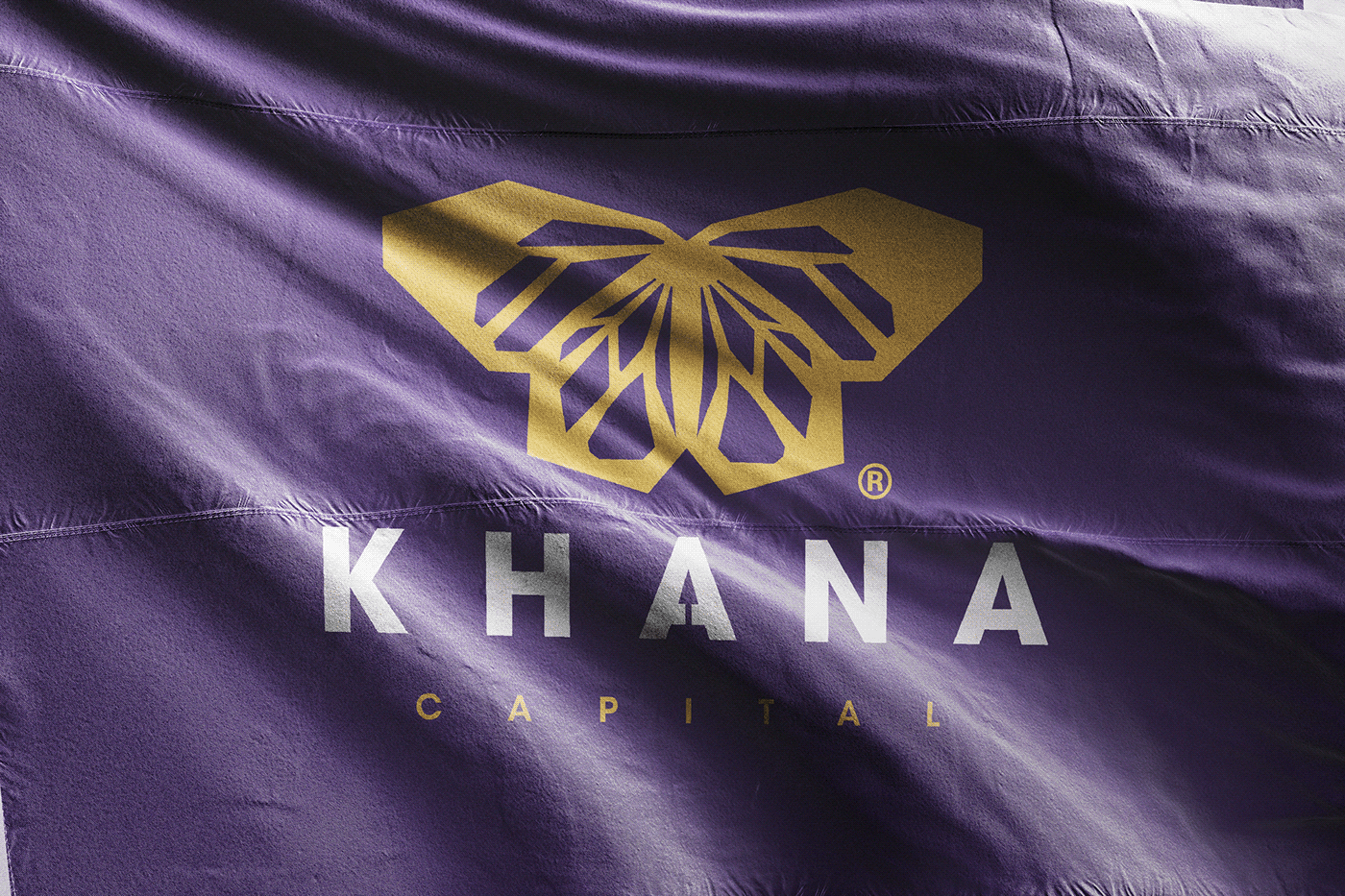
I’m also happy you guys asked for the revision cause i wouldn’t have gone for this style otherwise. Personally i feel a dark purple maybe with a minimal gold would more represent a financial company better
24 SEP 20
CLEINT 1
Good morning gentlemen
Thank you for the work so far Avo, I totally agree with Client 2's sentiments – the logo looks amazing and really captures the kind of aesthetic we were looking for. Totally nailed it so thank for that.
In terms of the colours, I like the idea of considering the colour emotion chart. I’m a Lakers guy so purple and gold sounds great to me 😊 I think Client 2 and I are really going to rely on your eye in terms of the direction we go colour-wise, so we appreciate you input. Please go ahead and send some final colour options.
Last 2 points from me:
Again, let’s retain the black and white designs as part of the final delivery
Please deliver different graphics to use for different platforms (print, online, social media, email banners, business cards, etc.). For example, you previously showed a design that had the words written in a circular pattern around the logo. Another example is the design you did for us with the butterfly flying of the letter “K” in “Khana”. We really love all those variations and would love to have them as part of the final package.
Thanks again, looking forward to your feedback but if you need any clarity, please give us a shout.


THANKS FOR WATCHING


