
description
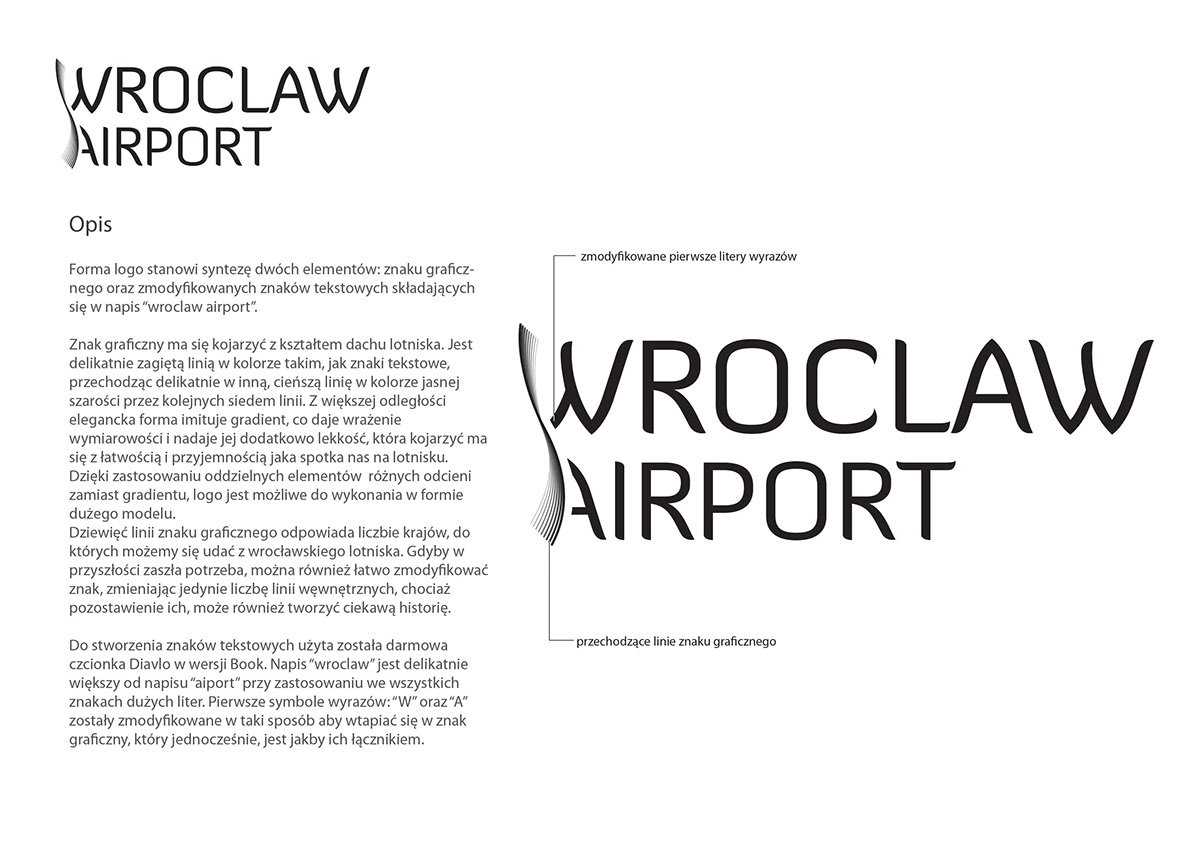
Logotype form is a connection of two elements: graphical sign and modified text symbols constituted in “wroclaw airport” inscription.
Graphical sign recalls the shape of a airport roof. It’s delicate curved line in the same colour as text symbols. It is passing gently in another, thinner line in light grey colour through next seven lines. From bigger distance elegant form is imitating gradient, which makes dimensional impression and gives additional lightness. It supposed to remind facility and pleasure that you can meet all around the airport.
Thanks to applied individual elements with different tone instead of gradient, it’s possible to make logo in a large prototype.
Nine lines of graphical sign replies number of a countries, that airport has connection with. If in the future there will be need, it’s possible to modify this sign by changing only the inside lines, but keeping them still makes quite a story.
Text symbols are free Diavlo font in Book version. “Wroclaw” inscription is delicate bigger than “airport” with uppercase for all symbols. First signs of words: “W” and “A” are modified in a special way to merge into a graphical sign, that finds to be their connecter.

colouring
Logo colouring in a grey tones is subdued for keeping elegance, universality and modernity. Dominating black part is a contrast for bright airport roof and environment to make logotype be better seen.
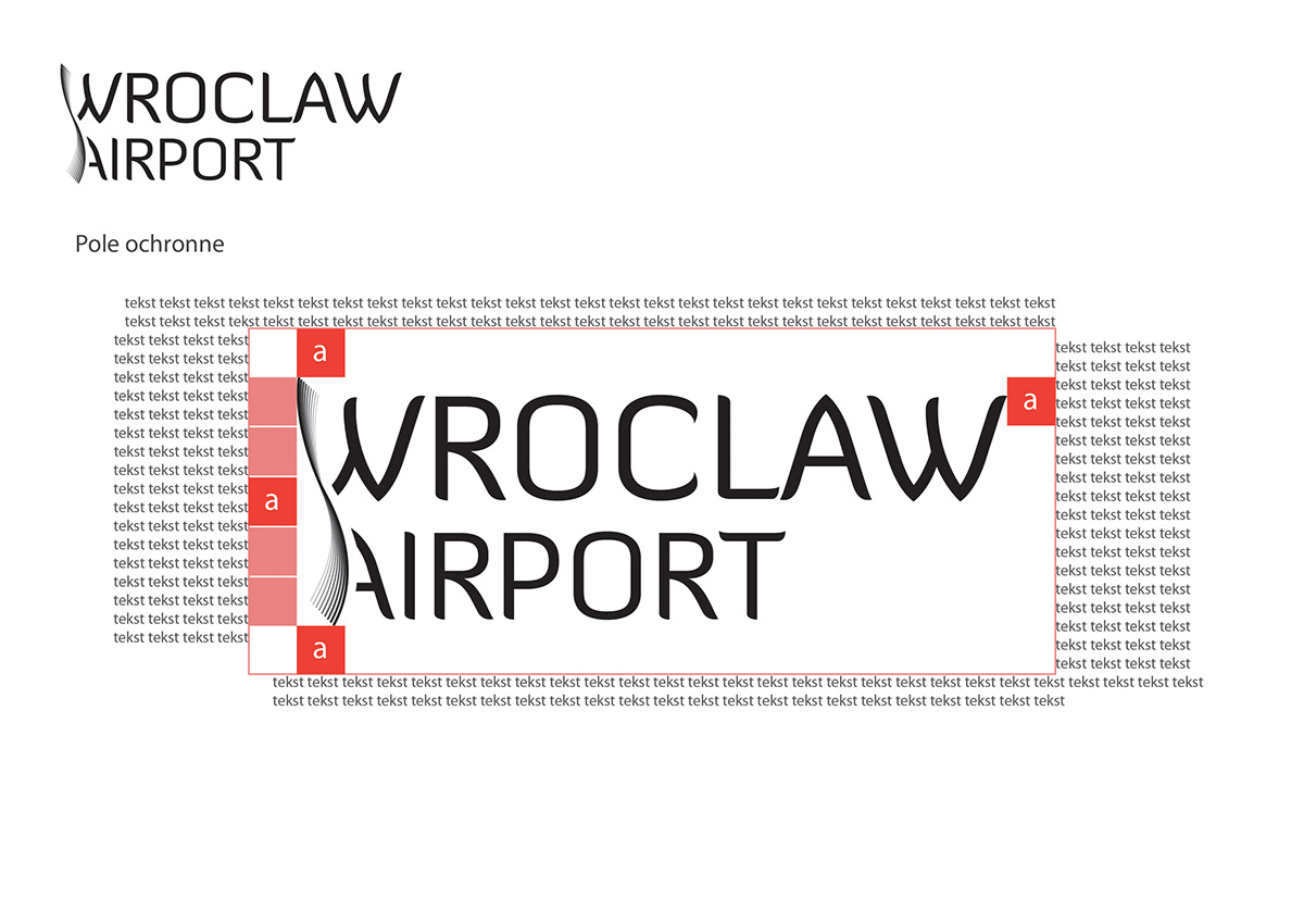
protective field
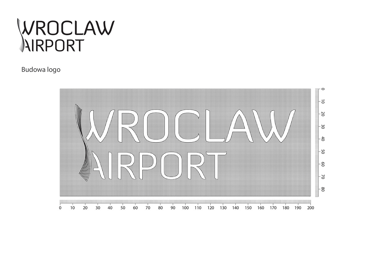
logo structure
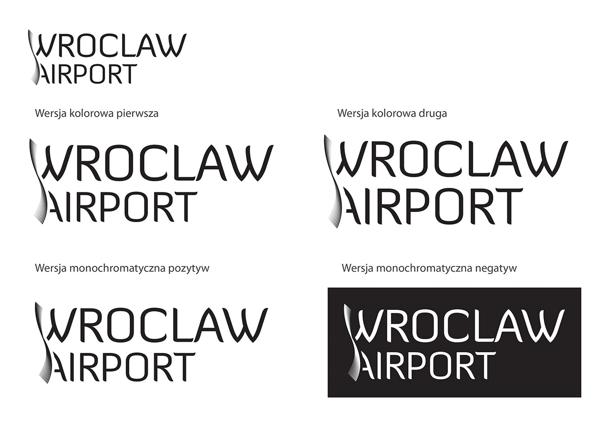
versions
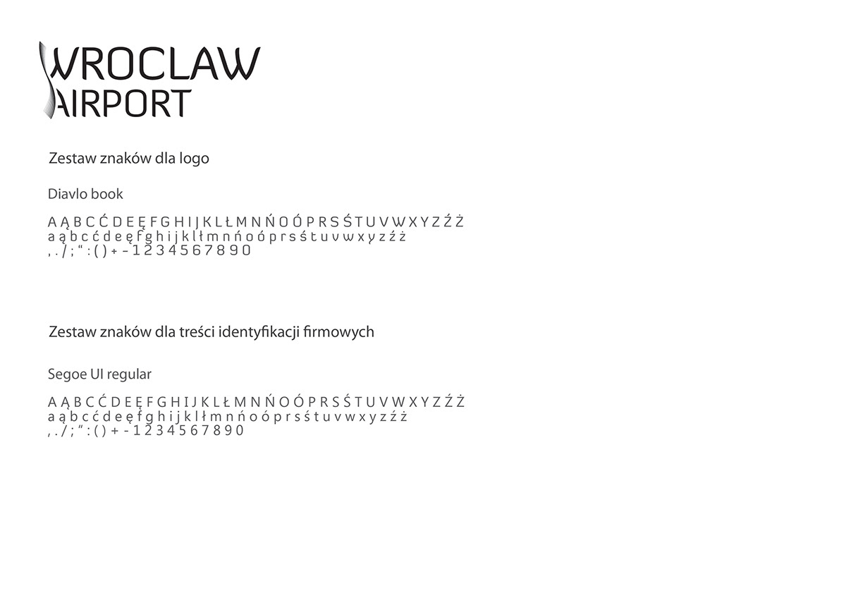
fonts
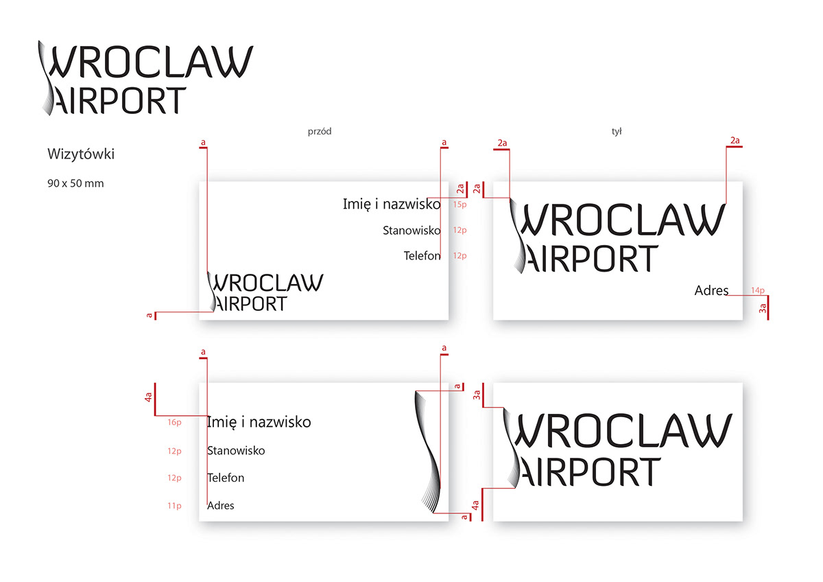
business cards
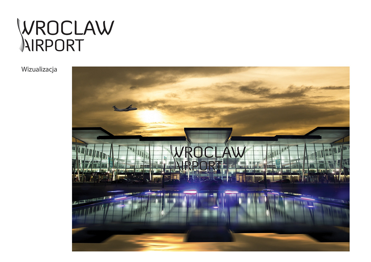
visualization


