A for Design
Corporate identity design for my own company
Corporate identity design for my own company

After 15 years of activity in the graphic and webdesign industry the time was right to start my own company: A for Design.
A for Design represents a blend of design & functionality: creativity with a logic approach.
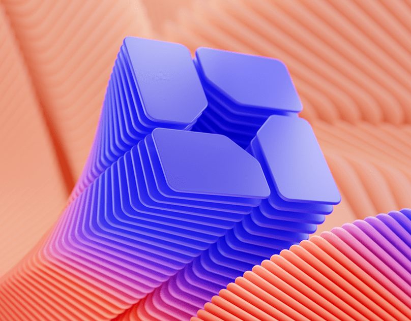
Therefor I chose for a pyrimad, one of the most elementary examples of beautiful logic design.
The pyramid is constructed using 2 opposite A's to enforce this statement. A platform was added to symbolize a solid foundation.
The red and blue colors were chosen for several reasons:
red: excitement, attention
blue: peace, thrust, comfort
Opposite colors, but in harmony.
A for Design represents a blend of design & functionality: creativity with a logic approach.
Therefor I chose for a pyrimad, one of the most elementary examples of beautiful logic design.
The pyramid is constructed using 2 opposite A's to enforce this statement. A platform was added to symbolize a solid foundation.
The red and blue colors were chosen for several reasons:
red: excitement, attention
blue: peace, thrust, comfort
Opposite colors, but in harmony.

All elements of the corporate identity so far were designed to stand out, but without pushing the enveloppes.
It was important to me to find the right balance. The elements had to be exciting, but still have a corporate look.
It was important to me to find the right balance. The elements had to be exciting, but still have a corporate look.