Visual Identity for Ubiquity Youth Alliance
Art Direction | Logo Design | Stationery | Merchandise Items | 2019
Art Direction | Logo Design | Stationery | Merchandise Items | 2019


Ubiquity Youth Alliance is the successor to the Quest Youth Development Program, a nonprofit organization founded in 1998 to provide youth and young adults aged 12-25 with a variety of social, cultural, recreational and educational programs. Since its founding, Quest successfully implemented community and school-based academic and enrichment programs that have contributed to the personal growth and academic performance of many young people in the Southern Marin community and broader San Francisco Bay Area.
Their mission is to help students define and accomplish their goals, develop character, build self-confidence, and to develop positive peer relationships. They seek to provide students with the knowledge they need to reach their goals and aspirations. They seek to provide an environment that will provide each student with the best possible opportunity to experience personal growth both on interpersonal and intrapersonal levels.
They want their young people to develop a sense of self, to feel connected to their community, and to develop partnerships with caring adults. These critical life skills serve youth well.


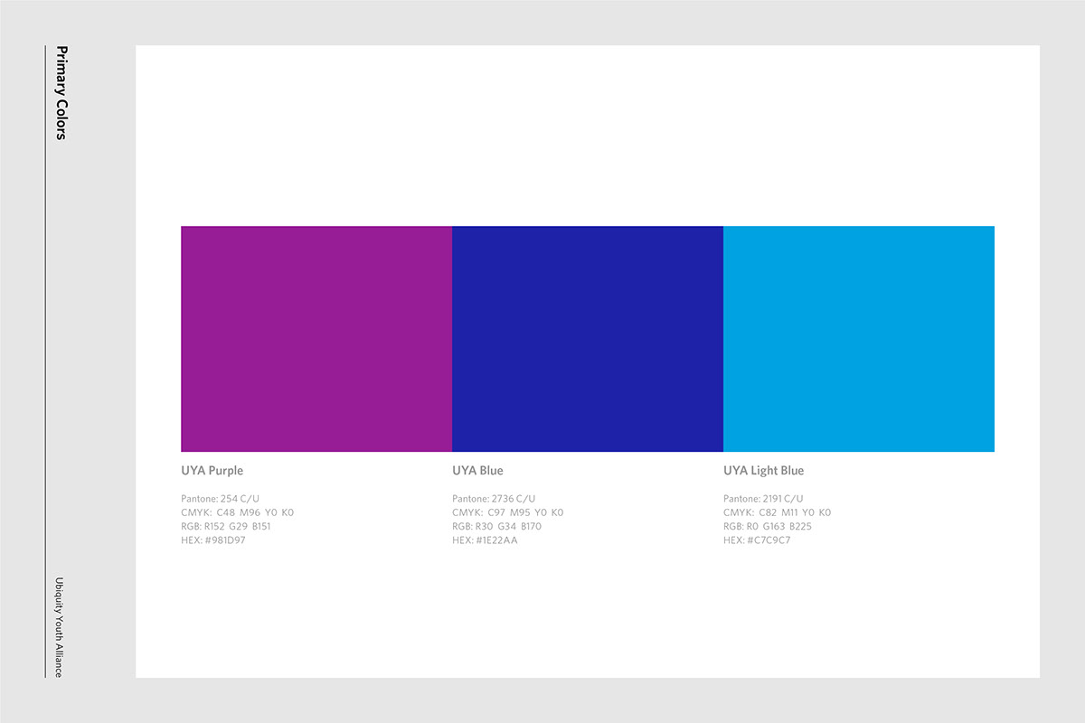
Yoske Mitsui was assigned to create the visual identity system including logo and also develop brand identity guidelines including the appropriate colors, typography, layout, and visual language for both print and digital media.
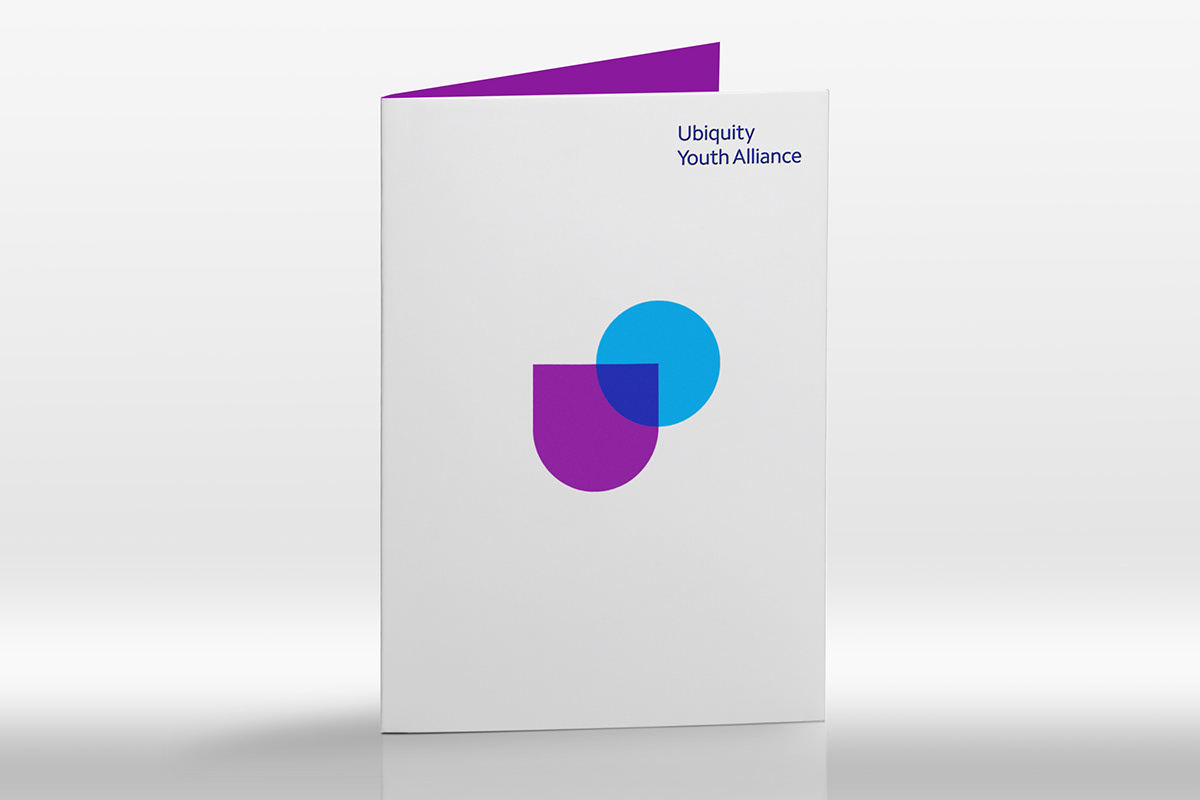
He worked with the Ubiquity Youth Alliance team to streamline and optimize their visual identity. The symbol suggests the relationship of the youth in all over the world and Ubiquity Youth Alliance, also it has also been simplified to emphasize its earth and letter U. The new logotype has been drawn in a distinctive title case, and works well on any kind of media.
He worked with the Ubiquity Youth Alliance team to streamline and optimize their visual identity. The symbol suggests the relationship of the youth in all over the world and Ubiquity Youth Alliance, also it has also been simplified to emphasize its earth and letter U. The new logotype has been drawn in a distinctive title case, and works well on any kind of media.