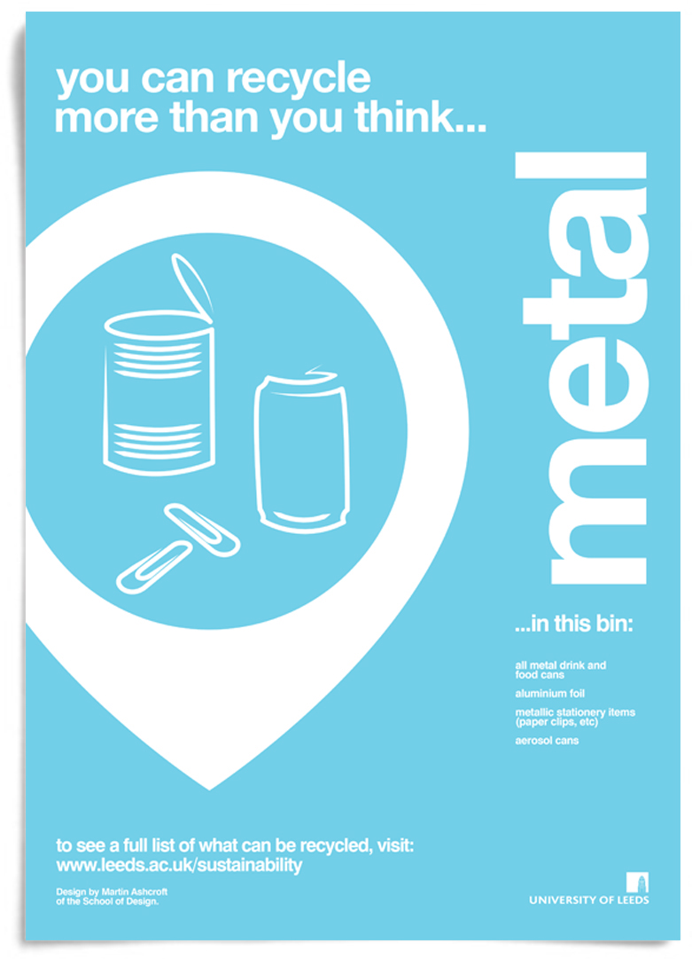
Each bin was given their own set of icons. The style of illustration I decided on experimenting with was the single line. Some contain a few seperate lines (a neccessity given how clear these icons have to be). That being said, none of these illustrated icons are "complete" images.
The "upside-down teardrop" shape I used to contain the illustrations works well as a direction tool "these items go in this bin". As well as create intrigue because illustrations and shapes like these have not been used in this sector or for this type of communicative design before. I hope you enjoy (and appreciate) viewing this project as much as I had designing it....