2009: A JOB ODISSEY
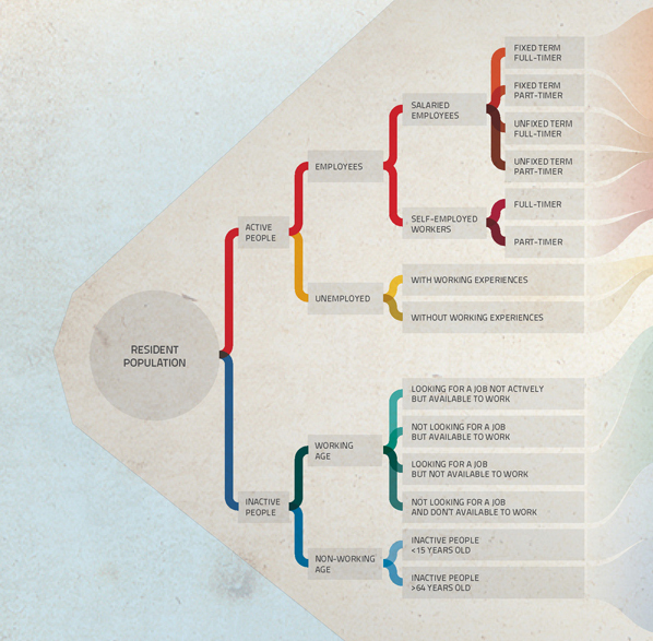
Using official data exclusively, the visualization illustrates the Italian employment evolution from 2004 to 2010, comparing employed, unemployed and inactive population of the country, with the due subdivisions. The minimum and maximum peaks are underlined in order to better understand the situation during the considered period of time. In the last part, data from 2010 are compared to those of the other European countries.
Moreover, we have realized a focus about the 15–34 years old population, analyzing the available data and reproducing, through the metaphor of the solar system, the actors system, the streams, the relationships through which each actor faces, in order to represent the dynamics against which they come up, through their journey from education conclusion or abandon to employment, with all the possibilities in-between and until the retirement moment. Observing the infographics in its entirety, it emerges that in Italy the work force decreases, against the increase of the over-64 population, that needs the support of the welfare state.
For a better view check out the full resolution here.
Check also on Visualizing.org and FFFFOUND!
Published by do\work "Data visualization"
Published by do\work "Data visualization"


project by
Alessandro Dallafina
Alessandro Dallafina
Francesco Faggiano
Stefano Greco
Marco La Mantia
Simone Paoli


