Isle of Barra Gin
Client: Isle of Barra Distillers.
Agency: D8, Glasgow
Agency: D8, Glasgow
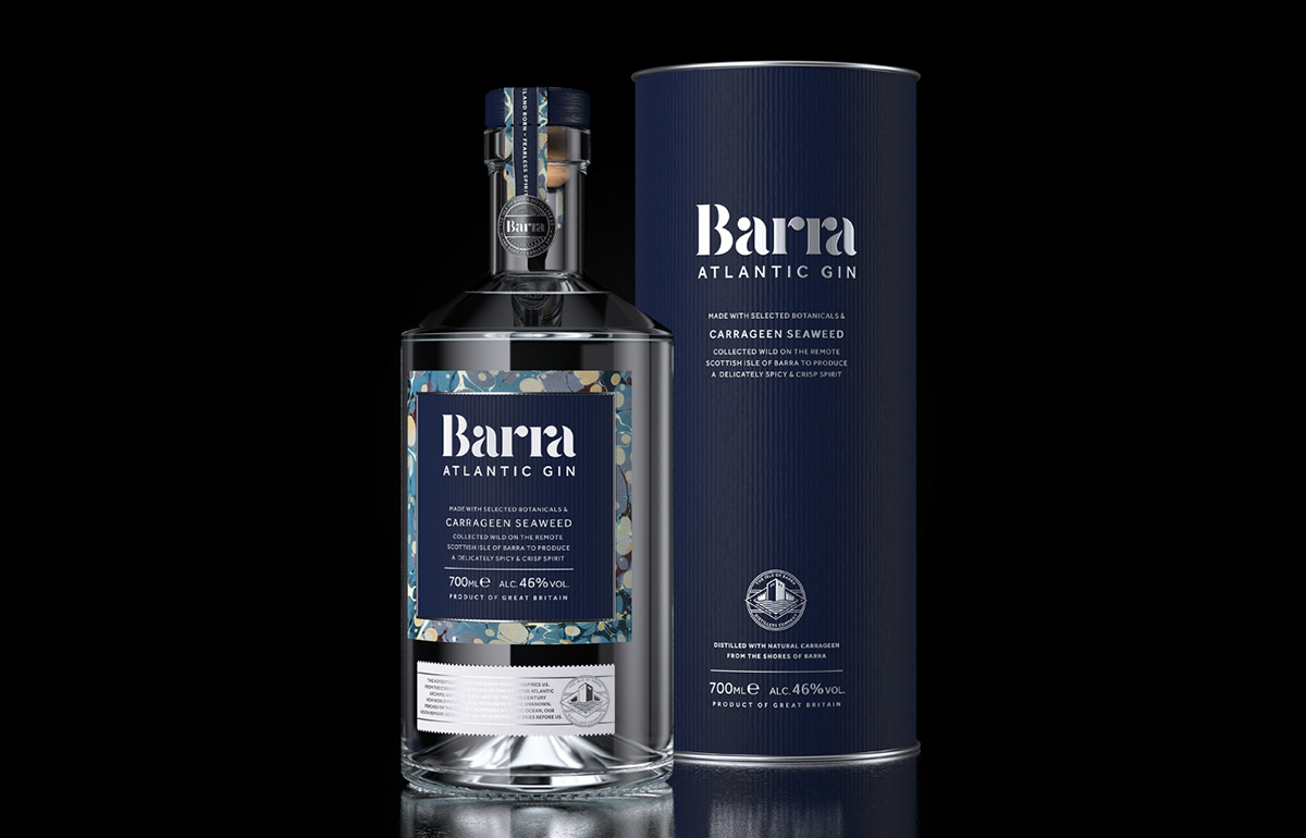
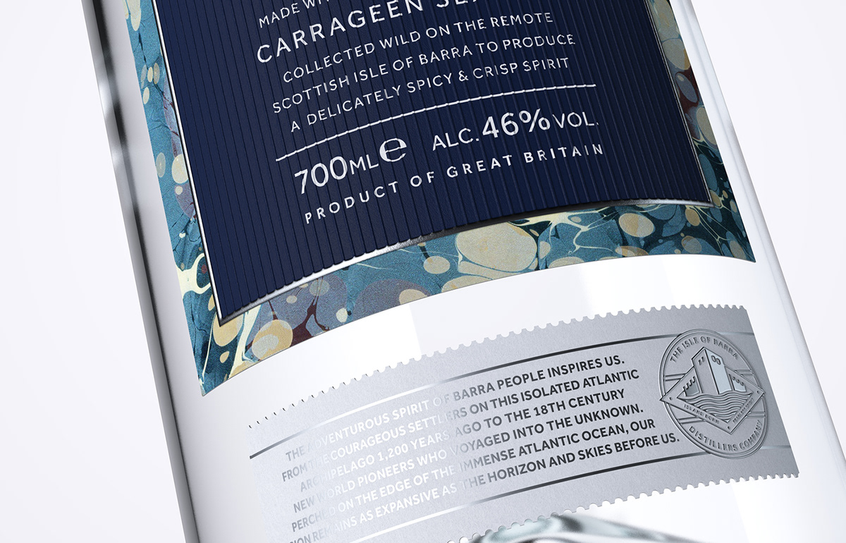
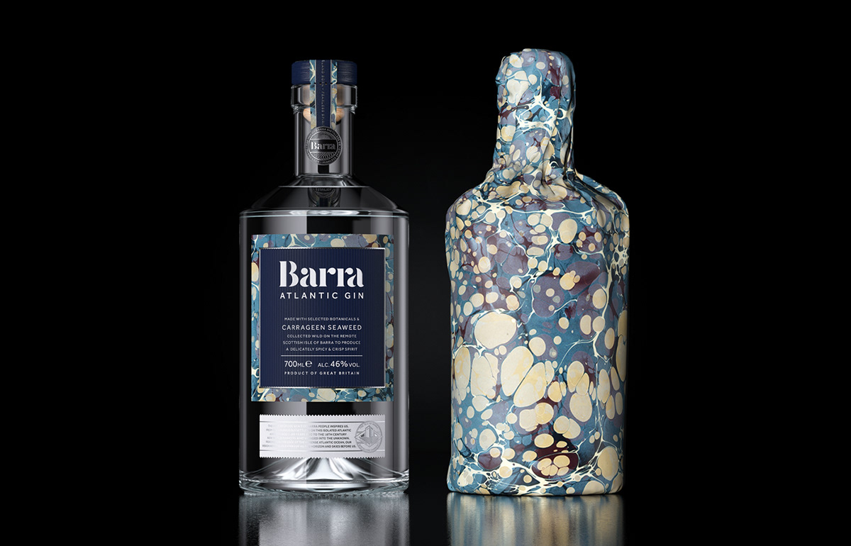
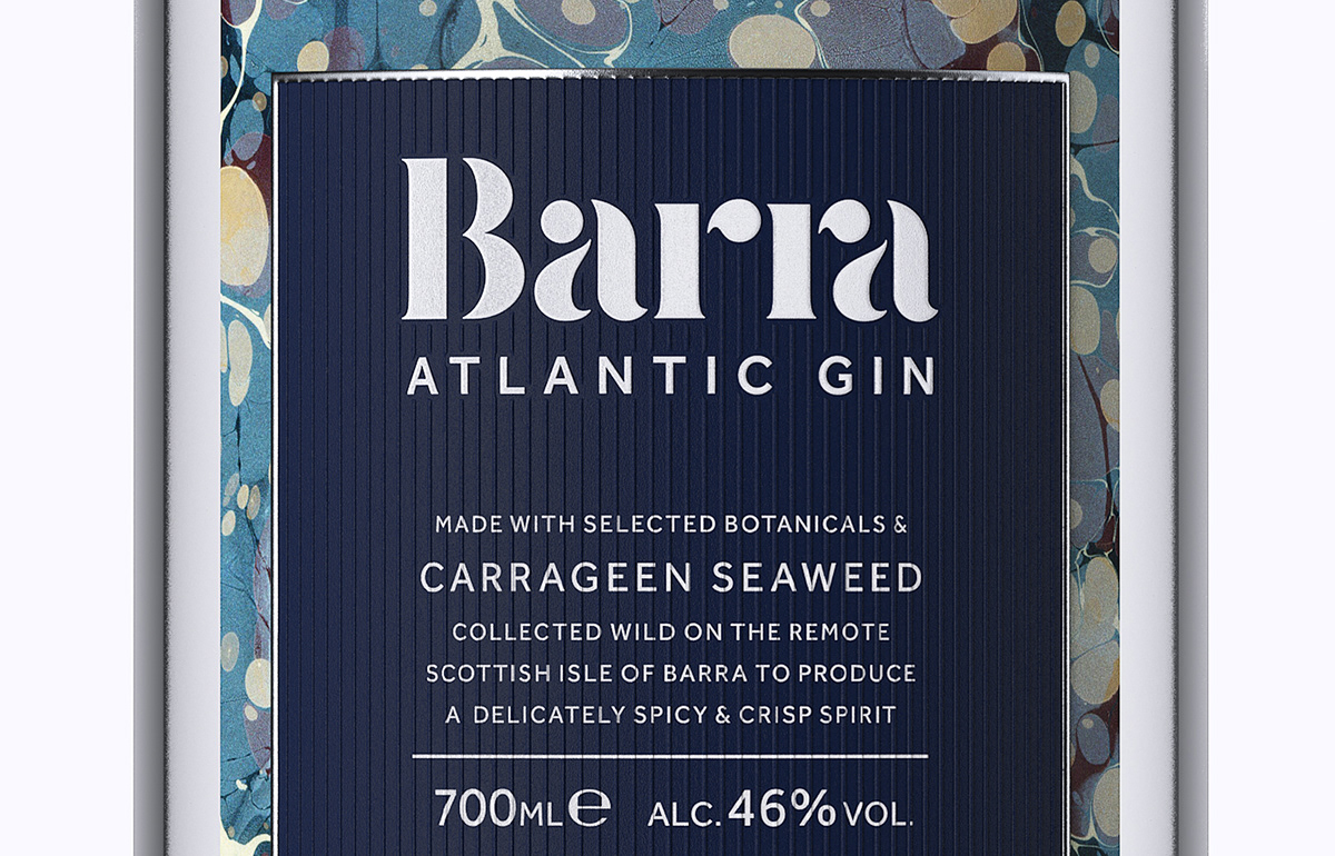
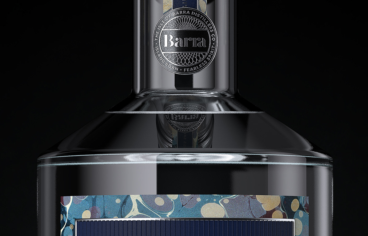
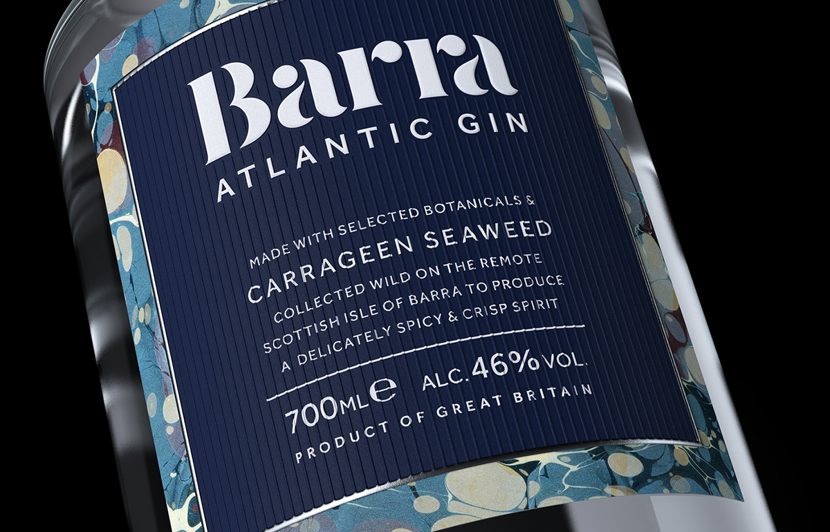
Barra Atlantic Gin is produced by the Isle of Barra Distillers Co. Michael Morrison, a craftsman born and bred on the island, hand-gathers carrageen seaweed as his gin’s key botanical. For a brand so rooted in the perfect blend of ingredients; the local kelp, the people behind the company, their skills and this small archipelago at the heart of it all, it made sense to approach the theme of ‘blends’ literally.
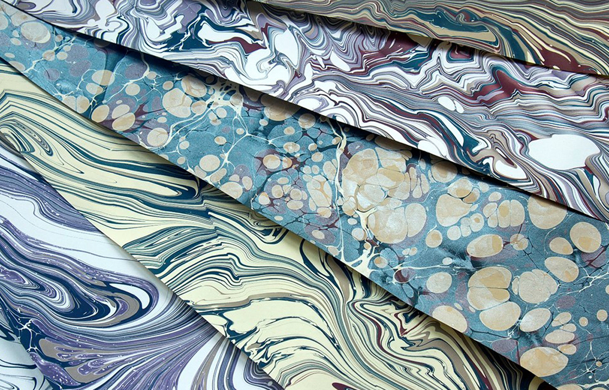
Several original patterns from paper marbler Jemma Lewis, taking the colour palette from the Barra landscape and creating patterns to evoke its shores and form a physical link between the product and its packaging. The logotype was designed to be as fluid as the pattern itself and secondary marks were created to reflect the product’s premium quality and origins. The positioning, ‘Island Born, Fearless Spirit’ conveys Michael’s home pride and adventurous nature.