Seven Crofts Gin
Client: The Highland Liquor Co.
Agency: D8, Glasgow
Photography: Susan Castillo
Agency: D8, Glasgow
Photography: Susan Castillo
Ullapool, home of the Highland Liquor Company, grew from a fishing station planned on the shores of Loch Broom in 1788. The original settlement on Scotland’s West Highland coast, included a boat builder, a rope maker, a cooper, a blacksmith, a fish curer and a mason. Several of these crafts survive to this day and have been joined by many new makers.
Back in 1791, the original settlers in the first seven dwellings sought to establish the village by generating growth through trade. In the spirit of these original settlers, The Highland Liquor Co. created Seven Crofts Gin.
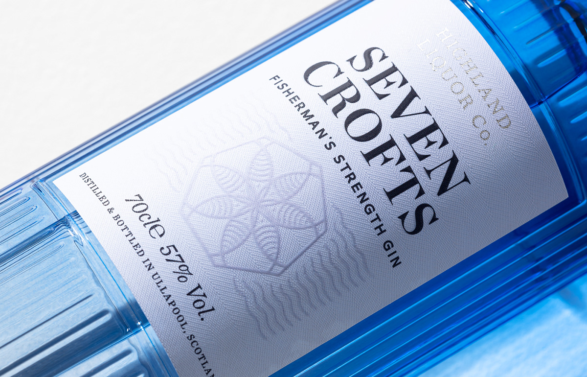
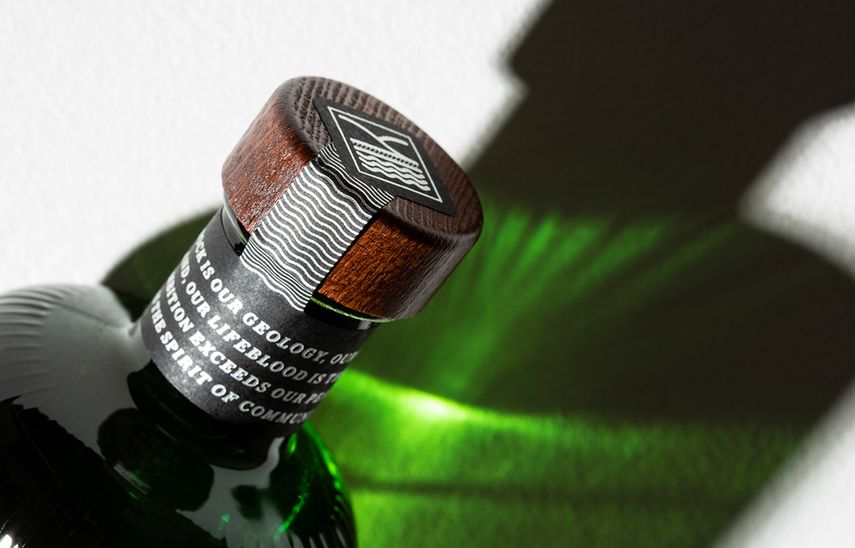
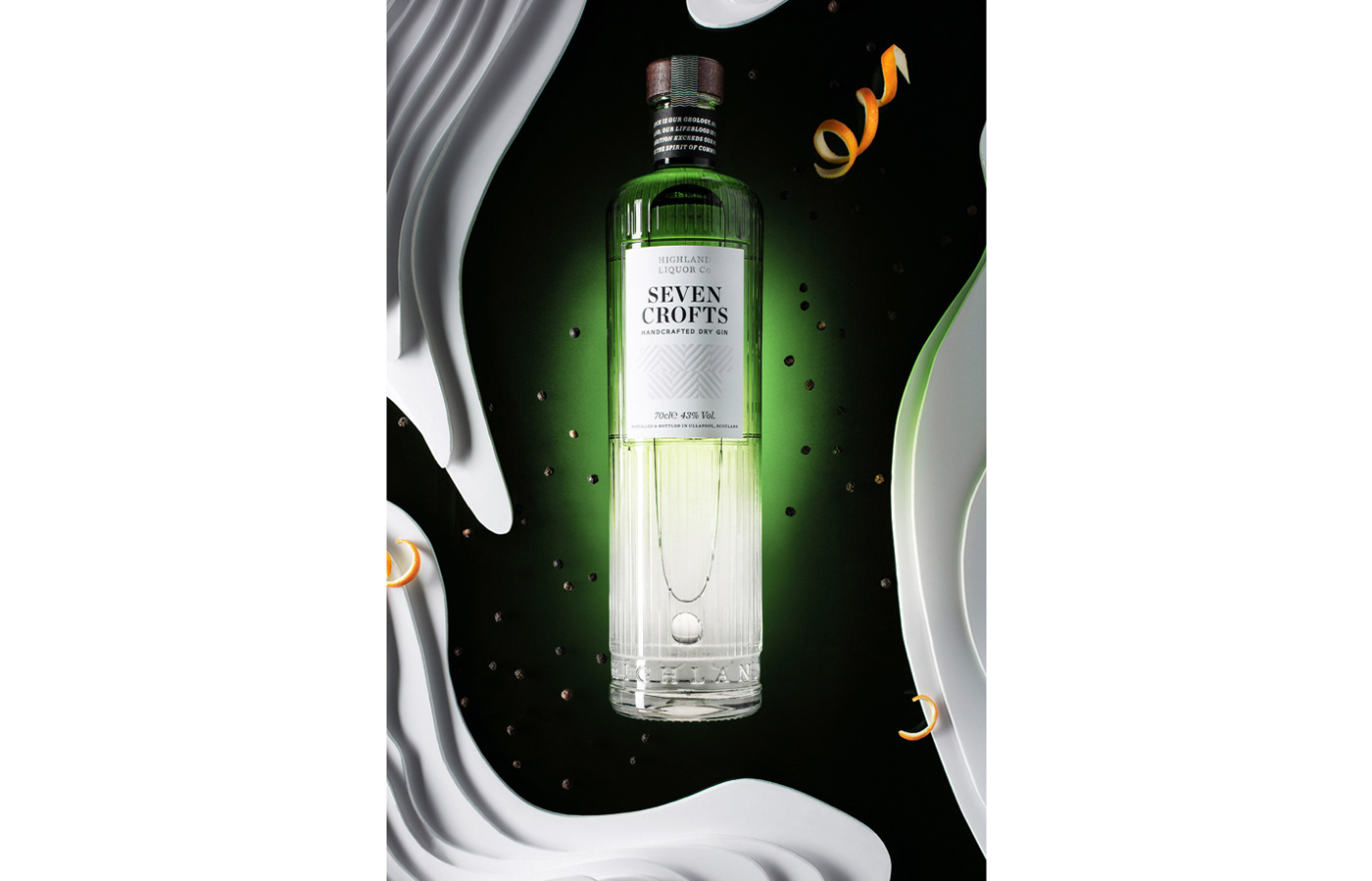
The Highland Liquor Co. identity is built around a system of geometric symbols, each one representing a feature of the local landscape. Seven Crofts builds on this system by using seven striped blocks (representing farmland) as it's symbols while the green ombre effect on the bottle is symbolic of the land meeting the sea.
A 'Fisherman's Strength' version accompanies the original Seven Crofts, and continues the system, presented in a blue ombre bottle with a symbol comprised of seven fish to signify the brand's links to the sea.