
Akademia Terapii Motywującej – case study.
Akademia Terapii Motywującej [Academy of Motivational Therapy] is a new training center for people working with patients or pupils: psychologists, physicians and teachers.
"This is a relatively new concept in Poland. Based on the great idea of Motivational Dialogue, which in turn draws inspiration from humanistic psychology and backed up by the contemporary results of psychological studies. At the same time, it is very much an anti-sectarian approach, which aims to reach representatives of various psychological faculties."
"Our training programs are going to be professional and far removed from the “quick and easy” courses that offer some meaningless diplomas. There will be no waffling, motivational business-speak or any new age nonsense at our Academy. ATM shall give professionals practical, sensible, proven and effective tools for their everyday work with patients or clients."
- Paweł Brudkiewicz, founder of ATM
In our subsequent discussions we have managed to establish a few possible approaches for the future ATM logo:
1. Dialogue as an interpersonal dynamic but also a cooperation between different psychological paradigms. A fusion of diverse perspectives on human psyche, which results in a more complementary and complete picture.
2. Motivation, growth and progress – pretty much a direct reference to the specificity of the courses offered by ATM, but also to its very name.
3. Human mind as a collection of separate components, which need to be correctly arranged for the person to function properly.
4. Rational and science-based view of the human psyche.
There was also an additional requirement for the logo, namely that it could coexist harmoniously with a mark for a different project of ATM founders: Centrum Dobrej Terapii (Good Therapy Center). I had already revised this design for Mr. Brudkiewicz a few months earlier.

CDT logo: before and after the update.
We have added a cell nucleus to the neuron symbol but, more importantly, I have redrawn the dendrites' structure and introduced more orderliness to the whole mark.
The original mark was quite delicate and therefore susceptible to malfunctioning in smaller sizes. After the update it was no longer the case. Chaotic configuration of dendrites might be closer to reality, but it also introduced impressions of disorder and negligence to the symbol. Adding a nucleus establishes a central point of the mark and should catch the viewer’s eye and make the symbol easier to remember.
Sketches.
It was time to work with pen and paper...

A whole galaxy of heads, groupings of people, dialog clouds and splitting the metaphorical psyche into its components. Plus an occasional exploration of the motivation/growth motif. Quite a bit of material for further development.
Initial proposals.
At this stage I always need to prepare several concepts of the logo, which present the spectrum of possible outcomes and provide my clients with some alternatives to choose from.

Proposal A.
Human mind as a puzzle to be solved jointly by the therapist and his patient. Unfortunately, it is a very common and worn out cliche. Its use would expose ATM to associations with banal, lack of creativity and immaturity. Moreover, it would provide no separation from thousands of other logos using this approach.

Proposal B.
With this design I wanted to visualize the idea of different psychological doctrines coming together to form a more complete picture of the human psyche. In my opinion, it is a pretty clear and neat illustration of this concept.

Proposal C.
Motivation, growth and activation of human potential for improvement. This design portrays this philosophy doubly: not only does the human head grows in size in subsequent “steps”, but also its jaw forms the shape of a rising staircase, or an increasing bar chart. The result is quite distinct, rewarding and somewhat mesmerizing.
My only concern was that this direction was a bit too close to the coaching jargon that permeates business spheres and constantly pesters us about leaving the comfort zone. Not exactly the kind of affiliation that ATM has been looking for.

Proposal D.
Geometric splitting of a human head into several basic shapes, which results in a fairly abstract but clear symbol. There is no dialogue here, no motivational imagery or any allusion to an interaction between doctrines. However, provided some good will, one could see scientific approach or even “analysis of human soul” in this mark. It is somewhat serious in tone, maybe even noble, which would give ATM the status of a trustworthy and sophisticated institution.
Development.
Option D quickly took the lead thanks to its simplicity. In my client's own words:
"A noble, integrating and original design – its features are classic and modern at the same time. It is simple (and therefore catchy and memorable), as well as individualistic (which is one of the unspoken goals of motivational dialogue)."
"I see it not as a representation of partitioning but of unification – in my opinion, it is a much more refined version of the “puzzle” concept. It is also the most “artistic” proposal, and our field is an art as well (apart from the fact that it should be a sound craft above all else)."
- Paweł Brudkiewicz, founder of ATM
Having selected a preliminary design, we could proceed to its further development.

Step 1: clarifying the shape.
The general form of the symbol required no revolutionary changes, just some minor improvements here and there, as well as a stricter definition of its structure. The accompanying image shows subsequent steps of the head symbol construction, along with the geometrical relationships that determine them.

Step 2: introducing color.
Testing various options of logo coloring. Shades of orange were our choice, due to their correspondence with the hues used in the CDT logo.
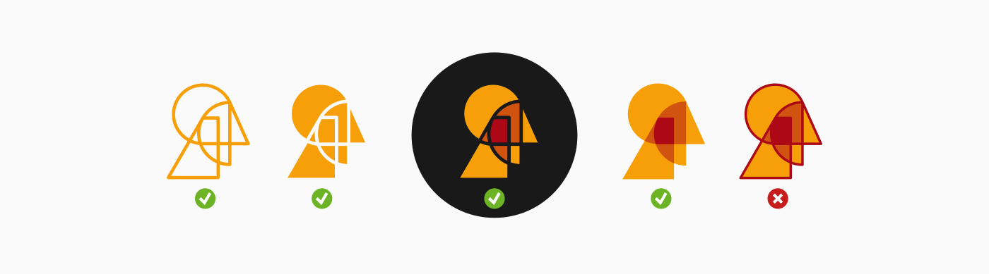
Step 3: variants of the symbol.
Exploration of the possible head versions. The original drawing is so characteristic that it retains its recognizability in various possible representation methods. Such flexibility is an asset, therefore we have decided to include all variants of the mark in the final collection, except one. The discarded option used both the line drawing approach, as well as the “shading” style, which feels like visual redundancy.
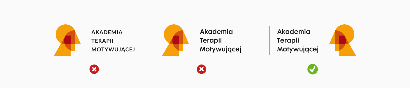
Step 4: the lettering.
From the very beginning of my work on concept D, it seemed pretty obvious that the lettering accompanying the symbol should be as straightforward and geometrical as possible. What turned out to be a surprise is that the version with the head turned left seemed to match the overall composition of the mark best. This change allowed for a smoother merger of both components, as the nose of our bust was complemented by the chipped free space created by the lettering. Moreover, I have added a vertical line to the mark, which acts as a framing device and results with a more integrated and complete layout.
The finishing-line.
We have managed to create a logo that successfully fulfills all the symbolic requirements and should be easy and flexible to use. I hope that it will contribute, at least to a small extent, to the future successes of the Academy of Motivational Therapy, its founder – Mr. Paweł Brudkiewicz – and his associates.


