Challenge :
Starting from scratch with a brand new name ready to emerge in the advertising/marketing industry.
Idea :
Ultra ("an ultra bold slab typeface with nods to wood type styles like Clarendon and Egyptian. Strong and dramatic letterforms for titling, a serious, yet friendly, and easily legible typestyle.
Perfect for power headlines and titling for impact" says the author Astigmatic One Eye Typographic Institue).
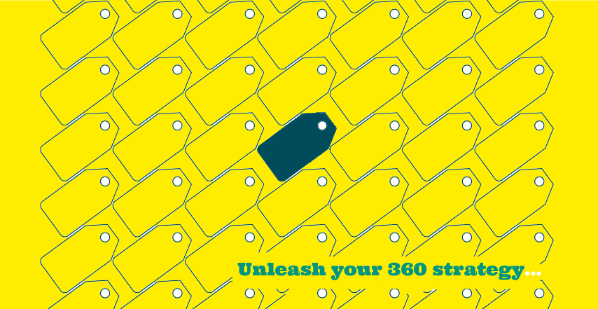
Yellow tag on background strenghtening the overall impact.
"Pass" lettered in cap with the "Color of the Year" according to Pantone ! Our AD told us it was by mistake she picked this flavour. Yeah right... whatever. We loved it!
Additionnal fonts will feature Cody Star & Tittillium Web.
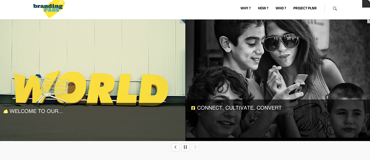
Web :
Responsive with html 5. To be released soon.
Result :
Share, love, like, pin... tweet @PhilRouin or phil@brandingpass.net!
About branding pass :
We are a small, flexible digital & branding agency specializing in web, print, event and social based in Paris. We work with individuals and businesses of different sizes to bring ideas to life... and love to turn projects into beautiful things.
branding pass team

Manifesto

brandingpass.net Sneak Peek
(c) Pictures, courtesy Hans Knikman & Ionut Julia


Responsive Design Emailing / powered by MailChimp

Value proposal header