


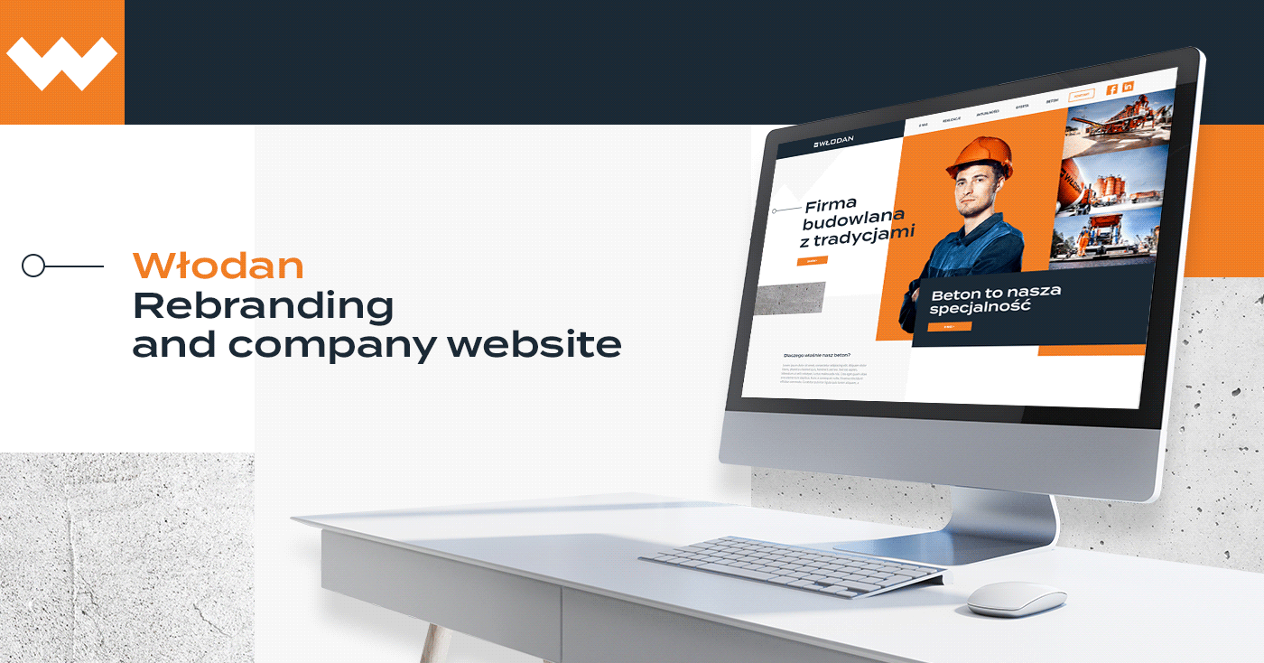
The Client
Włodan is a family-run construction company from Poland, with over fifteen years of experience in constructing roads and highways. We were tasked with refreshibng it's branding and creating a new website, aimed mostly at smaller clients, who want to buy construction concrete.
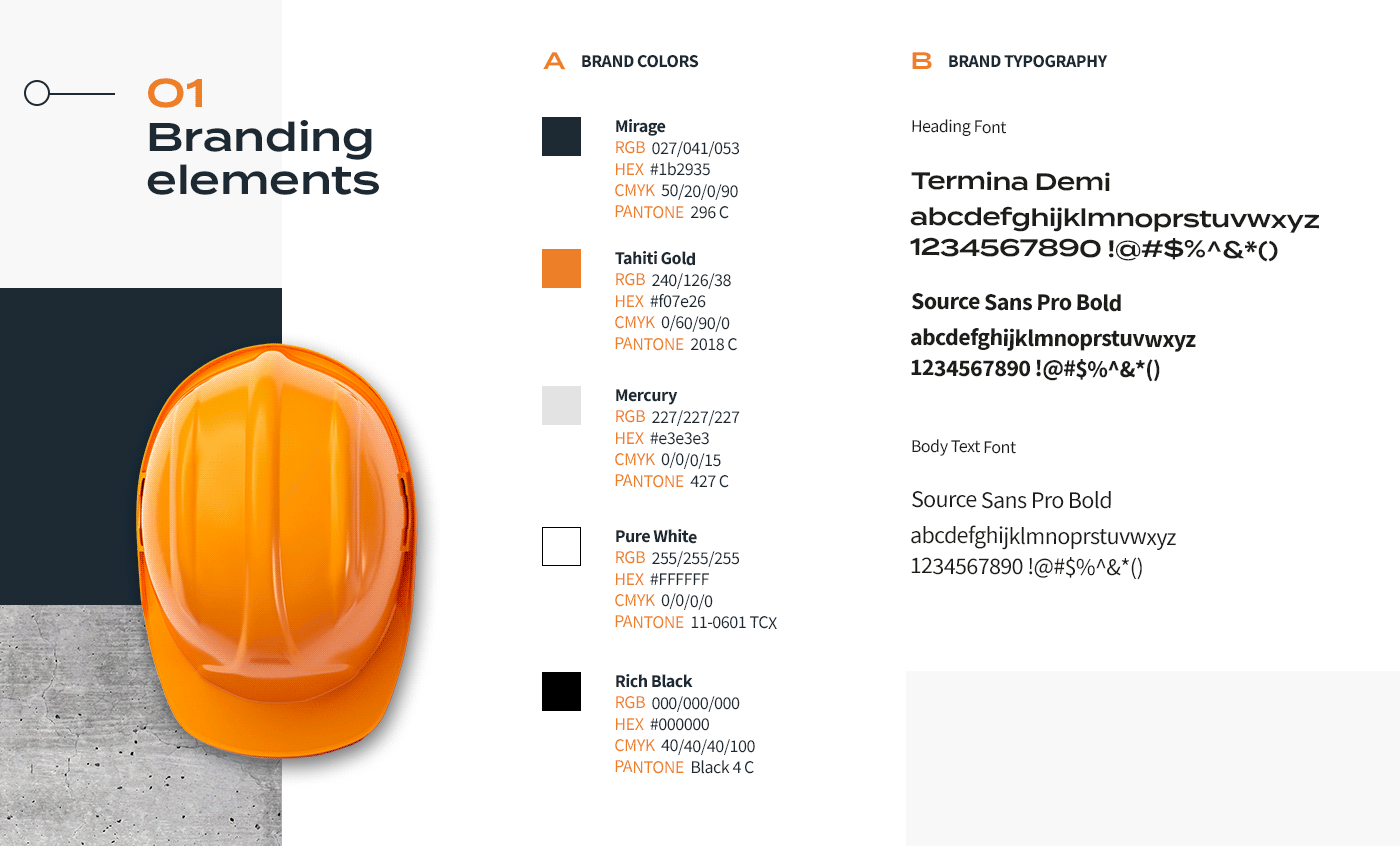
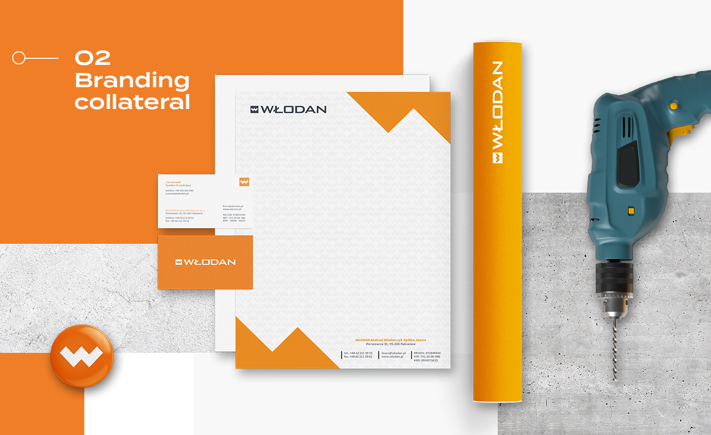
Brand Refresh
Without changing logo and a defining brand color (orange) we refreshed the whole branding by making it more modern and cohesive. We added brand elements such as W pattern and elements that originated from the logo itself. We decided on new heading font which was more in line with the logo as well.
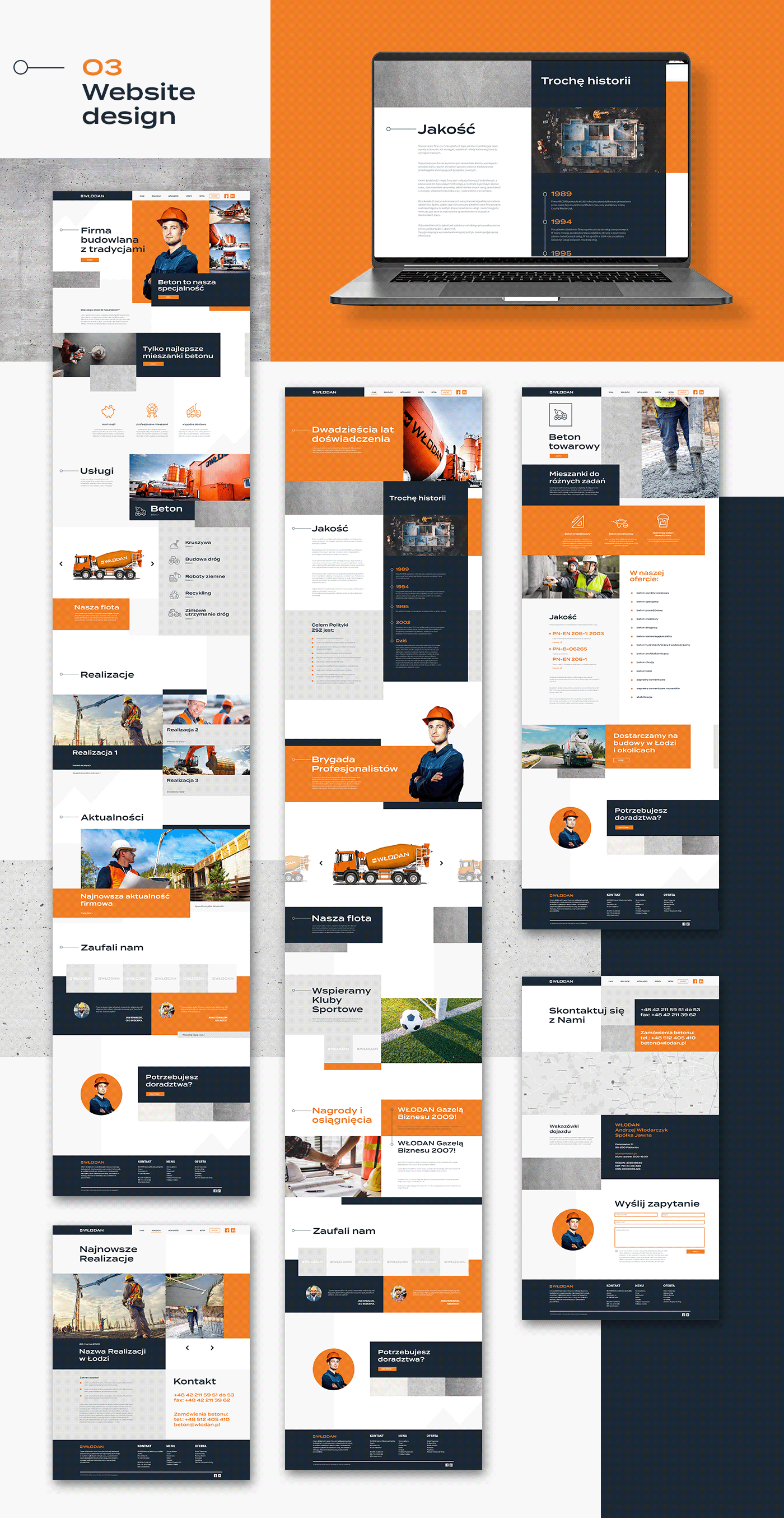
The Website
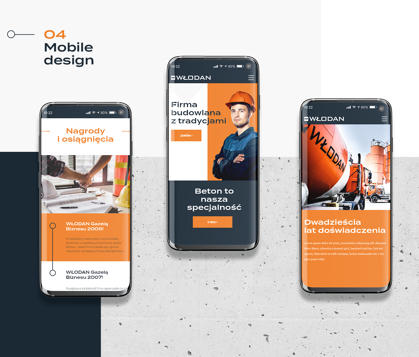
We decided to go with blocks of color and concrete patterns to put emphasis on the construction. The main goal was to make site more readable, usable and professional. We also designed mobile version in line with the modern standards.

The Effect
Włodan gained a new, modern look and a more professional web presence. The new site is more readable and easier to navigate for customers, which was the main point of the change.
Włodan gained a new, modern look and a more professional web presence. The new site is more readable and easier to navigate for customers, which was the main point of the change.
------------------------------------------------------------------------------------------------------------------------------------------------------


