Brief: Rebrand ‘The Cheese Shop Nottingham’ conveying the idea of heritage and aim to create a warm and homely feel.
Concept: Logo stemmed from the idea of combining a cheese wedge and silhouettes to create a family crest which represents the family run business. Idea simplified to logo becoming the wedge shape on it’s own, and the silhouetted images taken to create a pattern to be used alongside the logo. Repetitive patterns can often be found within the home so this design helps create a friendly and welcoming atmosphere. Heritage is conveyed within the brand not only via the use of the animals, which are the main source for cheese, but also in the materials used. These materials, predominantly being wood and brown paper, represent cheese’s natural origins.

Pattern used in an alternative way for letterhead and envelope design. Banner created almost like a ribbon and rosette to show ‘The Cheese Shop’s’ quality assurance.


Packaging: Cheese wrapped in patterned tissue paper and sealed with a Cheese Shop sticker - given the seal of approval. Pattern present in folds of brown paper bag. Screen printed for a handmade, rustic effect.


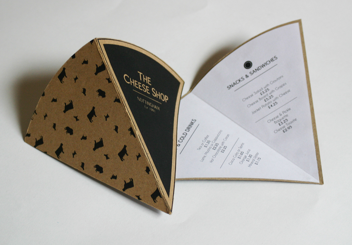
Menu design in the shape of the logo. Unconventional shape helps the design to be memorable and therefore assists the customer with remembering ‘The Cheese Shop’.