Reward Pay
Branding developed for RewardPay, a reward payment service for both brands and consumer.
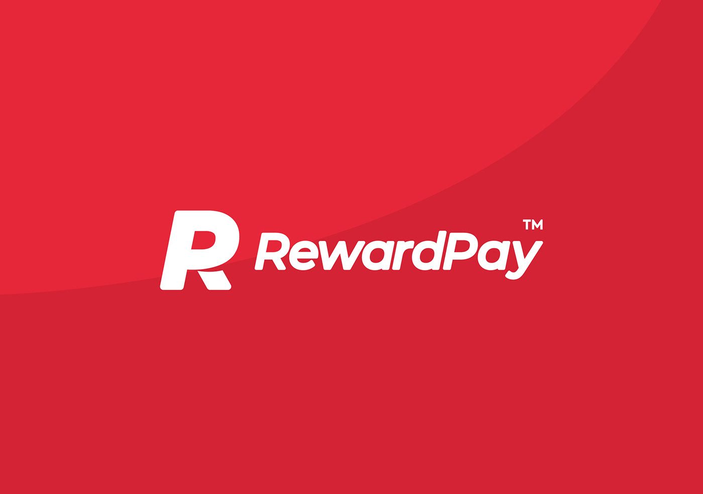
The solution to the logo features an (‘RP’) monogram based on an uppercase ‘R’, which sees the ‘P’ formed through a strategically placed incision.
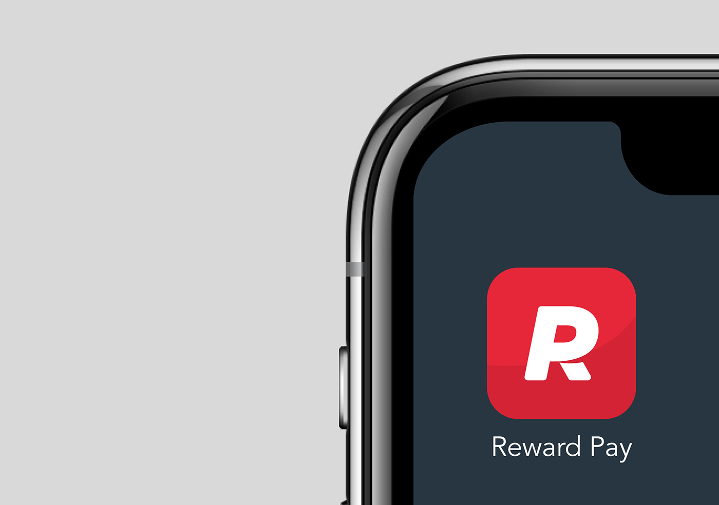
Application requirements are based firmly in the digital arena. This requires the logo to work effectively at various sizes, specifically retaining it’s characteristics when reduced down to app icon size.
The solution to the logo features an (‘RP’) monogram based on an uppercase ‘R’, which sees the ‘P’ formed through a strategically placed incision.
Application requirements are based firmly in the digital arena. This requires the logo to work effectively at various sizes, specifically retaining it’s characteristics when reduced down to app icon size.
The arc of the incision is used as an asset across various applications, allowing the organisation to take further ownership of visual communications.