

Tem Amor na Panela 2020 - SP, BRASIL
PT.
@temamornapanela é um portal culinário, focado em comida comida de mãe, com sabor, afeto e significado, onde o principal ingrediente é o amor <3. Tem amor na panela” é um nome que se explica por si só. O nome surgiu pela ideia da filha, que sempre ouviu a sua mãe dizer que o segredo principal de toda comida é o amor. O seu principal objetivo é levar ao mundo boa comida caseira, amor pela culinária simples de cada dia e muito sabor nordestino.
IN.
@temamornapanela is a culinary portal, focused on mother's food, with flavor, affection and meaning, where the main ingredient is love <3. “There's love in the pot” is a name that explains itself. The name came from the idea of the daughter, who always heard her mother say that the main secret of all food is love. Its main objective is to bring good home-cooked food to the world, a love of simple daily cuisine and a lot of northeastern flavor.


Tem Amor na Panela 2020 - SP, BRASIL
PT.
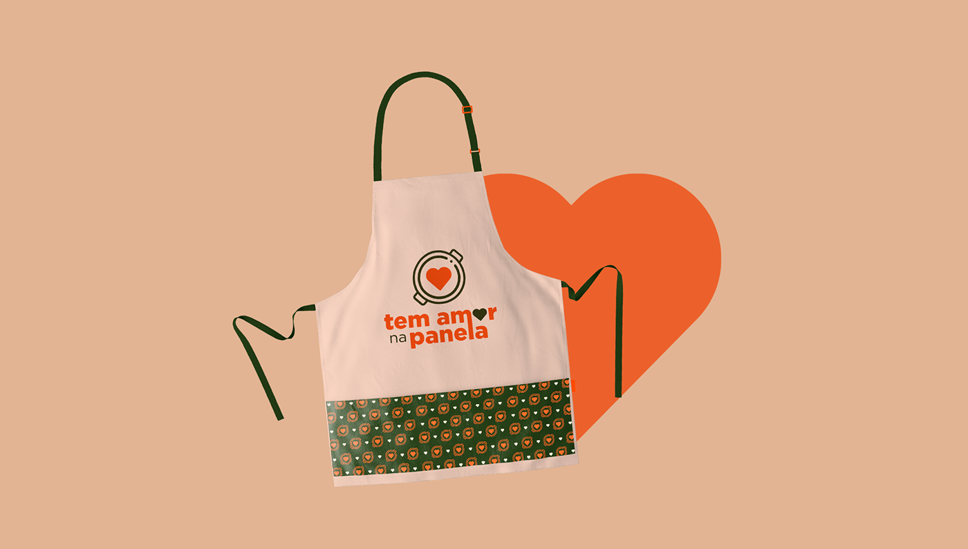
Para desenvolver a Identidade Visual, utilizamos como base principal os conceitos de amor, comida e simplificidade. Esses aspectos foram traduzidos através de símbolos, cores e tipografia para criar uma composição que faça com que a marca represente todo o sentimento que é passado através da preparação de pratos deliciosos através de uma Identidade delicada, marcante e simples (mas não simplória), como é a pureza do amor <3. O símbolo criado para a marca representa a visão de uma panela vista de cima, com um coração no centro. O desenho do símbolo é minimalista e delicado, para reforçar a pregnância da marca e exemplificar o conceito da simplicidade, do amor e da comida. A escolha da paleta de cores foi pautada em tons presentes na culinária salgada, principalmente nos temperinhos e brotos. A escolha tipográfica tem como base o conceito de simplificidade e amor: as formas simples e arredondadas favorecem a leitura do nome da marca e a união entre as hastes do m e do l representam a união e o amor. Além disso, temos o símbolo do coração representando a letra O.
IN.
To develop Visual Identity, we use the concepts of love, food and simplicity as the main basis. These aspects were translated through symbols, colors and typography to create a composition that makes the brand represent all the feeling that is passed through the preparation of delicious dishes through a delicate, striking and simple (but not simplistic) identity, as is the purity of love <3. The symbol created for the brand represents the view of a pan seen from above, with a heart in the center. The design of the symbol is minimalist and delicate, to reinforce the pregnancy of the brand and exemplify the concept of simplicity, love and food. The choice of the color palette was based on tones present in salty cooking, mainly in spices and sprouts. The typographic choice is based on the concept of simplicity and love: the simple and rounded shapes favor the reading of the brand name and the union between the stems of the m and the l represent union and love. In addition, we have the heart symbol representing the letter O.


All rights reserved © Fernanda Carvalho | Mova Design Studio
Quer fazer um projeto como esse conosco? Mande-nos uma mensagem!
Do you want to do a project like this with us? Send us a message!


