

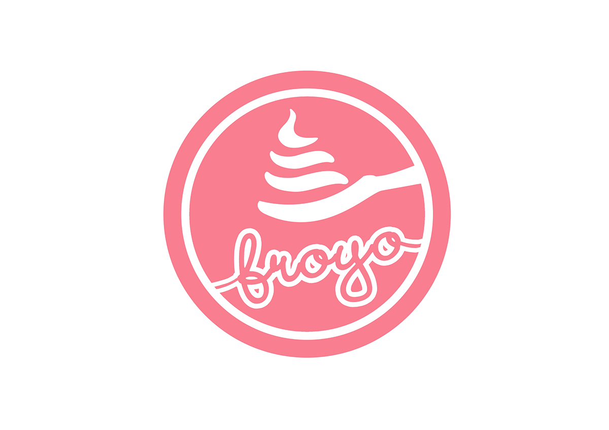
The logo uses Gestalt theory to create the form of the frozen yogurt image on the spoon. The word 'froyo' uses a rythmic typography that symbolises frozen yogurt coming out from the dispenser.
Pastel pink is chosen as it represents feminity, romantic, sweet, loving, young, which suits the target market.

Business card front.
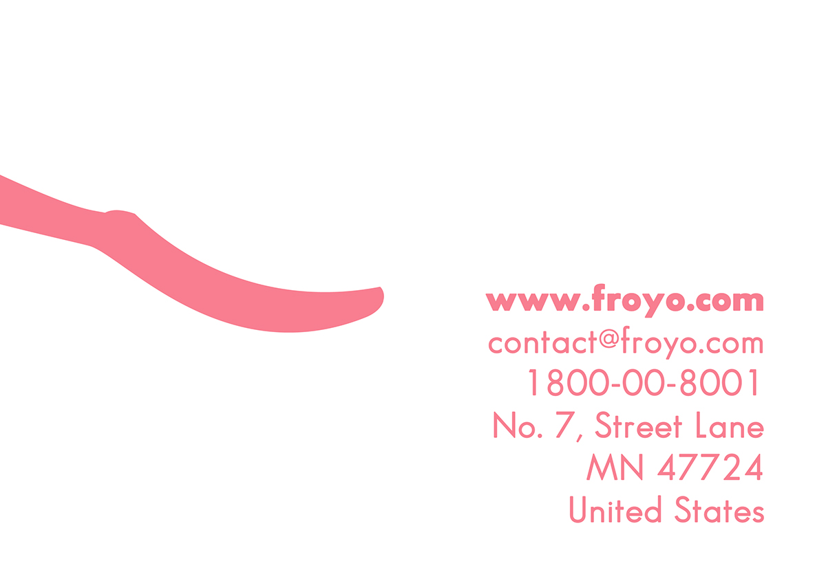
Business card back. (Notice the empty spoon is directly located at the same position as the front on actual printed card, which implies 'Come back for more - here!'.

Envelope front.
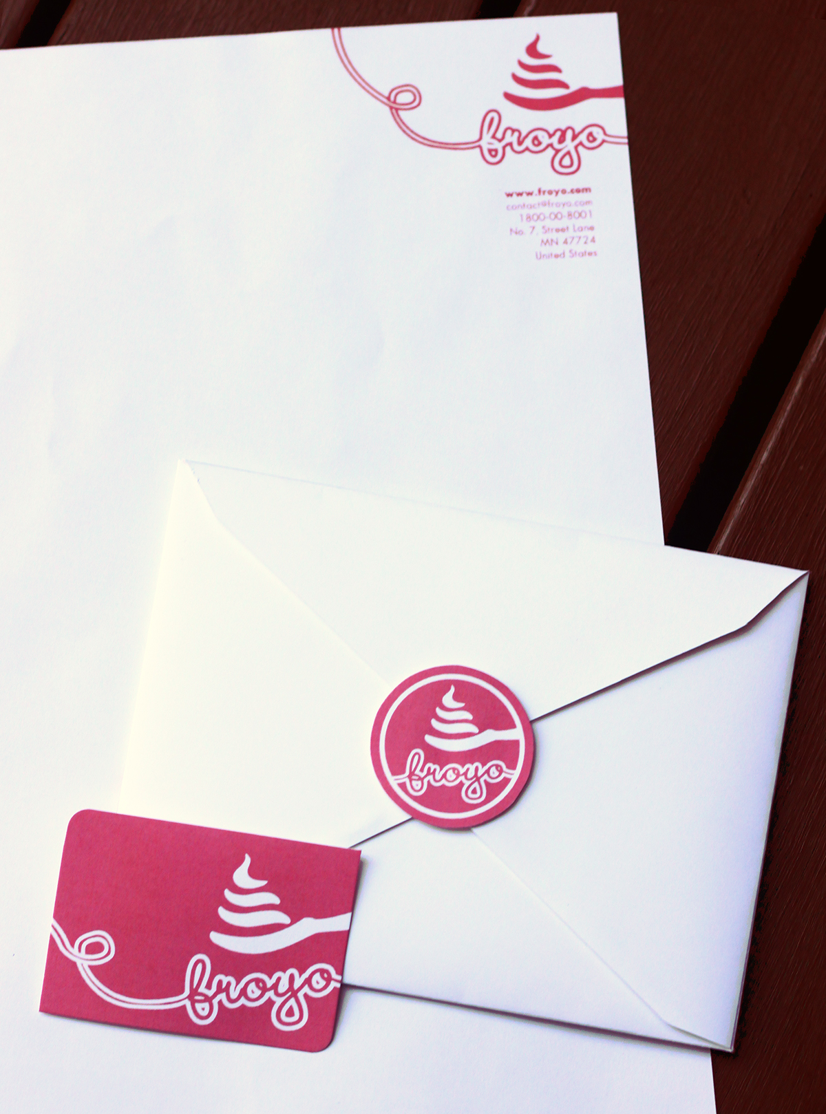
Actual printed stationaries - letterhead, envelope, business card.

Papercup design for two sizes.

Take-away packaging paperbag design.
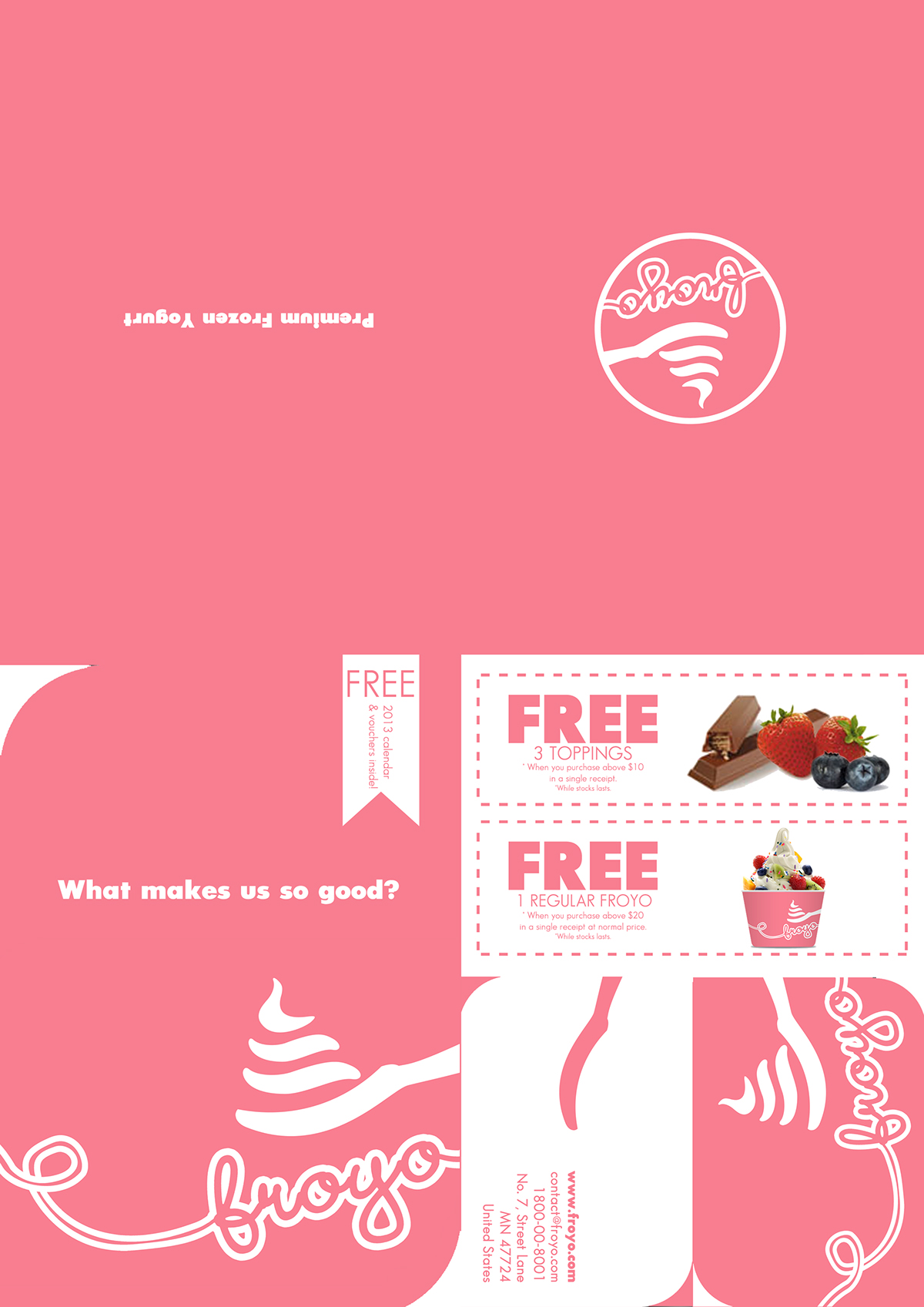
This is the promotional brochure which will be cut and folded in such a way that the page 'What makes us so good' will be the cover, and the page 'Premium frozen yogurt' is the back.
Two coupons are given and is perforated for easy tearing. A foldable business card is also incorporated and perforated. A calendar will be inside the foldable business card - as shown in the picture below.

The contents of the brochure will be informative, benifitial, and promotional.

The shop front.

The in-store logo placing.
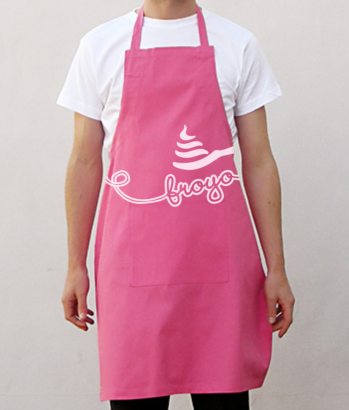
Uniform design.

And lastly, the vehicle design.


