

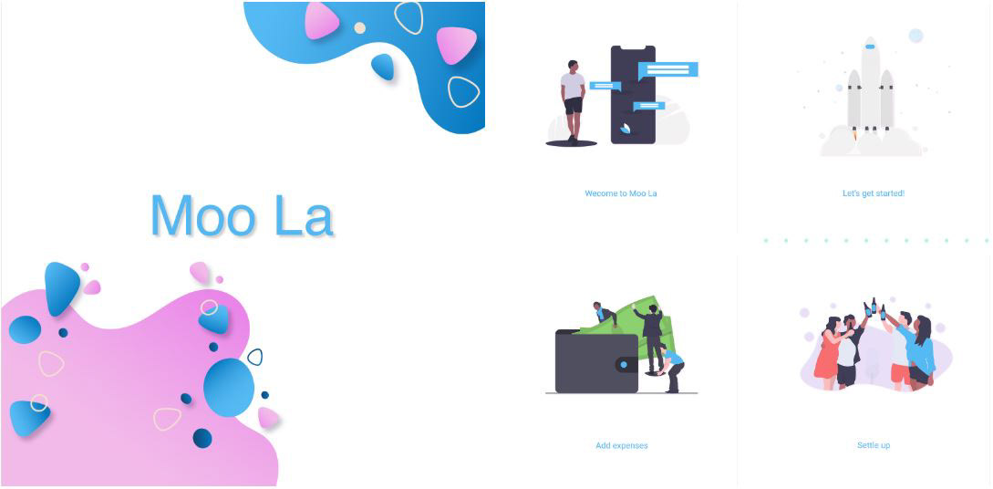
Moo La UI UX For Mobile Money Management App
For this project, I decided to design a new budgeting app called Moo La for managing and tracking both personal and group spend. Moo La makes it easy to track individual and shared (friends and family) expenses and balances. Moo La organizes all your expenses in one place so that everyone can see who they owe. When keeping track of money and shared expenses, people want to be fair but sometimes forget, stress, or can’t decide. I was responsible for research, design, testing, and hand-off. Since the Finance industry is already well researched, I committed most of the research time on market and competitor research. I was determined on delivering a neumorphic user app experience.
Client: Moo La
Date: 6.1.20
Based In: Toronto, Ontario, Canada

The Challenge
Almost everyone today mainly uses their phones to stay connected with their loved ones through social media, and some of them even use it for banking and making payments on-the-go. Furthermore, very few have the discipline and diligence to stick with it, as it takes a relentless dedication to achieve a competent personal and group budget. I believe that a powerful digital budget manager is a must-have app for everyone, especially the millennials, to be responsible for how they use their money. In fact, the ability to control money coming in versus going out is a major obstacle among individuals today. The development of personal and group budget is no easy task to complete. Thinking about this, I decided to design an app for money management for individuals and groups.
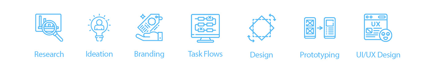
My Role
I completed all activities in the UX project cycle in a solo capacity- from research to design to prototyping. I was in charge of Research, Ideation, User Task Flows, Branding, Design, Prototyping & UI/UX Design. I conducted user research using interviews and surveys in order to address both user behaviors and attitudes.
Tools

Pen, Paper, Whimsical, Miro, Procreate, Microsoft Word, Microsoft Excel, Adobe Illustrator, Adobe Photoshop, Figma, Lookback, Zeplin
Techniques: Surveys, Questionnaires, Interviews, Affinity Diagram, Value vs. Complexity Model, Competitive/Comparative Analysis, Mood boards, User Flow, Paper Prototype, Crazy-8, Wireframes, Mockups, Pattern Library, Key Performance Indicators, Remote Un-moderated Usability Testing, Accessibility Analysis, Prototyping
Duration
1 month with weekly deadlines
Research & Analysis
Knowing that all users aren’t the same- I conducted interviews face to face interviews with approximately 15 men and women residing in cities and between the age group of 21 to 35 years, all working professionals. I noted down excerpts from the collected data on sticky notes and created an affinity diagram. Based on the results of affinity mapping, I did a few quick sketches to help me organize my thoughts and to outline the app. A pleasing UI was needed to maintain user retention. Besides, I have added a touch of neumorphism to make the idea of money management sound fun and exciting to the millennial, which are my target audience. I made User Flows to define the app Navigation and its structure followed by Wireframes and Low fidelity mockups.

I looked at the competition, users, and collected the necessary data. The next strategic step was to study the existing personal budget management apps of these competitors. A key strategy was to use similar existing apps and their features as a baseline. After completing my research and considering the ever-changing financial landscape, I decided to build a mobile app with the ability to track all your accounts digitally and in real-time. The next step in the design process was to organize everything and give a structure to the app.
Low Fidelity Mockup
I started by designing a few low-fidelity wire-frames using the crazy-8 method using a pen and paper. I later put the wire-frames together and created a prototype on Figma and transferred them to Lookback to send it out to users to test the prototype. So, I shared the wireframes with some UX Reviewers and friends (Users) for their feedback. The intention was to test the app to see how my users would process information.

Feedback & Iteration
Lookback was used to conduct remote user testing session as an attempt to observe each user’s interaction & behavior. Overall users were thought that it was too cluttered had consisted of a dated look and feel. Tests uncovered that the icon size felt like they were not from the same family and the look and feel lacked consistency. The testing sessions were very valuable to improve my designs.
Color Palette
Visual Design and Brand Identity was the most exciting part of the design process. This is also the most comprehensive and crucial project stage as it involves designing detailed mock-ups of the app, choosing an appropriate color scheme, and setting up the style guide to position the brand's presence. Since this is a financial app, it consists of a lot of data elements. Hence, this color palette was necessary to convey important actions & information by associating them with color hierarchy.

Typography
The Typeface for the app had to make for a more natural reading rhythm and appropriately suited for my finance app because the information being conveyed has to be legible and rightly formatted. I chose 'Roboto' as it is the standard typeface used in designing for android using the Google Material Design guidelines. I picked a default system fonts and used text sizes, alignment, and line & letter spacing to convey information.

Iconography
I picked large icons and buttons so that it can be easily touched in a finger-operated UI.

High Fidelity Clickable Prototype
The testing sessions were a very valuable way for me to identify the flaws in my designs and gain insights into what the users were expecting from each interaction. Based on the framework established in the low-fidelity mockups, testing & feedback, I converted those screens into high fidelity clickable digital prototypes. It was the most time-consuming task as it involved using the appropriate colors, icons, typefaces, fonts and designing the graphs. The whole app is consistent with the Google Material Design guidelines with a touch of neumorphism.


Validation, Usability, Feedback & Iteration
After Testing, checking for accessibility issues, and iterating based on feedback, insights, observations, and the latest UX trends, I created the final high fidelity clickable prototype using Figma. I standardized font and icon size for better consistency. I aligned objects for a smoother look and feel. I improved accessibility and iterated on designs based on user data. Finally, I exported the designs to Zeplin and created a style guide for Engineering Handoff.
Solution & Insights
I spent a full month with over 10 working hours each day on this project starting from brainstorming to deploying the final prototype and finally making an account of every step in this case study. However, mistakes are made even when you go all-in. I have a lot to say regarding this project as I left no stones unturned when it came to putting in the best of my efforts at each stage of this project. I learned some interesting things about conducting the design process, putting my assumptions and biases aside, and how important it is to trust the process. Even though I completed all activities in the UX project cycle in a solo capacity- from research to design to prototyping, looking at the app as a whole, I am confident that the solutions I came up with will definitely solve the problem that people face with existing money management apps or services.
High Fidelity Clickable Prototype


