

REVIEW ORIGINAL DESIGN


INTERACTION DESIGN
01. INFORMATION ARCHITECTURE
After reviewing the structure of original app, information organizing and labeling are modified to optimize navigation. Search function as an essential feature is moved to home screen and calendar is moved from action bar to navigation bar.

02. WIREFRAMES AND UI FLOW
For Consolidating ideation and visualizing concepts, Android high-fidelity wireframes and flow design are produced as below.


03 SOME CHALLENGES
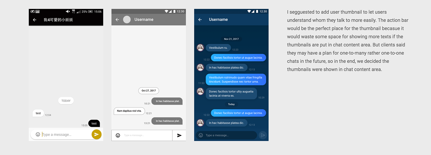
Design is an iterative process. Sometimes my client and I have different opinions and it is hard to get balanced. I always tried my best to convince my client that my thoughts are better choices, but I also have flexibility to change my design considering the startup's limited resource. And also, we lock evidence to proof which design is actually better. So we tried to release MVP as soon as possible and then to see the results to modify after receiving feedback from users.


VISUAL DESIGN
ICON SET
Outline icons, which are both modern and friendly, work perfectly with minimal design and are a great way of bringing apps up to date easily.


