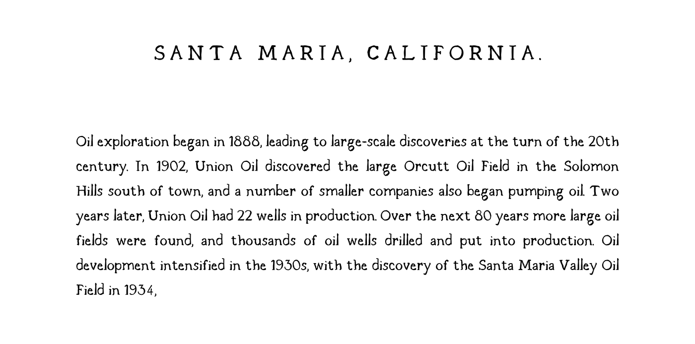
SANTA MARIA FONT FAMILY
Typeface design, art direction
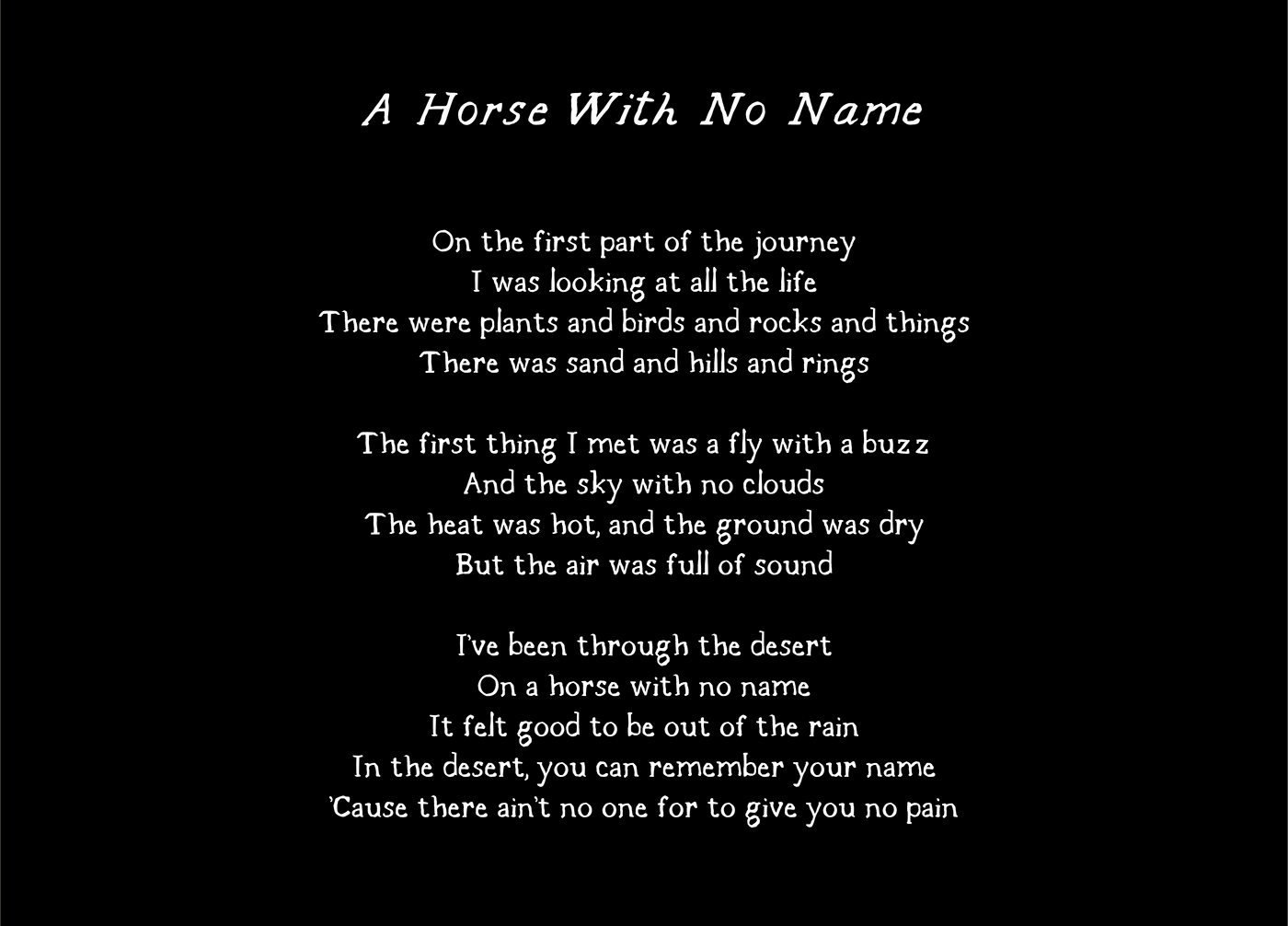
Santa Maria was not born out of a desire to bring an old typeface back to life. Nor was it born from an observation of certain families of typefaces, nor is it a tribute to a particular era or culture. Santa Maria was born out of a feeling. Of a memory I have never lived.
To me Santa Maria is the name of a place. It is this old white wall, eaten away by salt and sand, of which bricks have been exposed in time. Under the layers of the years and the owners, there is still an old inscription. We don't know if that was the name of a bar or of a guest house. What we can see is that the author tried to approximate an existing typography. He tried, with the rigor of his wrist, to pretend that this handwritten type wasn't one.
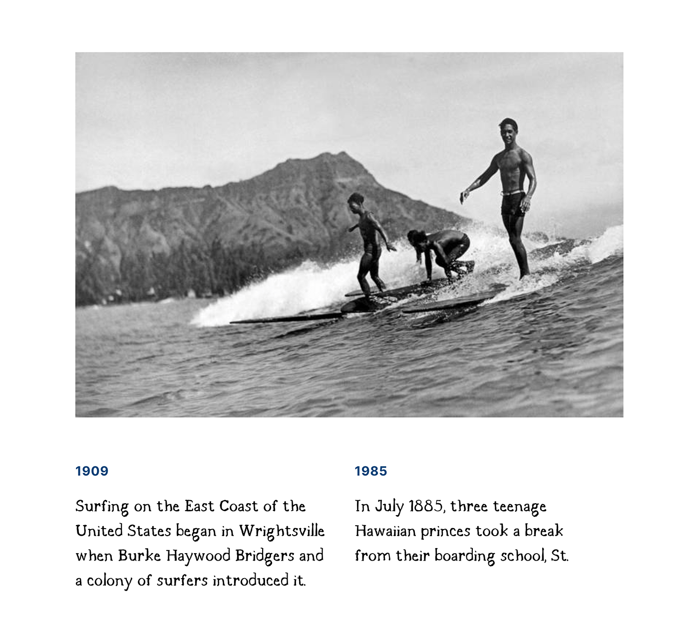
Photography : Waikiki archive ©
Design & art direction : Pierre Jeannelle
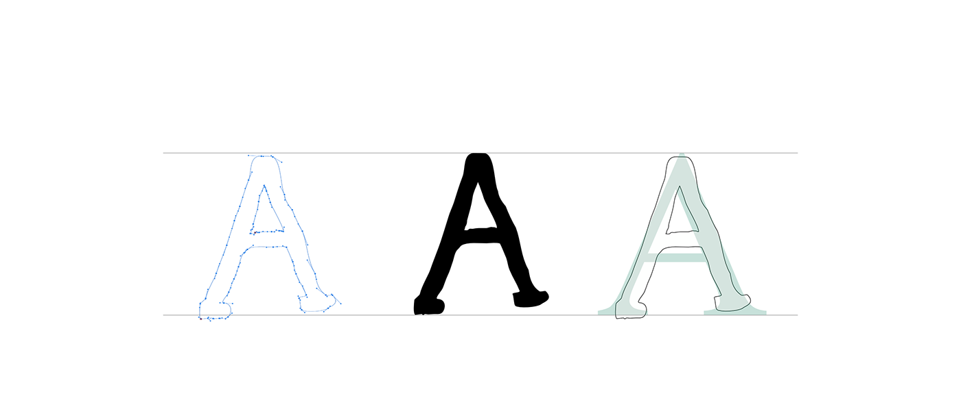

THE FLAWS
The main idea was to build a handmade typeface with serif curves. To reproduce the elegance and skill of an existing type, with the flaws and clumsiness of handwritten characters. There is a real humility and a certain elegance with the idea of hiding the flaws in one's own handwriting to approximate the curves of an real type. The challenge was to make this whole exist in a real, functional font family.


FAMILY DETAILS
The standard a's are called double-storey a's. And the primary reason they are designed this way is to distinguish them further from letters such as o. Italics are a form of a typeface that aims to emulate the written form of letters. This is especially pronounced for example in the Cyrillic alphabet, where letters can be completely different when in printed form and written form. It is with this logic that the a and other letter change. The so-called single-storey ‘a’ that we see in handwriting today can also be seen in the visgothic script and cursiva (a simplified form of textualis), and can also be found in the insular script.


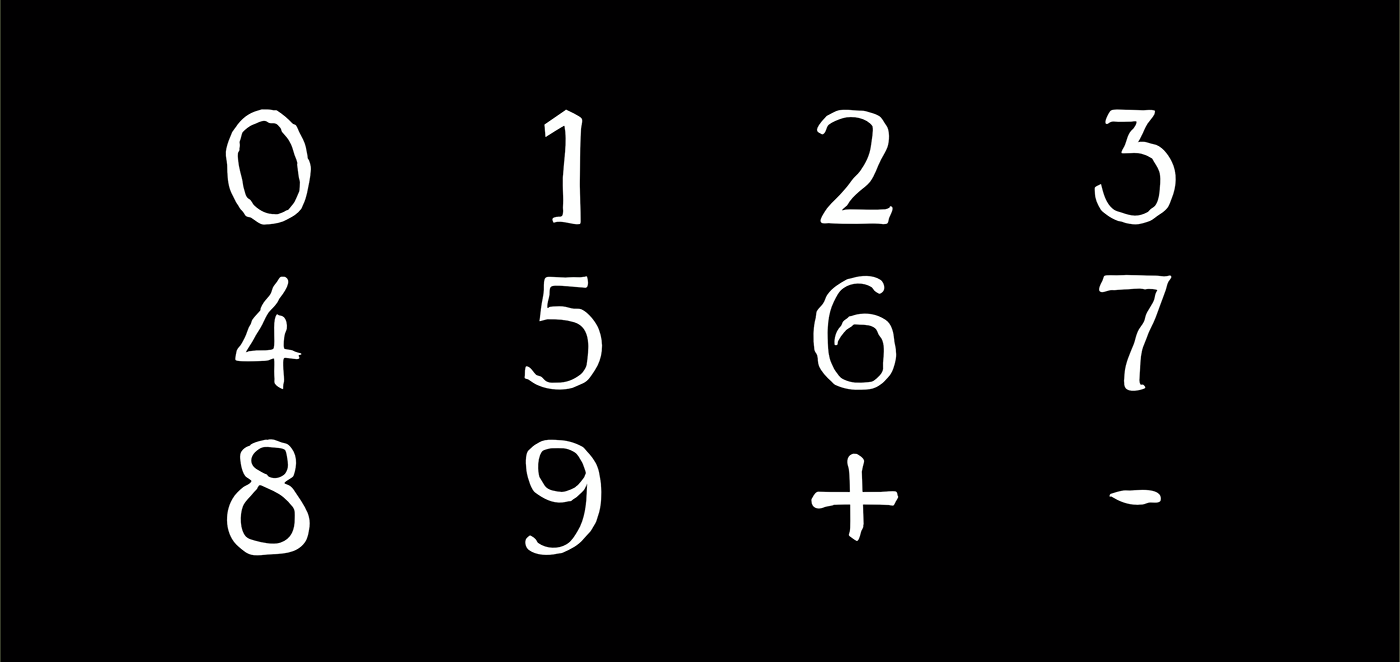
NUMBERS
Numbers are generally vectors of capital information. Whether it is an adress, a price or telephone number, they must be perfectly legible and unambiguous. The main idea of the typeface, however, had to prevail: to carry the elegance of a serif type with the humanity of a manuscript. The numbers of Santa Maria therefore contain several elements from these two universes